

A complete hands-on guide to simple linear regression, including formulas, intuitive explanations, worked examples, and Python code. Learn how to fit, interpret, and evaluate a simple linear regression model from scratch.
This article is part of the free-to-read Machine Learning from Scratch
Choose your expertise level to adjust how many terms are explained. Beginners see more tooltips, experts see fewer to maintain reading flow. Hover over underlined terms for instant definitions.
Simple Linear Regression
Simple linear regression is the foundation of predictive modeling in data science and machine learning. It's a statistical method that models the relationship between a single independent variable (feature) and a dependent variable (target) by fitting a straight line to observed data points. Think of it as finding a straight line that passes through or near your data points on a scatter plot.
Simple linear regression offers simplicity and interpretability. When you have two variables that seem to have a linear relationship, this method helps you understand how one variable changes with respect to the other. For example, you might want to predict house prices based on square footage, or understand how study hours relate to test scores.
Unlike more complex models that can be "black boxes," simple linear regression gives you a clear mathematical equation that describes the relationship between your variables. This makes it a useful starting point for understanding regression concepts before moving to more sophisticated techniques.
Advantages
Simple linear regression offers several key advantages that make it valuable for both learning and practical applications. First, it's highly interpretable - you can easily understand what the slope and intercept mean in real-world terms. The slope tells you how much the target variable changes for each unit increase in the predictor, while the intercept represents the baseline value when the predictor is zero.
Second, it has a closed-form solution, meaning you can calculate the optimal parameters directly using mathematical formulas without needing iterative optimization algorithms. This makes it computationally efficient and typically finds a well-fitting line (assuming the data meets certain assumptions).
It also serves as a foundation for understanding more complex regression techniques. Once you master simple linear regression, concepts like multiple regression, regularization, and even some machine learning algorithms become much easier to grasp.
Disadvantages
Despite its advantages, simple linear regression has several limitations that you should be aware of. A significant limitation is that it can only model linear relationships between variables. If your data has a curved or non-linear pattern, simple linear regression may provide a poor fit and misleading predictions.
Another limitation is that it can only use one predictor variable. In real-world scenarios, you often have multiple factors that influence your target variable. For instance, house prices depend on square footage, number of bedrooms, location, age, and many other factors - not just one variable.
Simple linear regression is also sensitive to outliers, which can significantly skew the fitted line. A single extreme data point can pull the entire regression line toward it, potentially making your model less accurate for the majority of your data. Additionally, it assumes that the relationship between variables is constant across all values, which may not hold true in many real-world situations.
Formula
The mathematical foundation of simple linear regression is expressed through a linear equation that describes the relationship between your variables. Let's break this down step by step to understand what each component means and how they work together.
The Basic Linear Model
The core formula for simple linear regression is:
where:
- : dependent variable (target/response variable) — what you're trying to predict or explain
- : independent variable (predictor/feature/explanatory variable) — what you're using to make predictions
- : intercept term (beta-zero) — the value of when ; where the regression line crosses the y-axis
- : slope coefficient (beta-one) — the change in for each one-unit increase in (positive = positive relationship, negative = negative relationship)
- : error term (epsilon) — the random error component representing the difference between the actual observed value and the model's prediction; captures unmodeled factors, measurement errors, and random variation that influence
In summary, is the outcome you want to predict, is the input feature, is the baseline value of when is zero, tells you how changes as increases, and accounts for everything not explained by the linear relationship.
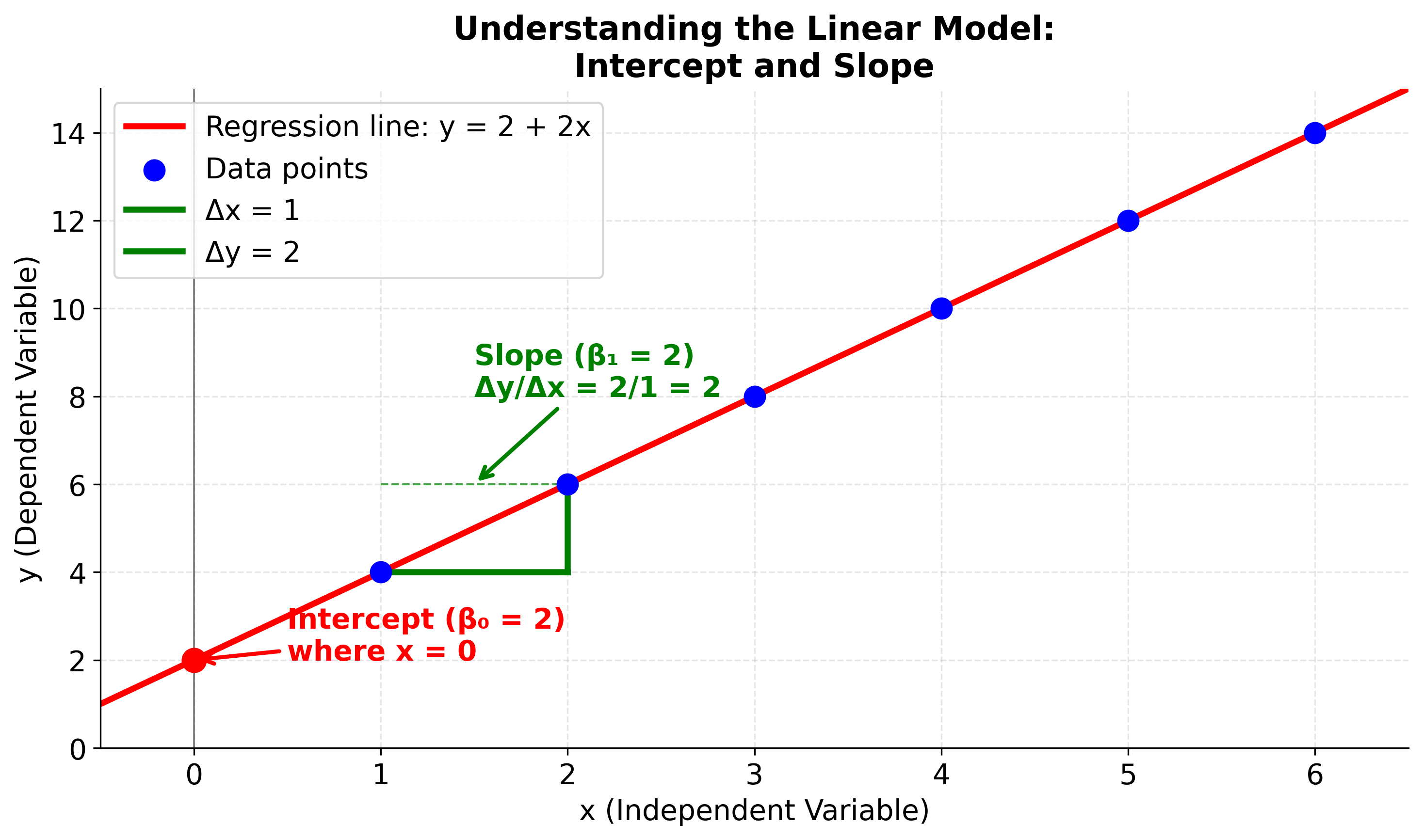
Visualizing the Linear Model Components
To better understand what the intercept and slope represent, let's visualize them on a regression line. This diagram will help you see where the intercept appears on the graph and how the slope determines the steepness and direction of the line. Pay attention to how the green triangle shows the relationship between changes in x and changes in y.
The Least Squares Solution
To find the best-fitting line, we use the method of least squares, which minimizes the sum of squared differences between observed and predicted values. The least squares objective function is:
where:
- : Sum of Squared Errors (also called Sum of Squared Residuals)
- : observed values
- : predicted values ()
- : regression coefficients to be estimated
- : number of observations
The goal is to find the values of and that minimize this sum. The formulas for calculating the optimal coefficients are.
We have covered the basics of the least squares solution in the Sum of Squared Errors (SSE) section. Refer to it for more a more detailed explanation.
Formula for calculating the slope ()
Let's break down the slope formula to understand why it works:
where:
- : slope coefficient (change in y per unit change in x, also called the regression coefficient)
- : individual x values
- : sample mean of x values
- : individual y values
- : sample mean of y values
- : number of observations
- measures how far each value is from the mean of all values
- measures how far each value is from the mean of all values
- captures the relationship between these deviations
- The numerator sums these products, giving us the total covariance between and
- The denominator sums the squared deviations of from its mean, giving us the variance of
- Dividing covariance by variance gives us the slope that describes the linear relationship
The numerator in the formula for :
calculates the sample covariance between and (up to a scaling factor of ). Here, the "scaling factor" refers to the denominator used when computing the sample covariance: the sum is typically divided by to obtain the average product of deviations, which corrects for bias in estimating the population covariance from a sample. In the regression slope formula, we use just the numerator (the sum), not the average, so the scaling factor is omitted.
Covariance measures how two variables change together: if both and tend to be above or below their means at the same time, the covariance is positive; if one tends to be above its mean when the other is below, the covariance is negative. In the context of regression, this term captures the direction and strength of the linear relationship between and . By dividing this covariance by the variance of (the denominator), we obtain the slope , which quantifies how much changes for a unit change in .
Formula for calculating the intercept ()
where:
- : intercept (value of y when x = 0)
- : sample mean of y values
- : slope coefficient
- : sample mean of x values
Here, is the intercept of the regression line—the value of when . The formula shows that to find the intercept, you first calculate the mean of the values () and the mean of the values (), then subtract the product of the slope () and the mean of from the mean of .
- is the sample mean of the values.
- is the sample mean of the values.
This formula ensures that the regression line passes through the point , meaning the average predicted value equals the average observed value. The intercept adjusts the line vertically so that it fits the data according to the least squares criterion.
Direct Substitution Formula
Here is the direct substitution version of the simple linear regression formula, where you can directly plug in the values of and to compute the predicted value for any :
Given data points , the prediction for at a given is:
where
and
with
With direct substitution, the formula for the predicted value is:
This formula allows you to compute the predicted value for any directly from the raw data, using only sums over the and values.
Note: In practice, we would never write the prediction formula in this expanded form. Instead, we would first compute the means and , then calculate the slope and intercept , and finally use the compact formula . The expanded version above is shown purely for explanatory purposes, to illustrate how the regression prediction can be written directly in terms of sums over the data. This helps clarify the underlying mechanics, but is not how regression is implemented in real code or statistical software.
Alternative Formulation
The simple linear regression model can also be expressed in a centered form that highlights the relationship between deviations from the mean:
This form shows that each prediction is the mean of plus the slope times the deviation of from the mean of . This formulation is mathematically equivalent to the standard form because:
This centered form is useful for understanding how the regression line relates to the data's center of mass and how predictions depend on deviations from the mean values.
Understanding Covariance and Correlation
The slope formula is based on the concept of covariance between variables. Let's see how the covariance terms work and why they determine the slope of the regression line.
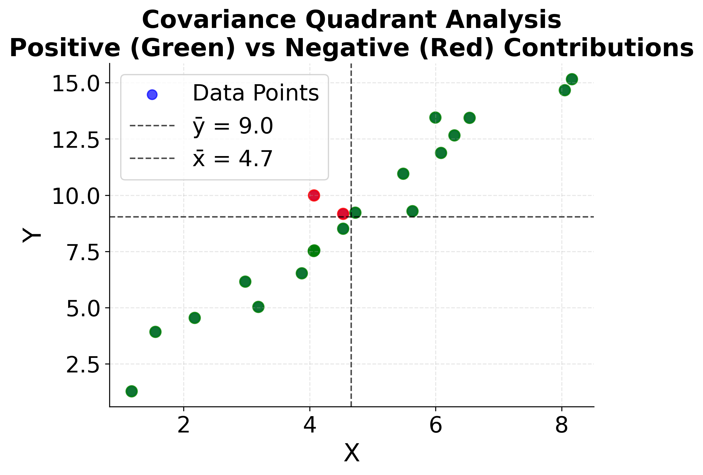
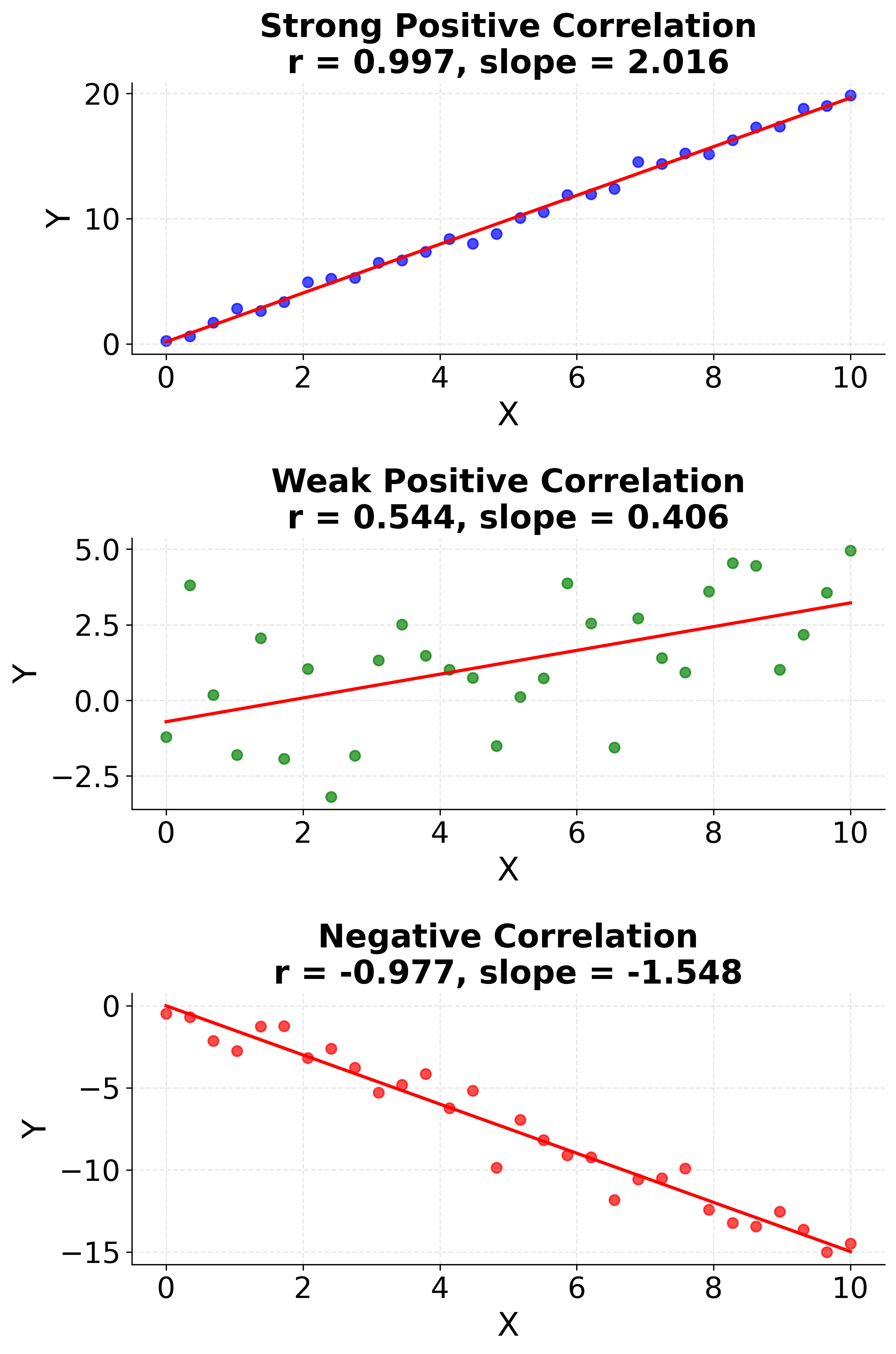
This visualization makes the abstract mathematical concepts of covariance and correlation concrete. The first plot shows how data points in different quadrants contribute to the covariance calculation, while the second plot demonstrates how correlation strength directly determines the regression slope. Understanding these relationships is important for interpreting why the slope formula works and how it captures the linear relationship between variables.
Complete Formula Derivation
The complete formula derivation for the simple linear regression model, showing the prediction for each observation, is:
Where the slope is given by:
And the intercept is:
So, the full prediction equation for every data point is:
Here, the intercept does not appear explicitly because it has been incorporated into the formula using the means of and . Recall that , so when you expand the prediction equation , you get:
This form centers the prediction around the mean values, making the intercept implicit in the calculation. Thus, is not shown separately because its effect is already included through and the adjustment by .
This formula shows that each predicted value is the mean of plus the slope (which measures the relationship between and ) times the deviation of from the mean of .
Mathematical Properties
The least squares solution has several important mathematical properties. First, it's unbiased, meaning that on average, the estimated coefficients will equal the true population values (assuming the model assumptions are met). Second, it's efficient among all unbiased linear estimators, meaning it has the smallest possible variance under the Gauss-Markov conditions (that is, when the errors are uncorrelated, have equal variance, and have zero mean given the predictors—these are known as the "Gauss-Markov assumptions"). Third, the sum of residuals (differences between observed and predicted values) equals zero, and the sum of squared residuals is minimized.
The method also produces a unique solution (unless all values are identical), typically ensuring that there's only one optimal line for any given dataset. This mathematical elegance makes simple linear regression both theoretically sound and practically useful.
Visualizing the Least Squares Method
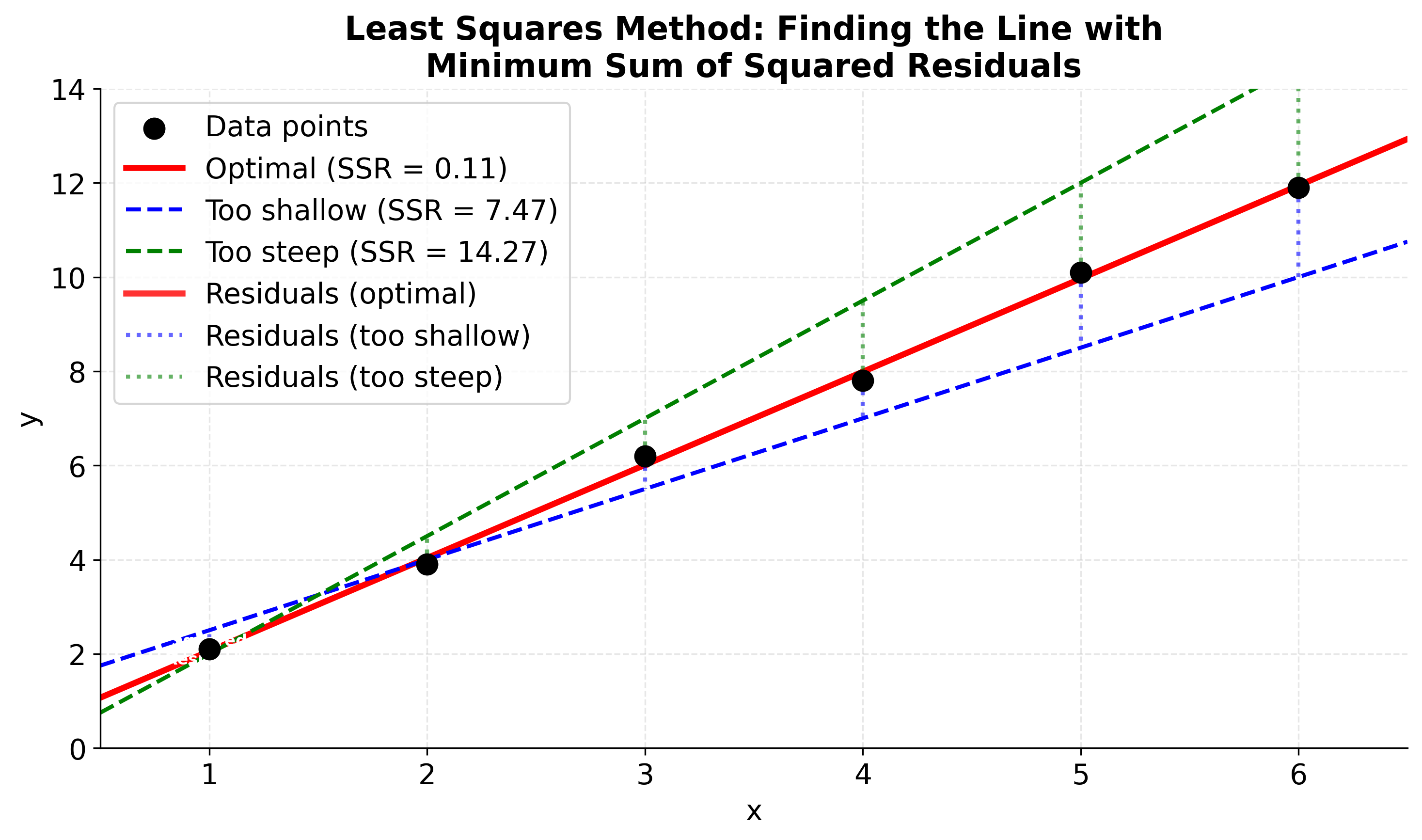
Let's visualize how it finds the line that minimizes the sum of squared residuals. The key insight is that we're looking for the line where the sum of the squared vertical distances from each point to the line is as small as possible. In this visualization, you'll see three different lines fitted to the same data: the optimal line (red) that minimizes the sum of squared residuals, and two suboptimal lines (blue and green) with higher residual sums. The thick red vertical lines clearly show the residuals (distances from points to the optimal line), while the blue and green dotted lines show residuals for the suboptimal models. The gray squares represent the squared residuals for the optimal line - their areas are proportional to the squared error magnitude, making it easy to see why the least squares method chooses the line with the smallest total squared error.
Visualizing Simple Linear Regression
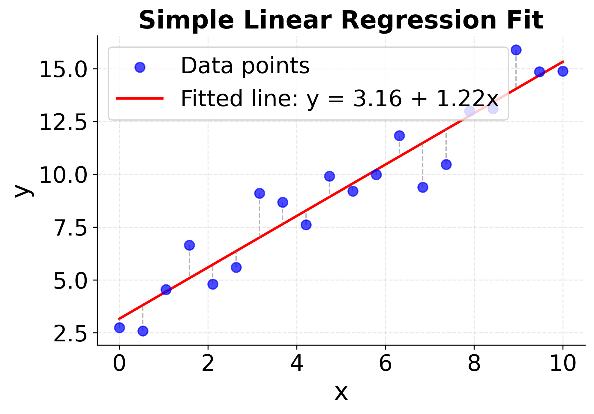
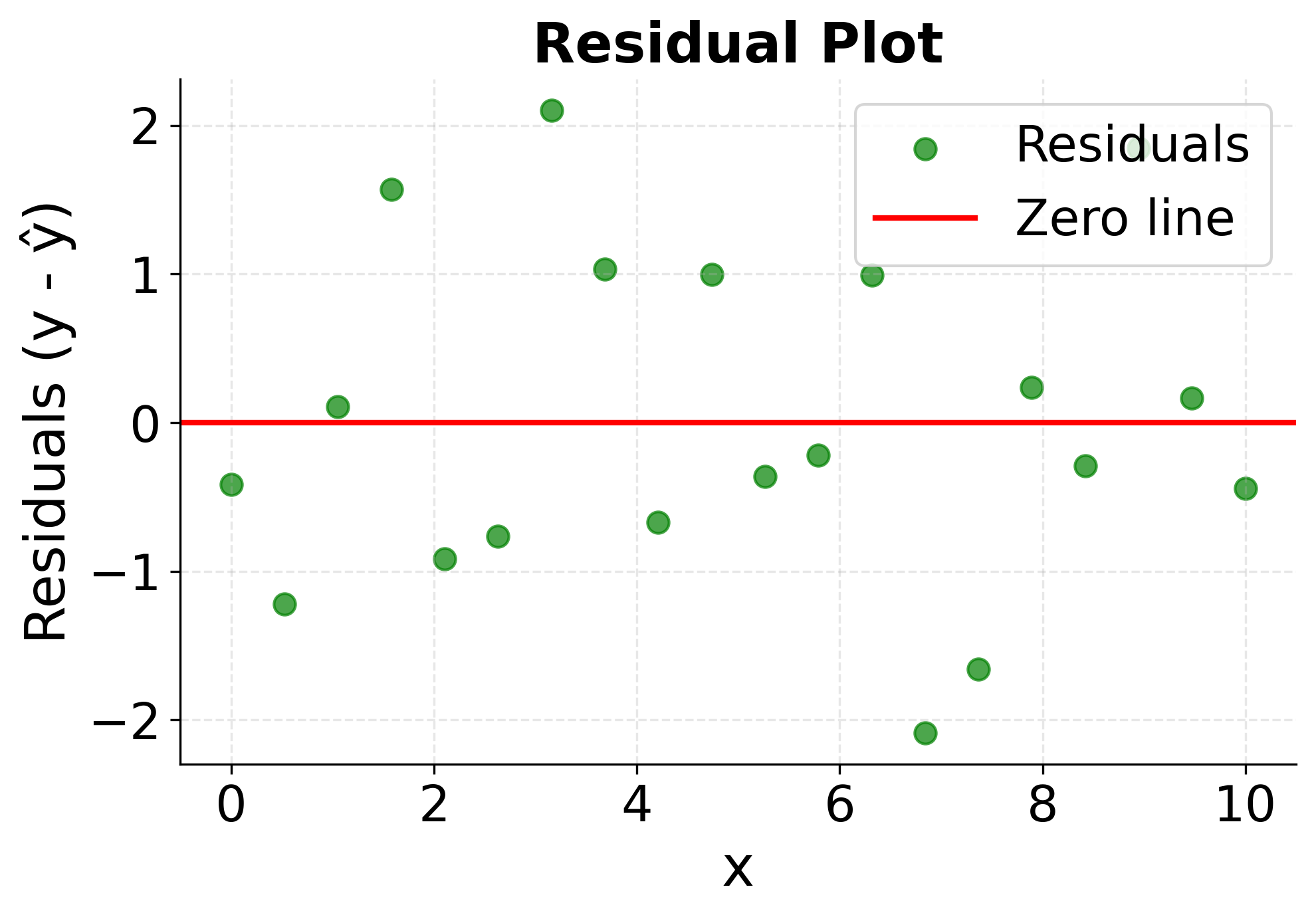
Let's create comprehensive visualizations that demonstrate the key concepts of simple linear regression in action. These plots will help you understand how we find a fitted line, what residuals represent, and how to assess whether a linear model is appropriate for your data.
The first plot shows the complete regression analysis with data points, the fitted line, and residual lines connecting each point to its prediction. This visualization helps you see how well the linear model captures the underlying relationship and provides a clear view of the prediction accuracy across different values of the predictor variable.
The second plot focuses specifically on the residuals, the differences between observed and predicted values, which is important for model validation and assumption checking. Randomly scattered residuals around zero with no clear patterns indicate a good model fit, while systematic patterns or trends in the residuals suggest that a linear model may not be appropriate for the data. This diagnostic plot is important for validating the assumptions underlying linear regression.
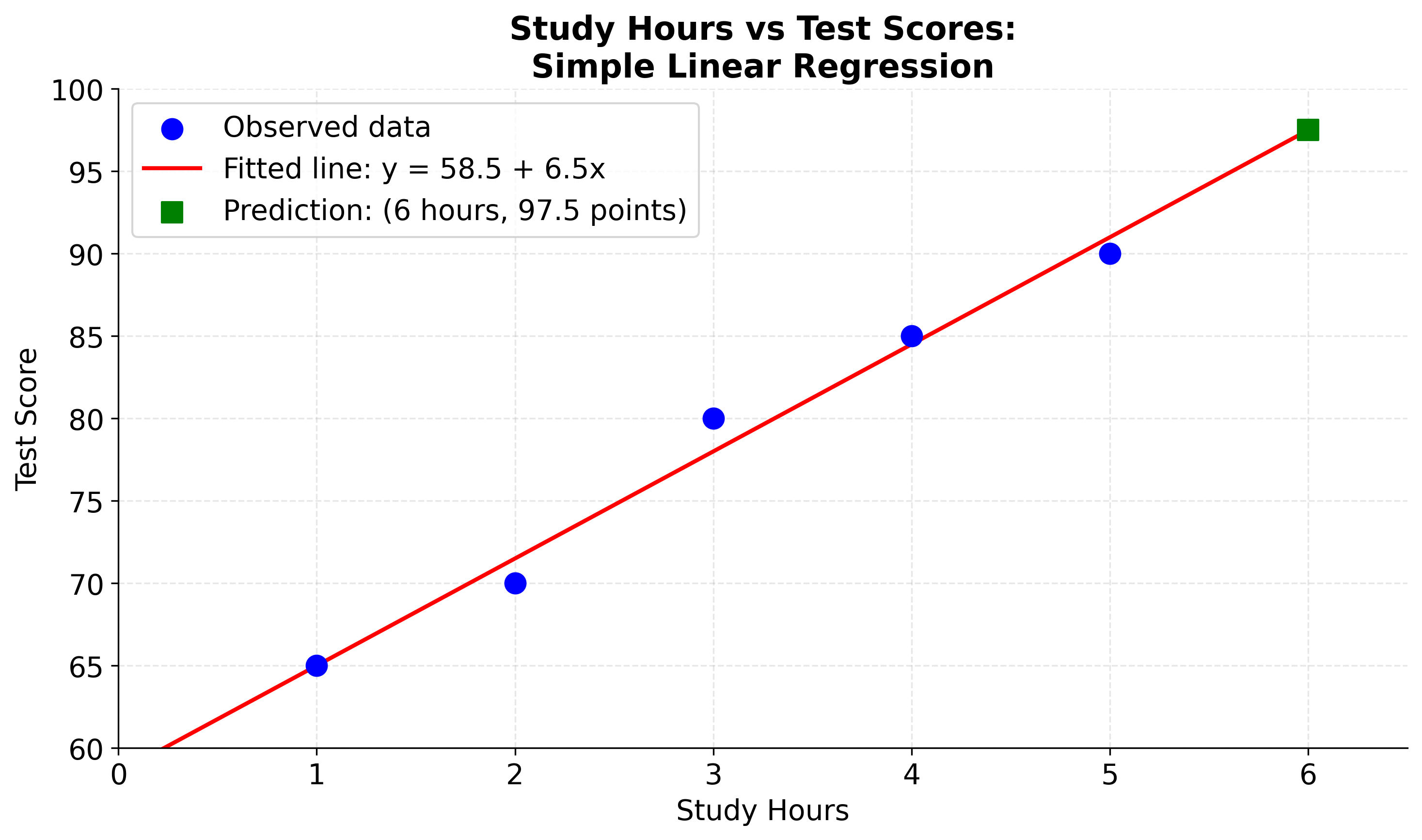
Example
Let's work through a concrete example with actual numbers to see how simple linear regression works step by step. Suppose you're studying the relationship between study hours and test scores. You have collected the following data from five students:
| Study Hours (x) | Test Score (y) |
|---|---|
| 1 | 65 |
| 2 | 70 |
| 3 | 80 |
| 4 | 85 |
| 5 | 90 |
Step 1: Calculate the means
First, we need to find the average values of both variables:
Step 2: Calculate the slope ()
Now we'll use the slope formula. Let's break this down into manageable pieces:
First, calculate for each data point:
- Point 1:
- Point 2:
- Point 3:
- Point 4:
- Point 5:
Numerator:
Next, calculate for each data point:
- Point 1:
- Point 2:
- Point 3:
- Point 4:
- Point 5:
Denominator:
Therefore:
Step 3: Calculate the intercept ()
Using the intercept formula:
Our final fitted equation is:
Step 4: Make a prediction
If a student studies for 6 hours, their predicted test score would be:
Step 5: Interpret the results
Our results can be interpreted as follows.
- Intercept (58.5): A student who studies 0 hours would be expected to score 58.5 points (though this might not be realistic in practice)
- Slope (6.5): For each additional hour of study, the test score increases by an average of 6.5 points
- Prediction: A student studying 6 hours would be expected to score about 97.5 points
The reason that we can simply interpret the slope and intercept as the change in the test score for each additional hour of study and the baseline score for no study, respectively, is because the linear model is a linear function of the form . This is why linear regression models are so interpretable.
Let's visualize this example to see how our calculated regression line fits the data and how we can use it to make predictions. The plot will show the original data points, the fitted regression line, and a prediction for a student studying 6 hours. This visualization helps confirm that our manual calculations are correct and demonstrates the practical application of simple linear regression.
Residual Analysis and Model Diagnostics
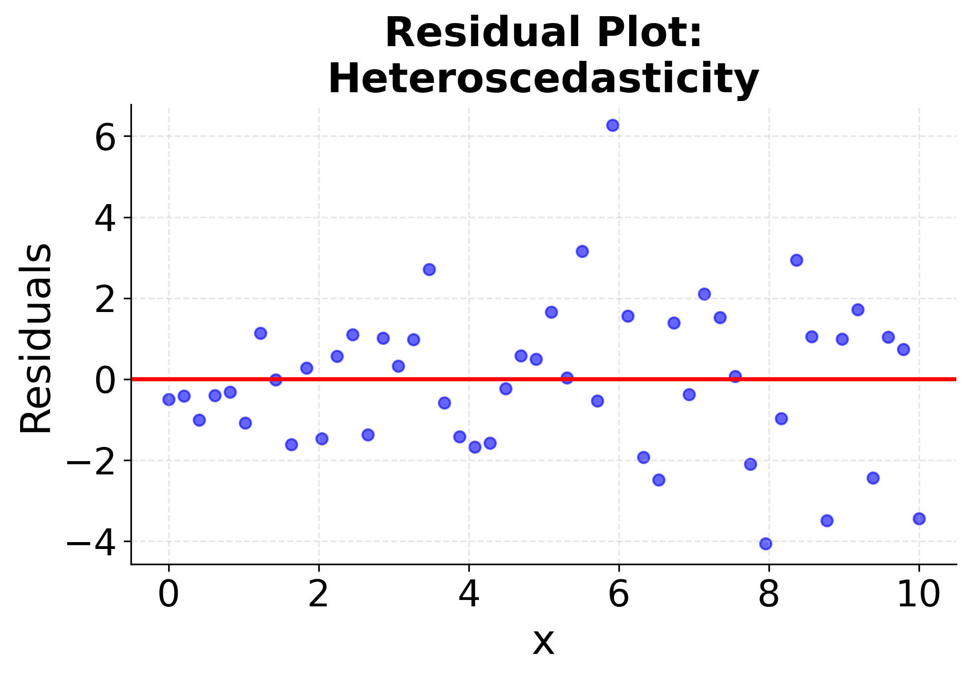
Proper model validation requires checking whether the linear regression assumptions are met. These diagnostic plots help identify violations of key assumptions: linearity, independence, homoscedasticity (constant variance), and normality of residuals. Understanding these diagnostics is important for determining whether linear regression is appropriate for your data and for interpreting the reliability of your results.
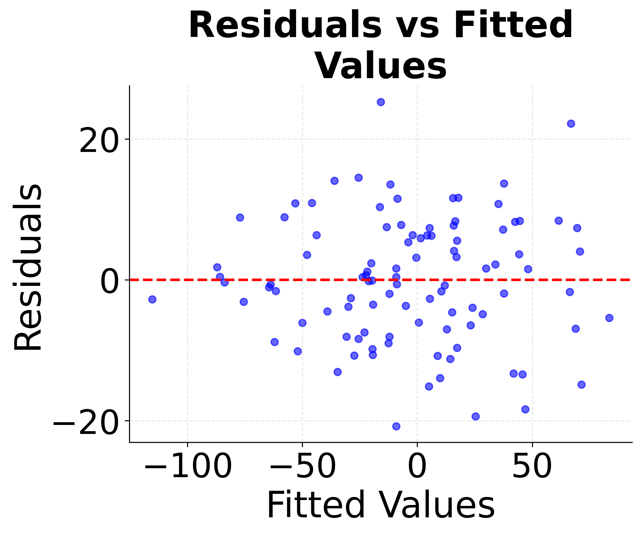
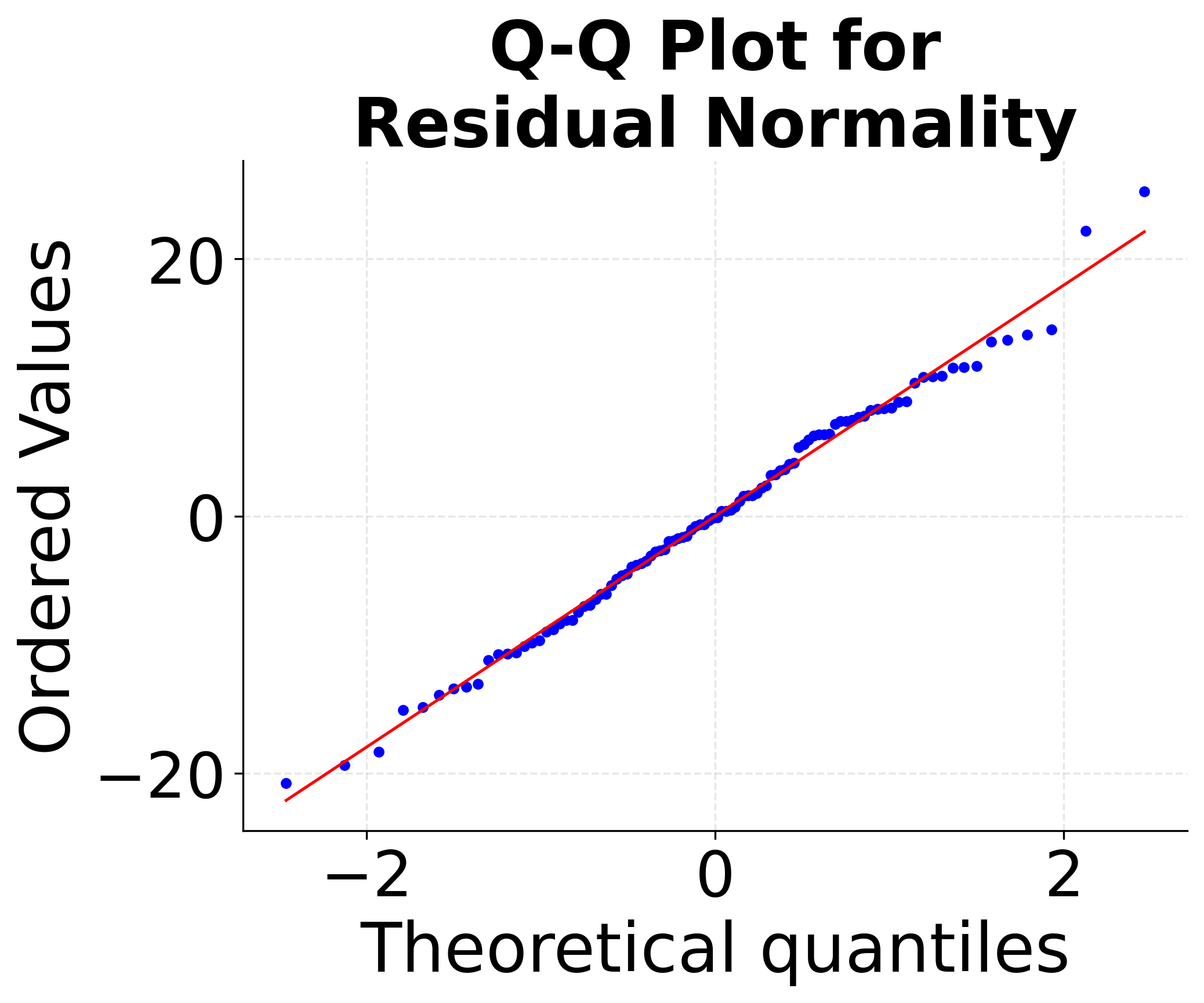
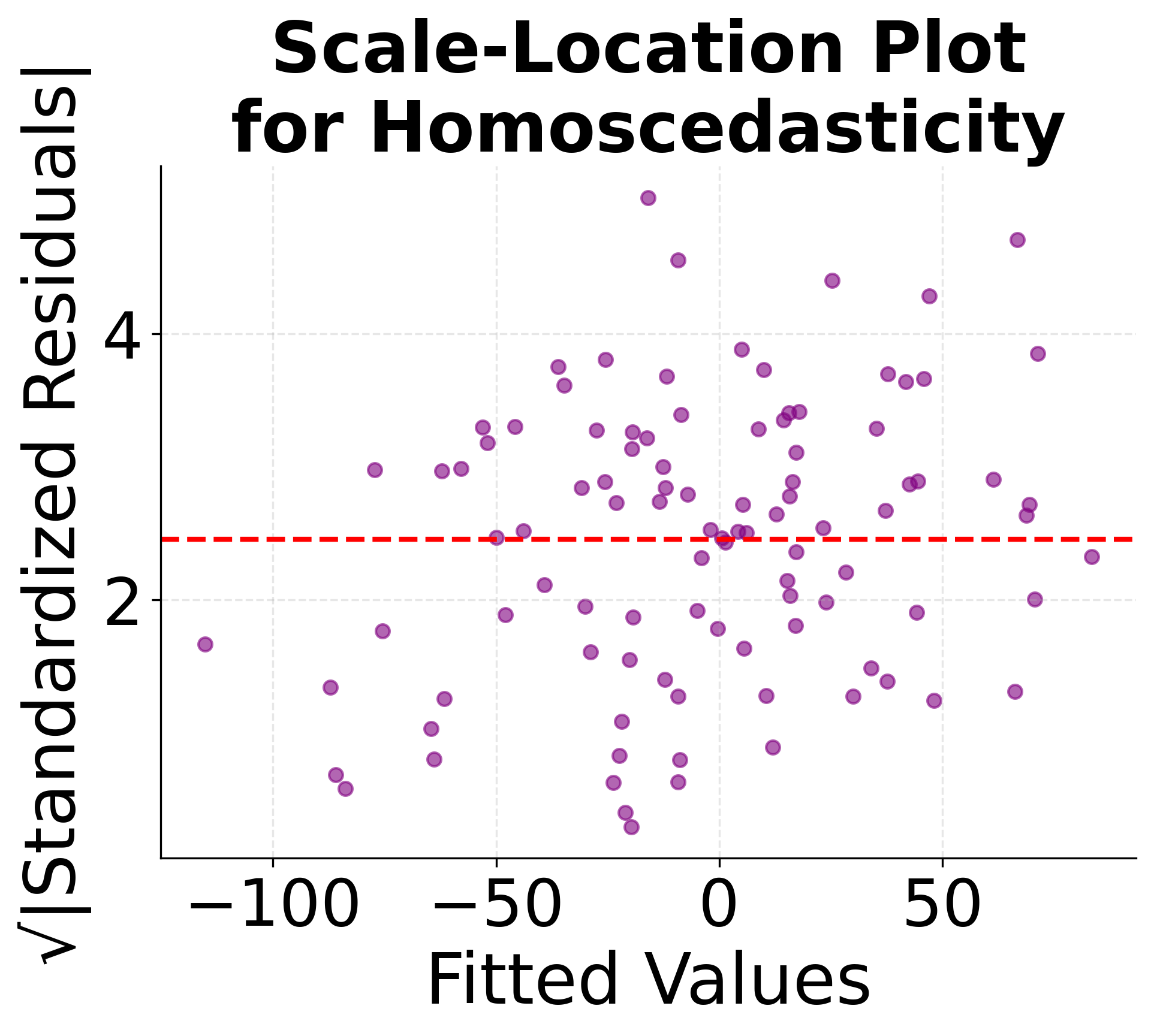
These diagnostic plots are important tools for model validation. The residuals vs fitted plot helps identify non-linear patterns and heteroscedasticity, the Q-Q plot assesses normality assumptions, and the scale-location plot provides additional insight into variance patterns. Systematic violations of these assumptions may require data transformations, alternative modeling approaches, or careful interpretation of results.
Implementation in Scikit-learn
Scikit-learn provides a clean and efficient implementation of simple linear regression that handles all the mathematical calculations automatically. We'll walk through a step-by-step implementation that verifies our manual calculations and demonstrates how to use this method in practice.
Step 1: Import Required Libraries
First, we need to import the necessary libraries for our implementation:
Step 2: Prepare the Data
Scikit-learn expects the feature matrix X to be 2D, even for a single feature. We'll prepare our study hours and test scores data:
Let's verify the data shapes to ensure proper formatting:
The output shows that X has shape (5, 1), meaning 5 samples with 1 feature each. This is the correct format for scikit-learn. The y vector has shape (5,), representing 5 target values. This data preparation is important because scikit-learn's LinearRegression expects this specific input format.
Step 3: Create and Train the Model
Now we'll create a LinearRegression model and fit it to our data:
The model has been successfully trained. The fit() method automatically calculated the optimal coefficients using the least squares method we discussed earlier. This is typically more efficient than our manual calculations and handles edge cases automatically.
Step 4: Extract Model Parameters
Let's examine the fitted model parameters:
Now let's display the fitted parameters:
These results match our manual calculations. The intercept and slope values are identical to what we calculated step-by-step. This confirms that our mathematical understanding is correct and that scikit-learn is implementing the same least squares method.
Step 5: Make Predictions
Now let's use the fitted model to make predictions:
Let's display the predictions:
The predictions show a consistent increase per additional hour of study, which matches our slope coefficient. The prediction for 6 hours matches our manual calculation. These predictions appear reasonable and follow the linear pattern we established.
Step 6: Evaluate Model Performance
Let's assess how well our model fits the data:
Now let's display the performance metrics:
The R-squared value indicates that the model explains most, but not all, of the variance in the training data. This represents strong performance - an R-squared above 0.9 is generally considered very good. The Mean Squared Error (MSE) and Root Mean Squared Error (RMSE) values show that there is a small amount of error in the model's predictions. This is typical in real-world scenarios, where some error is expected due to noise and measurement uncertainty.
Key Parameters
Below are some of the main parameters that affect how the model works and performs.
fit_intercept: Whether to calculate the intercept for this model (default: True). Set to False only if you know the data is already centered or you want to force the line through the origin.normalize: Whether to normalize the regressors before regression (default: False). Deprecated in newer versions - use StandardScaler for preprocessing instead.copy_X: Whether to copy X or overwrite the original (default: True). Set to False to save memory when working with large datasets.
Key Methods
The following are the most commonly used methods for interacting with the model.
fit(X, y): Fits the linear model to training data. X should be 2D array-like with shape (n_samples, n_features), y should be 1D array-like with shape (n_samples,).predict(X): Predicts target values for new data points. Returns predictions as 1D array with shape (n_samples,).score(X, y): Returns the coefficient of determination R² of the prediction. Values closer to 1.0 indicate better fit.
Practical Implications
Simple linear regression is valuable in scenarios where understanding the direct relationship between two variables is important for decision-making. In business analytics, it quantifies the impact of key business drivers on outcomes. For example, retail companies use it to understand how advertising spend affects sales revenue, while manufacturing firms analyze the relationship between production volume and costs. The interpretable nature of the linear equation makes it easy to communicate results to stakeholders and justify business decisions with clear, actionable insights.
The algorithm is also effective in scientific research and policy analysis, where establishing causal relationships or understanding mechanisms is important. In healthcare, researchers might use simple linear regression to study the relationship between drug dosage and patient response, or between exercise frequency and health outcomes. In environmental science, it helps quantify relationships between pollution levels and health impacts, or between temperature and energy consumption. The straightforward interpretation of slope and intercept coefficients makes it valuable for regulatory decision-making and public policy development.
In quality control and process optimization, simple linear regression provides a foundation for understanding how input variables affect output quality. Manufacturing processes often have clear linear relationships between factors like temperature, pressure, or time and product characteristics. The model's ability to provide predictions and confidence intervals makes it valuable for setting process parameters and establishing quality control limits. Additionally, its computational efficiency makes it suitable for real-time monitoring systems where quick predictions are needed.
Best Practices
To achieve good results with simple linear regression, it is important to follow several best practices. First, check the linearity assumption by plotting your data and examining residual plots - the relationship between x and y should be approximately linear. Ensure your data meets the regression assumptions: linearity (linear relationship between variables), independence (observations are independent), homoscedasticity (constant variance of residuals), and normality of residuals (for valid statistical inference). Use residual plots to diagnose assumption violations, as systematic patterns may indicate problems with your model.
For data preparation, consider standardizing your features if you plan to compare coefficients across different variables or models. Split your data into training and testing sets when working with real data to avoid overfitting. Use cross-validation to get more robust estimates of model performance, especially with small datasets. When interpreting results, remember that correlation does not imply causation, and be cautious about extrapolating beyond your data range.
Finally, combine quantitative metrics (R-squared, RMSE) with visual inspection of your data and residuals. A high R-squared doesn't guarantee a good model if assumptions are violated. Validate your model's assumptions and consider the practical significance of your results, not just statistical significance.
Data Requirements and Pre-processing
Simple linear regression requires two continuous numerical variables with a reasonably linear relationship, making data preparation relatively straightforward compared to more complex machine learning algorithms. The independent variable (predictor) should be measured with minimal error, as measurement uncertainty in the predictor can lead to biased coefficient estimates. The dependent variable (target) can tolerate some measurement noise, but excessive noise will reduce the model's predictive accuracy and make it harder to detect the underlying relationship. Data quality is important - you need sufficient sample size (typically at least 20-30 observations for reliable results, though more is always better) and must ensure that observations are independent of each other.
Unlike many machine learning algorithms, simple linear regression doesn't require feature scaling or normalization, which simplifies the data preparation process. However, you may want to standardize variables if you plan to compare coefficients across different models or variables, or if you're working with variables that have very different scales. Pre-processing considerations include carefully handling missing values (which can significantly impact results with small datasets), identifying and addressing outliers that could disproportionately influence the regression line, and ensuring your data meets the linearity assumption through thorough visual inspection. Data transformation techniques like log transformation can sometimes help linearize non-linear relationships, though this changes the interpretation of your results and requires careful consideration of the transformed scale.
Common Pitfalls
Several common pitfalls can undermine the effectiveness of simple linear regression if not carefully addressed. A common mistake is assuming linearity without proper validation - many relationships in real data are non-linear, and forcing a linear model can lead to poor predictions, misleading interpretations, and incorrect business decisions. Examine scatter plots and residual plots to verify that a linear model is appropriate for your data, and consider alternative approaches if non-linear patterns are evident. Another frequent error is ignoring outliers, which can disproportionately influence the regression line and skew results. Outliers should be investigated for data quality issues, measurement errors, or special circumstances, and their impact on the model should be carefully considered before deciding whether to include or exclude them.
Failing to check regression assumptions is another common mistake that can invalidate statistical inferences and lead to overconfident predictions. Heteroscedasticity (non-constant variance) and non-normal residuals can make confidence intervals and hypothesis tests unreliable, even if predictions seem reasonable. Additionally, confusing correlation with causation is a common error that can lead to incorrect business decisions and policy recommendations. Remember that a strong linear relationship doesn't imply that one variable causes the other, and consider alternative explanations, confounding variables, and reverse causality when interpreting results. Finally, overfitting to small datasets is problematic - with very few data points, you might achieve a perfect fit that doesn't generalize to new data, leading to overly optimistic performance estimates and poor real-world performance.
Computational Considerations
Simple linear regression has good computational properties that make it suitable for a wide range of applications. The closed-form solution means that training time is O(n) where n is the number of observations, making it fast even for large datasets. Memory requirements are minimal since the algorithm only needs to store the input data and compute basic statistics (means, sums of squares). This makes simple linear regression suitable for real-time applications, edge computing, and resource-constrained environments where computational efficiency is important.
For very large datasets (millions of observations), the algorithm can be parallelized or implemented using streaming algorithms that process data in batches. The mathematical simplicity also means that the model can be implemented in many programming languages or computational environments, from high-level statistical software to low-level embedded systems. Unlike iterative optimization algorithms, simple linear regression converges to the optimal solution, eliminating concerns about convergence issues or local optima.
Performance and Deployment Considerations
Model performance evaluation in simple linear regression relies on several key metrics that provide different insights into model quality. R-squared (coefficient of determination) measures the proportion of variance in the dependent variable explained by the model, with values above 0.7 generally considered strong for many applications, though this threshold varies by domain and problem complexity. Mean Squared Error (MSE) and Root Mean Squared Error (RMSE) provide measures of prediction accuracy in the original units of your data, making them intuitive for stakeholders to understand. However, combine these quantitative metrics with visual inspection of your data and residuals to ensure the model is appropriate and assumptions are met.
Deployment of simple linear regression models is straightforward due to their computational efficiency and minimal resource requirements. The closed-form solution means predictions are fast (requiring only a simple multiplication and addition), making it suitable for real-time applications, edge computing, and resource-constrained environments. In production, implement monitoring systems to track model performance over time, as relationships between variables can change due to external factors, market conditions, or system evolution. Data validation is important to ensure new inputs fall within the range of your training data, as extrapolation beyond the training range can lead to unreliable predictions. Regular retraining may be necessary if the underlying relationship shifts, and establish alerting systems to detect when model assumptions are violated or when prediction accuracy degrades significantly.
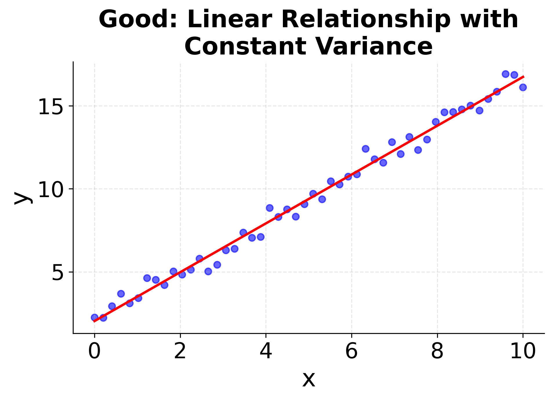
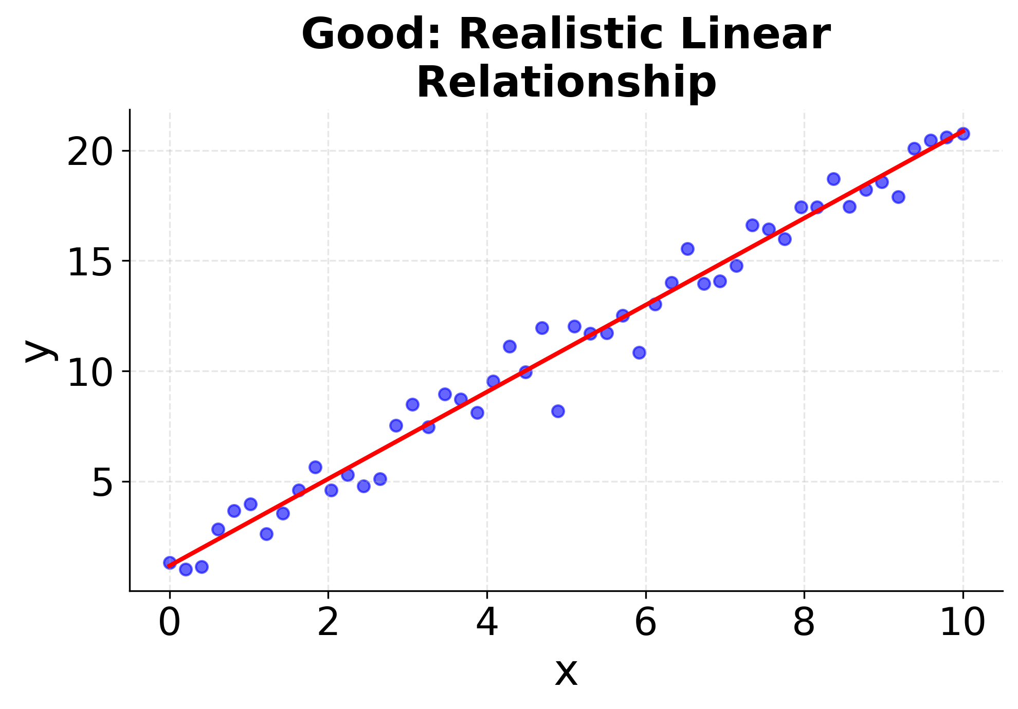
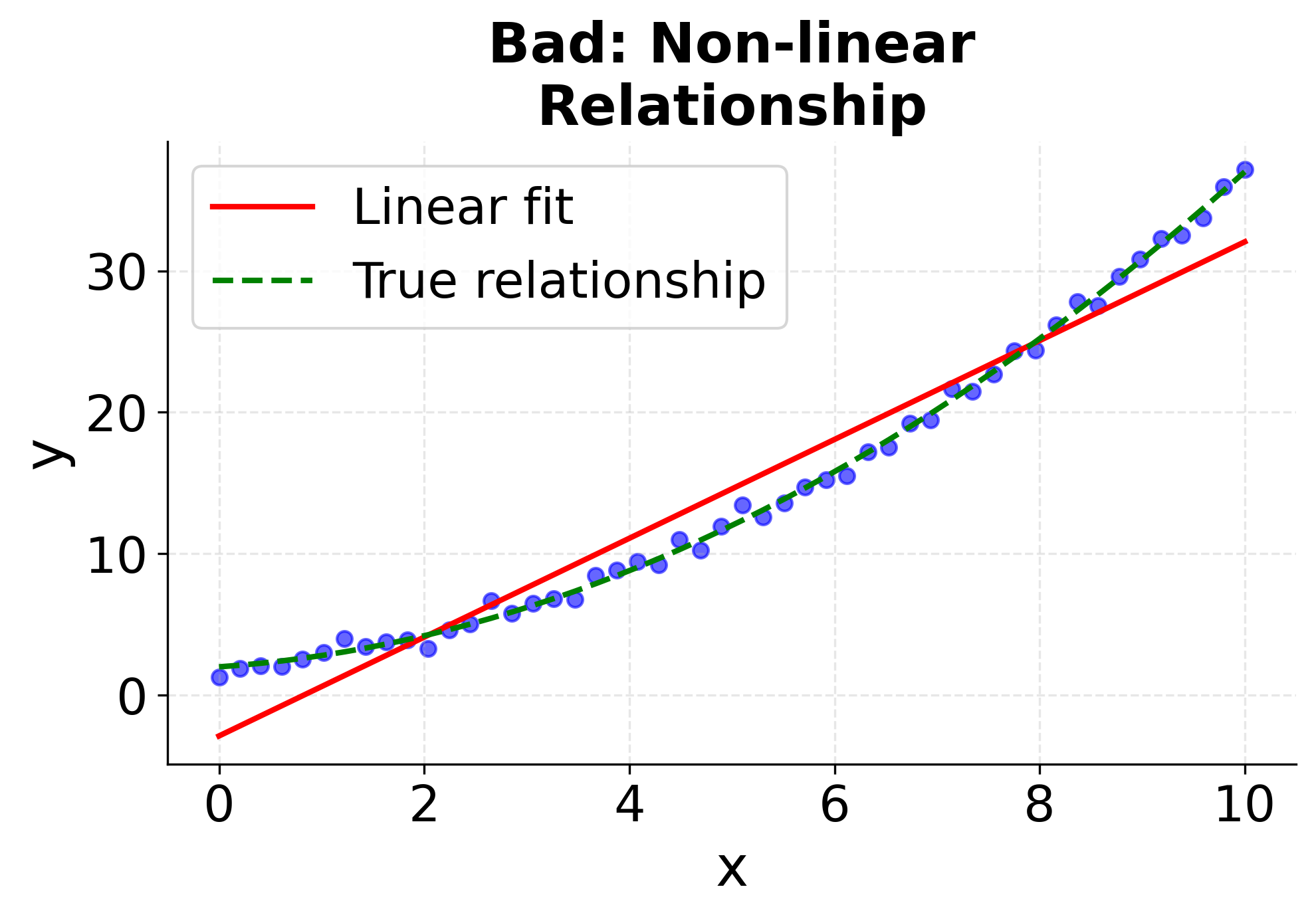
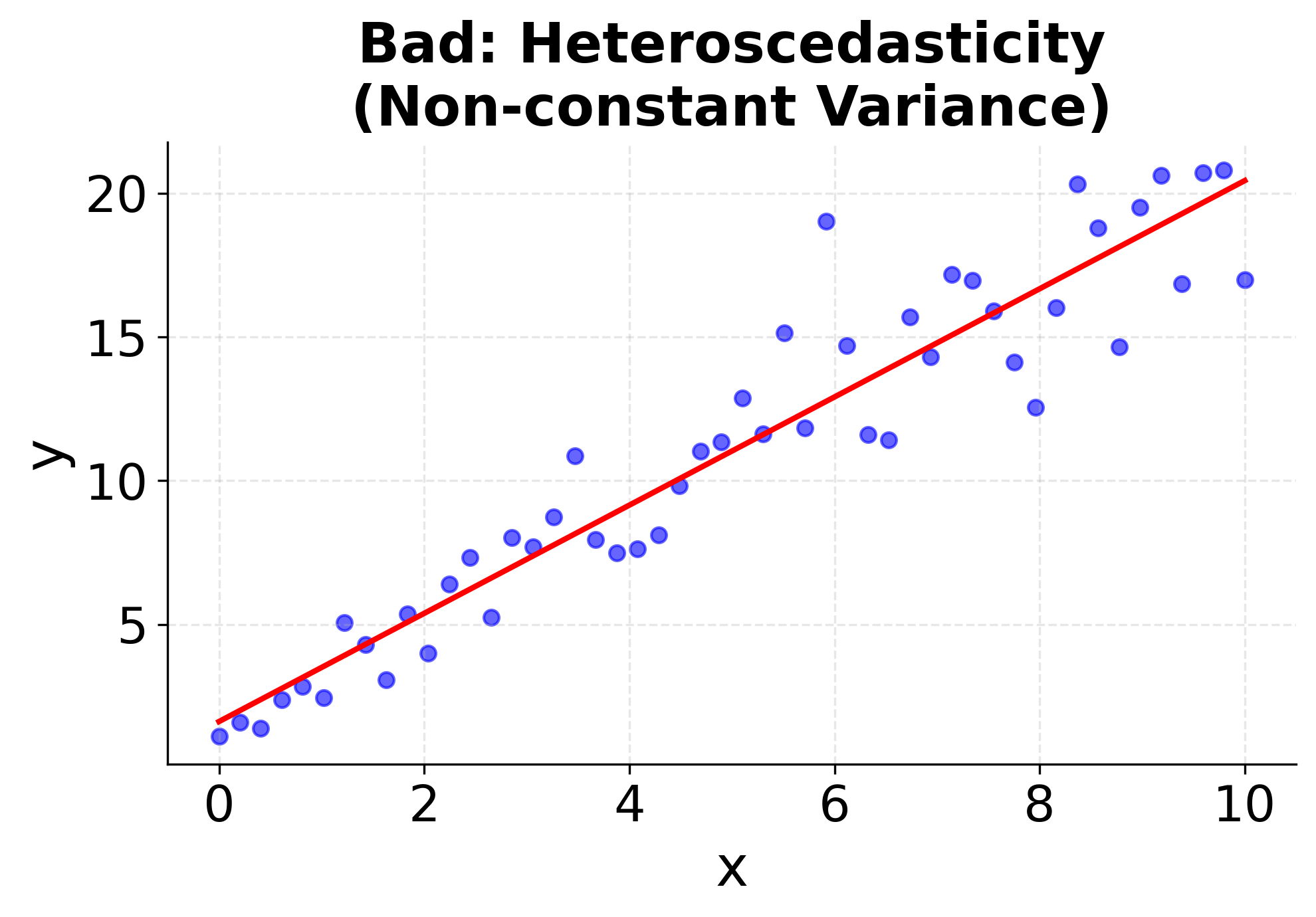
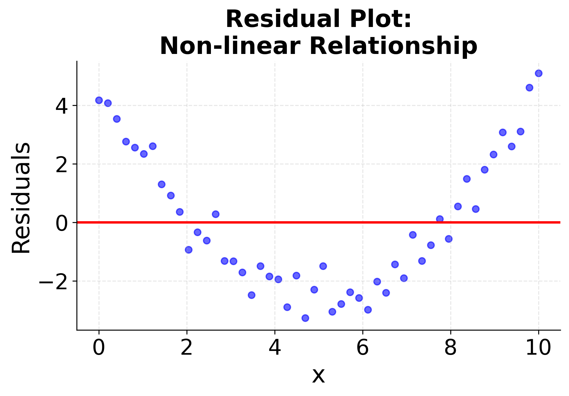
Visualizing Regression Assumptions
Understanding when simple linear regression is appropriate requires checking these assumptions. The following visualizations demonstrate what happens when assumptions are met versus violated, helping you recognize these patterns in your own data. The first four plots show different scenarios: two where linear regression works well (good linear relationships with constant variance), and two where it fails (non-linear relationships and heteroscedasticity). The final two plots show the corresponding residual patterns, which are important diagnostic tools for model validation. Pay attention to how the data points are distributed around the fitted line and what patterns emerge in the residual plots. These visualizations will help you develop the skills needed to assess whether simple linear regression is appropriate for your specific dataset.
Summary
Simple linear regression provides a fundamental and interpretable approach to understanding linear relationships between two variables. By fitting a straight line through your data points using the least squares method, you can both explain existing patterns and make predictions for new observations. The closed-form solution ensures computational efficiency and provides a unique best-fitting line.
The method's strength lies in its simplicity and interpretability - you can easily understand what the slope and intercept mean in real-world terms, making it valuable for both exploratory analysis and stakeholder communication. However, its limitation to linear relationships and single predictors means it's often just the starting point for more sophisticated modeling approaches.
While simple linear regression may seem basic, mastering its concepts, assumptions, and implementation provides a foundation for understanding more complex regression techniques, machine learning algorithms, and statistical modeling in general. It's a tool that data scientists should be comfortable with, both for its direct applications and as a stepping stone to more advanced methods.
Quiz
Ready to test your understanding of simple linear regression? Take this quiz to reinforce what you've learned about modeling relationships between two variables.

Comments