

A comprehensive guide to SHAP values covering mathematical foundations, feature attribution, and practical implementations for explaining any machine learning model

This article is part of the free-to-read Machine Learning from Scratch
Choose your expertise level to adjust how many terms are explained. Beginners see more tooltips, experts see fewer to maintain reading flow. Hover over underlined terms for instant definitions.
SHAP (SHapley Additive exPlanations)
When a machine learning model makes a prediction, one of the most fundamental questions we can ask is also one of the most difficult to answer: How much does each feature contribute to this specific prediction? This question matters profoundly, whether we're debugging a model that makes unexpected decisions, explaining predictions to stakeholders, or ensuring regulatory compliance in high-stakes applications. Yet the answer is far from straightforward, because a feature's contribution depends critically on what other features are present, creating a complex attribution challenge that simple difference-based methods cannot fairly resolve.
SHAP (SHapley Additive exPlanations) addresses this challenge by providing a unified, mathematically principled framework for feature attribution that works across any machine learning model, from simple linear regression to complex deep neural networks. Unlike explanation methods that provide inconsistent attributions or depend on arbitrary feature orderings, SHAP draws on game theory's Shapley values to ensure fair, consistent attribution that satisfies fundamental mathematical guarantees.
SHAP resolves the attribution problem by considering a feature's contribution across all possible contexts, every conceivable combination of other features, then weighting these contributions by how naturally each context arises. Rather than asking "what happens if we remove this feature?" (which depends on what baseline we assume), this exhaustive yet weighted averaging approach ensures that the final attribution doesn't depend on arbitrary choices about feature ordering or baseline assumptions, but rather reflects the feature's true average contribution across all possible scenarios.
This comprehensive approach makes SHAP explanations both local and global: we can understand individual predictions (local explanations) and overall feature importance across the entire dataset (global explanations), making the method versatile for different analysis needs. Whether you're debugging why a specific prediction seems anomalous, understanding which features drive model behavior overall, or communicating insights to stakeholders, SHAP provides a consistent, mathematically grounded language for model interpretability.
Why SHAP Succeeds: Core Advantages
The power of SHAP comes from how it directly addresses the fundamental attribution challenges we've identified. Its first major advantage is universality. SHAP provides a unified framework that works seamlessly across any machine learning model type. Whether you're working with a simple linear regression, a random forest, a gradient boosting model, or a deep neural network, SHAP uses the same mathematical foundation to explain predictions. This universality means you can apply consistent interpretability standards across your entire machine learning pipeline, ensuring that explanations are comparable and trustworthy regardless of the underlying model architecture.
More fundamentally, SHAP's mathematical guarantees emerge naturally from its rigorous foundation in Shapley values. These aren't just convenient properties. They're necessary outcomes that ensure the explanations are fair and principled. The efficiency property guarantees complete attribution (no missing contributions), symmetry ensures equivalent features receive equivalent credit, and additivity means explanations compose naturally across model ensembles. These properties aren't optional features that might be nice to have. They're fundamental guarantees that distinguish SHAP from ad-hoc attribution methods that can produce inconsistent or biased explanations.
Finally, SHAP's dual explanatory capability, providing both local explanations for individual predictions and global insights into overall feature importance, makes it uniquely versatile. When debugging an anomalous prediction, local SHAP values reveal which features drove that specific decision. When understanding overall model behavior, global SHAP values show which features matter most across the dataset. This flexibility makes SHAP valuable across the entire model development and deployment lifecycle, from initial debugging to stakeholder communication.
Acknowledging Limitations: When SHAP Requires Care
Despite its mathematical rigor, SHAP is not a panacea, and understanding its limitations is important for using it effectively. The most significant challenge is computational complexity. The exact Shapley value calculation requires evaluating the model on all possible subsets of features. For a model with features, this means evaluations per prediction. This exponential growth makes exact computation infeasible for high-dimensional problems, necessitating approximation methods that trade some precision for computational tractability.
A related challenge is baseline sensitivity. While SHAP's weighted averaging approach reduces dependence on arbitrary feature orderings, the baseline (the prediction with no features) still represents a choice that can affect interpretations. Different baseline definitions, whether the mean prediction, the mode, or a reference dataset, can lead to different SHAP values, requiring careful thought about what "absence of features" means in your specific context.
Perhaps most importantly, SHAP provides attribution, not causation. The values show how features correlate with predictions given the trained model, but they don't reveal underlying causal mechanisms or guarantee that changing a feature value will produce the corresponding change in prediction. Users should be careful not to over-interpret SHAP values as causal effects or assume that high SHAP values indicate direct causal relationships. Understanding these limitations helps us use SHAP appropriately, recognizing both its power and its boundaries.
Formula
At its heart, SHAP answers a deceptively simple question: How much does each feature contribute to this specific prediction? Yet answering this question fairly requires navigating a fundamental challenge: the contribution of a feature depends on what other features are present. A feature might have a large impact when considered alone, but a smaller impact when other correlated features are already in the model. SHAP solves this attribution problem by drawing on a concept from cooperative game theory called Shapley values, which provide a mathematically principled way to fairly distribute credit among contributors.
The key insight is that we cannot simply ask "what happens when we add feature ?" because the answer depends on the context, the set of other features that are already present. Instead, we should consider feature 's contribution across all possible contexts, then average these contributions in a way that ensures fairness. This journey from intuitive question to rigorous formula guides our understanding of how SHAP works.
The Attribution Challenge
To understand why SHAP's formula is structured the way it is, we should first appreciate the fundamental problem it addresses. Imagine you're trying to explain why a machine learning model predicted a house price of $235,000. You have three features: square footage, number of bedrooms, and age of the house. If you simply ask "how much does square footage contribute?", the answer isn't straightforward.
If we look at the difference between the prediction with all features () and the prediction with square footage removed (), we might conclude square footage contributes . But what if we had started from a different baseline? What if we removed bedrooms instead, or age? The contribution would appear different depending on what context we assume.
This reveals the core challenge: a feature's marginal contribution depends on what other features are already in the model. A feature might have a large impact when added to an empty set, but a smaller impact when added to a set that already contains correlated features. To be fair, we need to consider every possible way the feature could have been added to the model, across all possible sequences and contexts.
SHAP solves this by averaging the feature's marginal contribution across all possible subsets of other features, weighted by the probability of encountering each subset in a random ordering. This ensures that the attribution doesn't depend on the arbitrary order in which features are considered, but rather reflects the feature's true average contribution across all possible contexts.
Building the Formula: Marginal Contributions
The foundation of SHAP lies in understanding marginal contributions, the change in prediction that occurs when we add feature to a specific subset of other features. Formally, for a given subset that doesn't include feature , the marginal contribution is:
This captures a simple but crucial idea: what does feature add when it's included alongside the features in , compared to what the prediction would have been with just ?
However, this single marginal contribution tells only part of the story. The same feature might contribute differently depending on what other features are present. For example, square footage might contribute more when considered alone (because it's picking up information that would otherwise be captured by bedrooms), but contribute less when bedrooms are already in the model (because some of the information overlaps). To get a fair attribution, we need to look at the feature's marginal contribution across all possible subsets .
But here's where we encounter another challenge: simply averaging the marginal contributions would be unfair because not all subsets are equally likely or important. Some subsets might be more representative of how the feature typically appears in practice. This is where the weighting factor comes in. It ensures that each marginal contribution is weighted appropriately based on how likely we are to encounter that particular context.
The Shapley Value Formula
The SHAP value for feature in a prediction is given by:
This formula combines three essential components:
The Summation: ensures we consider every possible subset of features that doesn't include feature . This exhaustive enumeration guarantees that we've examined the feature's contribution across all conceivable contexts, leaving no scenario unaccounted for.
The Marginal Contribution: represents how much feature adds when included alongside subset . This is the raw signal of the feature's impact in each specific context. Notice that this value can differ dramatically depending on . A feature might have a large positive contribution when added to an empty set, but a smaller or even negative contribution when added to a set containing correlated features.
The Weighting Factor: is the sophisticated piece that ensures fairness. This combinatorial weight doesn't just count subsets equally. It accounts for the probability that, if we randomly ordered all features, we would encounter subset before feature , with all remaining features coming after. This probability-based weighting ensures that the final attribution doesn't depend on any arbitrary ordering of features, but reflects the feature's average contribution across all possible orderings.
These three components work together to produce a fair, mathematically principled attribution: we enumerate all possible contexts (summation), measure the feature's impact in each context (marginal contribution), and then average these impacts weighted by how naturally each context arises (weighting factor). The result doesn't depend on the order in which features are considered or the baseline we happen to choose.
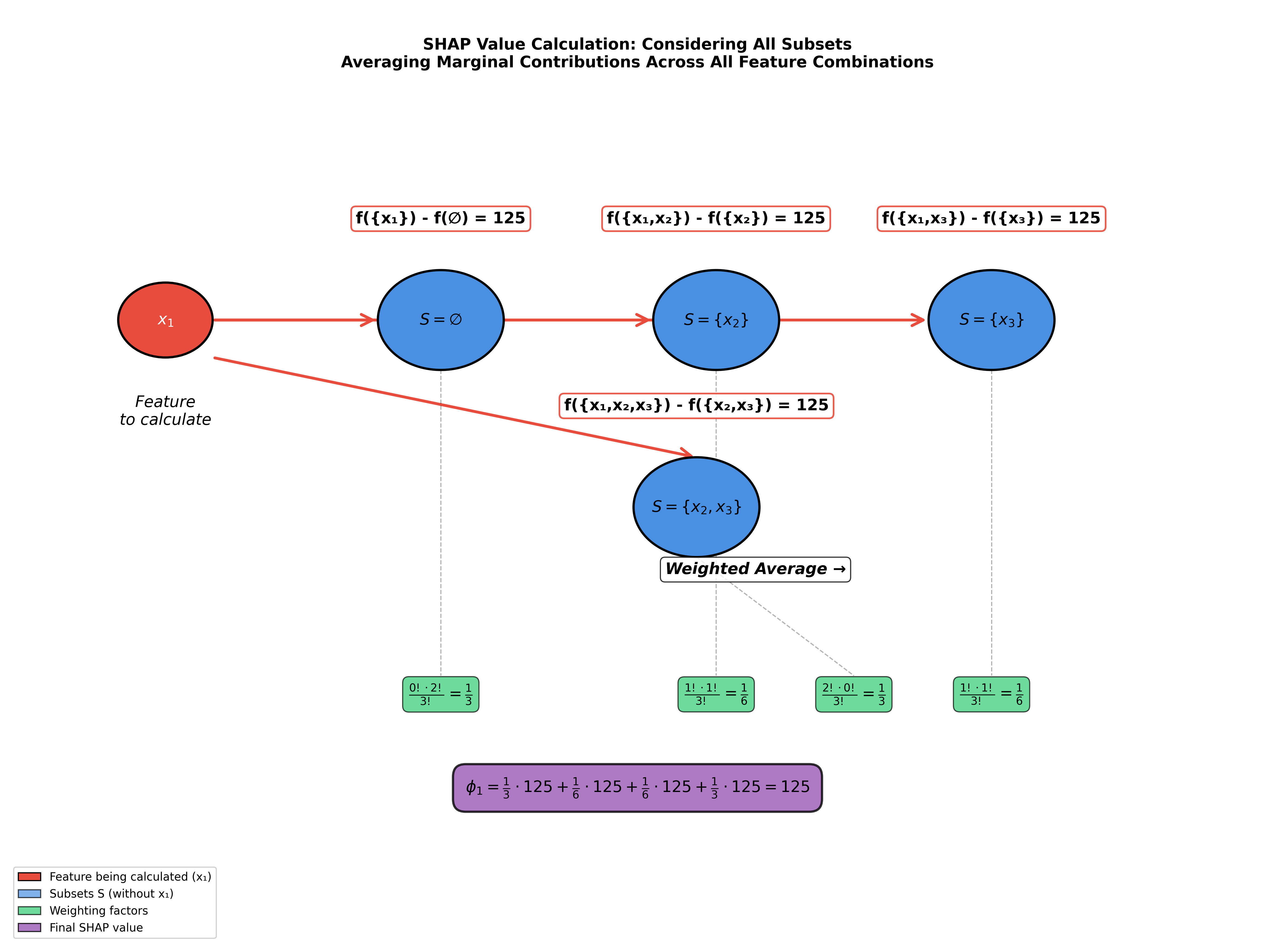
Seeing the Formula in Action
To make this concrete, let's walk through a visual example that demonstrates how all these pieces fit together. The visualization below shows the complete calculation process for computing the SHAP value of feature in a model with three features.
You'll see four subsets (shown in blue circles): the empty set , the singleton sets and , and the pair . For each subset, the diagram shows:
- The marginal contribution (shown as red-bordered boxes with values like "125")
- The weighting factor that applies to that marginal contribution (shown in green boxes)
- How these weighted contributions combine to produce the final SHAP value
In this particular example, all marginal contributions happen to equal 125, which simplifies the calculation. In general, these values can vary depending on the model's structure and how features interact with each other. The key insight to take away is how the formula systematically considers every possible context, weights each appropriately, and combines them to produce a single, fair attribution value.
The visualization makes visible what the formula encodes: that fair attribution requires us to consider not just one context, but all contexts, and to weight them by how naturally they arise in random orderings of features.
Understanding the Weighting Factor
The weighting factor is central to ensuring fairness in SHAP's attribution scheme. While it might look intimidating at first, it encodes a simple idea: we should weight each marginal contribution by how likely we are to encounter that particular context in a random ordering of features.
To understand why this matters, consider what happens if we simply averaged all marginal contributions equally. Some subsets would be over-represented (like the empty set or the full set), while others would be under-represented. But more fundamentally, different subsets represent different "stages" in the feature addition process. If we imagine features being added one by one in some order, then subset represents all the features that would come before feature in that ordering.
The weighting factor captures this probabilistic interpretation: if we randomly shuffle all features, what's the probability that exactly the features in subset come before feature , with all remaining features coming after?
Let's break down the formula piece by piece:
-
: This counts the number of ways to arrange the features in subset among themselves. If contains features, there are ways to order them, but crucially, we care about their position relative to feature , not their internal ordering.
-
: This counts the number of ways to arrange the features that come after feature . Since we have total features, features come before , feature itself is in the middle, leaving features to come after, which can be arranged in ways.
-
: This is the total number of possible orderings of all features, the denominator that normalizes our probability calculation.
The ratio therefore represents the probability that, in a random ordering, we find exactly this configuration: all features in before feature , all remaining features after feature .
Why is this the right weight? Because it ensures that each marginal contribution is weighted by how "typical" or "representative" that context is. Subsets that are more likely to appear in random orderings (like medium-sized subsets) get appropriate weight, while extreme subsets (like the empty set or nearly complete sets) get weights that reflect their relative rarity. This probabilistic weighting guarantees that the final SHAP value doesn't depend on any arbitrary ordering we might choose. It's the average contribution across all possible orderings, weighted by how naturally each ordering arises.
This probabilistic interpretation of the weighting factor completes our understanding of how SHAP achieves fairness. By weighting each marginal contribution by the probability of encountering its context in a random ordering, we ensure that the final SHAP value is independent of any arbitrary feature ordering. The formula doesn't favor one subset over another arbitrarily. It weights them according to how naturally they arise, creating an attribution scheme that is both mathematically principled and intuitively fair.
How Everything Connects: The Efficiency Property
Now that we understand the individual components of the SHAP formula, we can see how they work together to create a coherent whole. The efficiency property provides a crucial sanity check that demonstrates how the formula's structure ensures completeness:
This equation states that the sum of all SHAP values equals the difference between the model's prediction using all features and the baseline prediction (using no features).
Why is this important? It guarantees that SHAP provides a complete decomposition of the prediction. Every unit of difference between the full prediction and the baseline is accounted for. There are no "orphaned" contributions floating around, and nothing is double-counted. This is not just a nice property. It's a mathematical guarantee that emerges naturally from the way SHAP averages marginal contributions across all subsets.
To see why this holds, consider what happens when we sum all the SHAP values. Each feature's SHAP value is a weighted average of its marginal contributions across all subsets. When we sum these up, we're essentially reconstructing the path from baseline () to full prediction () by adding features one at a time, across all possible orderings. The mathematical structure ensures that this reconstruction is exact. The weighted sum of all marginal contributions perfectly captures the total difference between baseline and final prediction.
This efficiency property is what makes SHAP explanations interpretable and actionable: if you start with the baseline and add each feature's SHAP contribution, you arrive exactly at the model's prediction. There's no missing piece and no unexplained remainder. Just a clean, complete decomposition.
The Mathematical Guarantees
The efficiency property is just one of several fundamental guarantees that SHAP values provide. These properties aren't arbitrary design choices. They emerge naturally from the mathematical structure of Shapley values and ensure that SHAP explanations are consistent, fair, and principled:
Efficiency: As we've just seen, the sum of all SHAP values equals . This ensures complete attribution with no missing pieces. Every unit of difference between prediction and baseline is accounted for.
Symmetry: If two features and have identical marginal contributions in all possible contexts (i.e., for all subsets ), then they receive identical SHAP values: . This guarantees fair treatment of equivalent features. Features that contribute equally in all contexts are attributed equally.
Dummy: If a feature never changes the prediction regardless of what other features are present (i.e., for all subsets ), then its SHAP value is zero: . This ensures that irrelevant features get zero credit. The mathematical structure naturally filters out features that don't contribute.
Additivity: For models that decompose as a sum of sub-models (e.g., ), the SHAP values of the combined model equal the sum of the SHAP values from the individual models: . This means SHAP explanations compose naturally, making them useful for understanding ensemble models and complex systems.
Together, these properties form a mathematical foundation that makes SHAP explanations trustworthy. They ensure that the attributions are not arbitrary or dependent on implementation details, but rather reflect fundamental properties of how features contribute to predictions. This mathematical rigor is what distinguishes SHAP from simpler attribution methods. It provides guarantees that hold regardless of the specific model or data, making the explanations reliable for model interpretation, debugging, and stakeholder communication.
Visualizing SHAP
The mathematical foundation of SHAP provides rigorous attribution values, but these numbers only become meaningful when we can see them in context. Visualization transforms the abstract concept of fair feature attribution into concrete insights that guide understanding and decision-making. The key SHAP visualizations each serve different purposes: some reveal overall patterns across the dataset (global explanations), while others focus on individual predictions (local explanations). Together, they make SHAP's formula accessible to practitioners who need to understand, debug, and communicate model behavior.
What makes SHAP visualizations particularly powerful is how they directly reflect the formula's structure: each visualization shows features ordered by their SHAP values (which emerge from the weighted averaging of marginal contributions), making visible the relative importance that the formula calculates. The colors and positions encode not just the magnitude of contributions, but also how feature values relate to those contributions, helping us understand both what matters and why it matters in specific contexts.
SHAP Summary Plot: Seeing Global Patterns
The summary plot transforms the abstract concept of feature importance into a visual narrative that shows how features influence predictions across the entire dataset. Each point represents a SHAP value for a specific feature-instance pair, the result of applying our formula to that particular prediction. The horizontal position shows the SHAP value magnitude (how much the feature contributed), while the color indicates the feature's actual value, creating a rich view of how different feature values relate to their contributions.
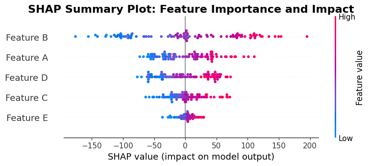
How to Interpret the SHAP Summary Plot
Reading a SHAP summary plot requires understanding several visual elements that encode different information about your model:
Y-axis (Vertical Positioning): Features are listed vertically, ordered from top to bottom by their importance, which is calculated as the average absolute SHAP value across all instances. The most important features appear at the top. This ordering reflects overall feature importance across your entire dataset, not just for a single prediction.
X-axis (Horizontal Position): Each dot's horizontal position represents the SHAP value for that specific feature-instance pair. The X-axis center (typically zero) represents no contribution. Points to the right indicate positive contributions (the feature increased the prediction), while points to the left indicate negative contributions (the feature decreased the prediction). The farther from center, the larger the contribution magnitude.
Color Encoding: The color of each point represents the actual value of that feature for that specific instance. The color scale typically ranges from blue (low feature values) through white (medium values) to red (high feature values), though the exact mapping depends on the feature's distribution. This color coding lets you see not just how much a feature contributed, but whether high or low values of that feature are associated with positive or negative contributions.
Density and Distribution: The horizontal spread of points for each feature shows the distribution of SHAP values. A wide spread indicates the feature's impact varies significantly across instances. A narrow, concentrated cluster suggests the feature has consistent impact. Points stacked vertically at the same X position represent multiple instances with identical or very similar SHAP values for that feature.
Interpreting Patterns: When reading this plot, look for:
- Horizontal clustering: Points clustered far from zero indicate features with consistently strong positive or negative impacts
- Color gradients: If red (high values) consistently appears on the right and blue (low values) on the left, high feature values are associated with increased predictions
- Overlap: When points from different features overlap horizontally, those features contribute similar amounts to some predictions
- Outliers: Isolated points far from the main cluster may represent anomalous predictions worth investigating
Practical Reading Strategy: Start by identifying the most important features (top of the plot), then examine how their SHAP values vary (horizontal spread), and finally observe how feature values (colors) relate to contribution direction (left/right position). This three-dimensional view (importance, magnitude, value relationship) provides comprehensive insight into your model's behavior.
SHAP Waterfall Plot: Decomposing Individual Predictions
Where the summary plot reveals global patterns, the waterfall plot provides a detailed local explanation that makes the efficiency property tangible: it shows exactly how we progress from baseline to final prediction by adding each feature's SHAP contribution. This visualization directly embodies the formula's promise. Starting with the baseline and cumulatively adding each feature's SHAP value , we arrive exactly at the full prediction . The waterfall format makes visible the decomposition that the formula guarantees, turning abstract mathematical properties into concrete visual narratives that stakeholders can understand.
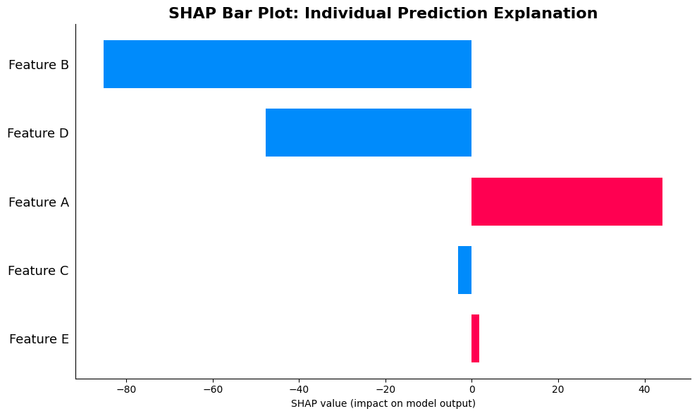
How to Interpret the SHAP Bar Plot (Waterfall)
The bar plot provides a focused view of a single prediction, making it ideal for explaining why the model made a specific decision. Understanding its components is essential for interpreting individual predictions:
Y-axis (Feature Names): Features are listed vertically, ordered by the magnitude of their SHAP values for this specific instance, with the largest absolute contributions at the top. This ordering helps you immediately identify which features drove this particular prediction, regardless of whether their contribution was positive or negative.
X-axis (SHAP Values): The horizontal position and length of each bar represents the SHAP value for that feature. The center of the plot (typically zero) represents no contribution. Bars extending to the right show positive contributions (increasing the prediction), while bars extending to the left show negative contributions (decreasing the prediction). The length of the bar directly corresponds to the magnitude of contribution.
Bar Length and Direction: Each bar's length is proportional to the feature's SHAP value magnitude. A long bar to the right means the feature significantly increased the prediction, while a long bar to the left means it significantly decreased it. Short bars indicate minimal contribution. The visual length makes it easy to compare relative contributions at a glance.
Color Coding: Bars are typically colored to reinforce direction: red or warm colors for positive contributions (pushing predictions up) and blue or cool colors for negative contributions (pulling predictions down). Some implementations may use color intensity to indicate magnitude as well.
Feature Ordering Strategy: Since features are ordered by absolute SHAP value, the most impactful features appear at the top, making it easy to scan from top to bottom to understand what drove this specific prediction. Features with similar magnitudes appear near each other, helping you identify which features had comparable influence.
How to Read the Plot: Start at the top and work down, noting the direction (left or right) and length of each bar. Features with long bars are the primary drivers of this prediction. If most bars point in the same direction, the prediction is driven by features with consistent directional influence. Mixed directions indicate a balanced contribution from both positive and negative influences.
The Efficiency Property in Action: If you mentally sum all the SHAP values shown (rightward bars minus leftward bars), you get the total contribution. Adding this to the baseline (expected value) gives you the exact prediction. This visual representation makes the efficiency property tangible, showing how each feature's calculated contribution combines to produce the final output.
Practical Use: This plot excels for explaining individual predictions to stakeholders. You can point to specific features and say "this feature contributed +X units" or "this feature reduced the prediction by Y units," making model decisions transparent and understandable.
SHAP Force Plot: Visualizing Feature Forces
The force plot offers an intuitive metaphor that connects directly to how we think about feature attribution: each feature "forces" the prediction in a particular direction, with the magnitude of the force corresponding to its SHAP value. This visualization makes tangible the idea that features don't just correlate with outcomes. They actively push predictions up or down, and the SHAP formula quantifies exactly how much force each feature exerts. The red/blue color coding and bar lengths provide immediate visual feedback about both the direction and magnitude of each feature's contribution, making it easy to see at a glance which features are driving the prediction and in what direction.
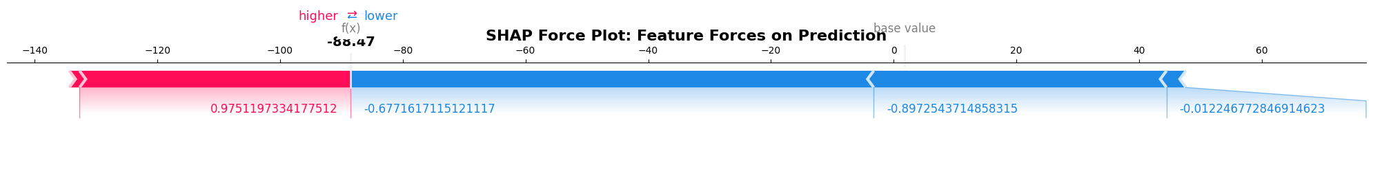
How to Interpret the SHAP Force Plot
The force plot visualizes feature contributions as physical forces acting on a prediction scale, making the efficiency property immediately visible. Reading it correctly requires understanding its unique layout:
The Prediction Scale: The horizontal axis represents a continuous prediction scale, typically showing the baseline (expected value) as a reference point, often marked or colored distinctly. The final prediction appears at the rightmost point of the plot, showing where all the forces push the prediction.
Baseline Reference: The baseline, which is the expected prediction value (), serves as the starting point. It's usually shown as a distinct marker or reference line, representing what the model would predict with no feature information.
Force Bars (Feature Contributions): Each feature appears as a colored bar that "pushes" the prediction from the baseline toward the final value. The bars are arranged sequentially along the prediction scale, showing how each feature moves the prediction.
Bar Direction and Color: Red bars (or warm colors) push the prediction higher (to the right), while blue bars (or cool colors) push it lower (to the left). The color intensity may also reflect magnitude, with brighter colors indicating larger contributions. This color coding provides immediate visual feedback about whether each feature increases or decreases the prediction.
Bar Length and Magnitude: The length of each bar represents the absolute magnitude of the SHAP value. Longer bars indicate larger contributions, making it easy to compare which features had the most impact. The bars are typically arranged to show the cumulative effect, with each bar starting where the previous one ended, creating a cascading effect.
Feature Ordering: Features are usually ordered by their SHAP value magnitude, with the most impactful features shown first. However, the ordering may vary depending on implementation, with some plots ordering by absolute value and others maintaining a different sequence.
Reading the Flow: To interpret the plot, start from the baseline (left) and follow the colored bars as they push the prediction toward the final value (right). Each bar shows not just magnitude but direction: features that push the prediction up appear above or to the right of the baseline line, while those pushing it down appear below or to the left.
Feature Labels: Each bar is typically labeled with the feature name and may include the actual feature value or SHAP value. These labels help you connect the visual representation to specific features in your dataset.
The Cumulative Effect: The plot visually demonstrates the efficiency property: if you mentally trace from baseline through all the force bars, you arrive at the final prediction. The sum of all positive pushes minus all negative pushes equals the distance from baseline to final prediction, making the complete decomposition visible.
Pattern Recognition: Look for dominance (one or two very long bars indicating a few features driving the prediction), balance (many moderate bars suggesting distributed influence), or cancellation (long bars in opposite directions indicating features with competing effects that partially offset each other).
Practical Interpretation: This plot is particularly powerful for understanding the "journey" from baseline to prediction. It shows not just which features matter, but how they combine sequentially to produce the final result. When explaining to stakeholders, you can literally point to the plot and say "these features pushed the prediction up, these pushed it down, and together they resulted in this final value."
Example: Walking Through the Formula
Now that we've explored the theoretical foundation of SHAP, let's work through a concrete example that demonstrates how the formula translates into actual calculations. This walkthrough will make tangible all the abstract concepts we've discussed, including marginal contributions, weighting factors, and the efficiency property, showing how they work together in practice to produce fair, interpretable attributions.
We'll use a simple house price prediction model with three features, which is small enough to compute all subsets manually while still illustrating the key principles. This example will help you see how the formula's components combine in a real calculation, making the mathematical abstraction concrete and actionable.
Setting Up the Problem
Suppose we have a simple regression model that predicts house prices based on three features:
- : Square footage (in thousands)
- : Number of bedrooms
- : Age of house (in years)
Our model is:
Notice that this is a linear model, which simplifies our calculations, but the SHAP approach works identically for any model type. For a specific house with (2,500 square feet), (3 bedrooms), and (10 years old), the prediction would be:
Applying the Formula: Step by Step
To calculate SHAP values using our formula, we need to:
- Identify all possible subsets that don't include each feature
- Compute the marginal contribution for each subset
- Apply the weighting factor to each marginal contribution
- Sum the weighted contributions to get the final SHAP value
Let's assume our baseline (the prediction with no features). This baseline represents what the model would predict if it had no information about the house. Essentially, it's a starting point from which features add their contributions.
For feature (Square footage):
We need to consider all subsets that don't include :
- : ,
- Marginal contribution:
- : ,
- Marginal contribution:
- : ,
- Marginal contribution:
- : ,
- Marginal contribution:
The SHAP value for is the weighted average of these marginal contributions:
For feature (Number of bedrooms):
- : Marginal contribution =
- : Marginal contribution =
- : Marginal contribution =
- : Marginal contribution =
For feature (Age of house):
- : Marginal contribution =
- : Marginal contribution =
- : Marginal contribution =
- : Marginal contribution =
Verifying the Mathematical Guarantees
This calculation provides an opportunity to verify the efficiency property that we discussed earlier, the property that makes SHAP explanations complete and interpretable. Let's check:
The sum of all SHAP values exactly equals the difference between the full prediction and the baseline. This confirms two things: first, that our calculations are correct (a useful sanity check), and second, that the efficiency property holds in practice. Every unit of difference between baseline and prediction is accounted for. There's no missing contribution and no unexplained remainder. Just a complete decomposition that we can trust.
This property is what makes SHAP explanations actionable: if we start with the baseline (100) and add each feature's SHAP contribution in sequence, we reconstruct the exact prediction: . This linear decomposition is exactly what the waterfall plot visualizes, and it's what makes SHAP explanations intuitive. Each feature's contribution is clear, unambiguous, and mathematically guaranteed to add up correctly.
Interpreting the Results
Now that we've calculated the SHAP values, what do they tell us?
-
Square footage contributes +125 to the prediction. This is by far the most important feature, accounting for most of the difference between baseline and final prediction. The positive contribution makes intuitive sense: larger houses cost more.
-
Number of bedrooms contributes +30 to the prediction. This is moderately important, with a positive effect that aligns with expectations that more bedrooms increase value.
-
Age of house contributes -20 to the prediction. This feature reduces the price, which matches our intuition that older houses tend to be worth less, all else equal.
The total contribution of all features (135) plus the baseline (100) equals the final prediction (235), demonstrating how SHAP provides a complete, interpretable decomposition. These attributions reflect not just the model's structure (the coefficients in our linear model), but also account for how features interact. The SHAP values emerge from considering all possible contexts, not just isolated contributions.
Implementation: Bringing Theory to Practice
Having worked through the mathematical foundation and a manual calculation, we're now ready to see how SHAP translates into practical Python code. The SHAP library provides optimized implementations that handle the computational complexity we discussed. For models with many features, it uses intelligent approximations that maintain the mathematical guarantees while being computationally tractable.
The library's architecture reflects the universality we emphasized earlier: different model types get specialized explainers (TreeExplainer for tree-based models, LinearExplainer for linear models, etc.) that exploit model-specific structure for efficiency, but all produce SHAP values that satisfy the same mathematical properties. This means you can use the same explanation framework across your entire machine learning pipeline while getting optimal performance for each model type.
What makes the implementation particularly powerful is how it makes the formula's guarantees visible: when you compute SHAP values, you can verify the efficiency property programmatically, ensuring that baseline + sum of SHAP values equals the prediction. This built-in verification connects directly to the mathematical foundation, making theory practical and actionable.
Notice how the code directly verifies the efficiency property: the baseline plus the sum of SHAP values equals the actual prediction. This programmatic check makes visible the mathematical guarantee we've been discussing, the complete decomposition that makes SHAP explanations trustworthy and interpretable.
SHAP Summary Plot: Visualizing Global Patterns
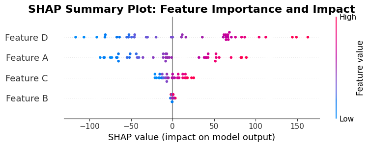
Interpreting This Summary Plot
This summary plot uses the same structure as the earlier example, but now you're seeing it applied to your actual test data. Here's how to read it:
Feature Importance Ranking: The vertical ordering shows which features matter most across your test set. Features at the top have the highest average absolute SHAP values, meaning they consistently have large impacts on predictions. This global ranking helps you understand overall model behavior, not just individual predictions.
Contribution Patterns: The horizontal distribution of points reveals how each feature typically contributes. If points cluster far to the right, that feature consistently increases predictions. If they cluster far to the left, it consistently decreases them. A symmetric distribution around zero indicates the feature has variable impact depending on context.
Value-Contribution Relationships: The color coding (blue to red representing low to high feature values) reveals whether high or low values of a feature are associated with increased predictions. If red points cluster on the right and blue on the left for a feature, high values of that feature increase predictions and low values decrease them. The reverse pattern indicates an inverse relationship.
Instance-Level Insights: Each point represents one test instance. Densely populated areas indicate many instances with similar SHAP values for that feature. Sparse regions or outliers may represent unusual cases worth investigating, potentially revealing data quality issues or model limitations.
Comparative Analysis: You can compare features by examining their relative vertical positions (importance) and horizontal spreads (consistency of impact). Features with similar positions and spreads have comparable importance and variability. Large differences suggest some features dominate while others have minimal or variable influence.
SHAP Waterfall Plot
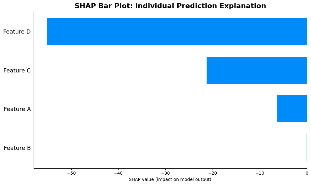
Interpreting This Waterfall Plot for Test Instance 0
This bar plot shows exactly how the model reached its prediction for the first test instance. Here's how to read it systematically:
Reading from Top to Bottom: The features are ordered by absolute SHAP value magnitude, so the most impactful features for this specific prediction appear first. Start reading from the top to identify what primarily drove this prediction.
Bar Direction Tells the Story: Each bar's direction (left for negative, right for positive) shows whether that feature increased or decreased the prediction for this instance. Long bars indicate dominant influences. If you see several long bars all pointing in the same direction, those features worked together to push the prediction in that direction.
Magnitude Comparison: The relative bar lengths let you compare contributions. If one bar is twice as long as another, it contributed roughly twice as much. This visual comparison makes it easy to identify which features were most critical for this specific instance.
Context-Specific Attribution: Remember that this plot shows contributions for one specific instance. A feature that appears large here might be small for other instances, because SHAP values are context-dependent. The ordering in this plot reflects this instance's particular context, not global importance.
Efficiency Verification: You can verify the efficiency property by mentally summing the bar lengths (rightward bars as positive, leftward bars as negative). This sum should equal the difference between the baseline and the actual prediction for this instance, confirming that all contributions are accounted for.
Practical Interpretation: Use this plot to answer "Why did the model predict this value for this instance?" The top few bars explain the primary drivers. You can explain to stakeholders: "For this prediction, Feature A increased the prediction by X units, Feature B decreased it by Y units, and so on."
SHAP Force Plot
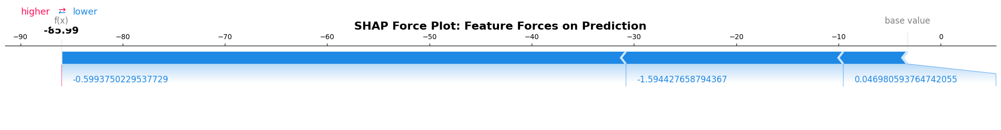
Interpreting This Force Plot for Test Instance 0
This force plot shows the same prediction as the bar plot above, but in a format that emphasizes the sequential "journey" from baseline to final prediction. Here's how to read it:
Baseline as Starting Point: Identify the baseline marker (typically shown as or the expected value). This represents what the model would predict with no feature information. All forces act relative to this starting point.
Tracing the Prediction Path: Follow the colored bars from left (baseline) to right (final prediction). Each bar represents a feature "force" that pushes the prediction along the scale. The cumulative effect of all bars moves the prediction from baseline to its final value.
Force Magnitude and Direction: Bar length indicates contribution magnitude, while color (red/blue) indicates direction. Red bars push right (increase prediction), blue bars push left (decrease prediction). The longest bars represent the strongest forces driving this prediction.
Sequential Impact Visualization: Unlike the bar plot which shows unordered contributions, this plot shows how features combine sequentially. The ordering helps you understand the relative importance and how each feature moves the prediction along its path.
The Final Prediction Mark: The rightmost point shows where all forces push the prediction. The distance from baseline to this final point equals the sum of all SHAP values, visually demonstrating the efficiency property.
Pattern Analysis: Look for patterns in the force bars. Do they mostly push in one direction (indicating a consistent directional influence), or do they alternate (suggesting competing forces)? Large blue bars followed by large red bars (or vice versa) indicate features with offsetting effects.
Feature Values and Labels: Each bar is typically labeled with the feature name and its actual value for this instance. This lets you connect the abstract "force" concept to concrete feature values: "When Feature A has value X, it exerts this force."
Stakeholder Communication: This visualization is powerful for explaining predictions because you can literally trace with your finger from baseline to final value, saying "these features pushed it up, these pushed it down, and here's where we ended up." The physical metaphor makes the abstract mathematical concept tangible.
SHAP Bar Plot
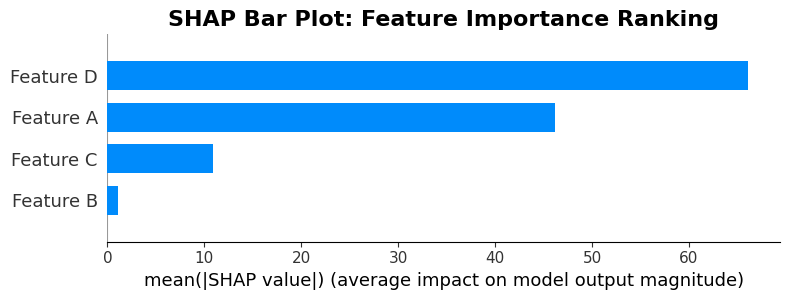
Interpreting the Mean Absolute SHAP Bar Plot
This bar plot provides a simplified, aggregated view of feature importance by showing the mean absolute SHAP value for each feature. It's one of the most straightforward SHAP visualizations:
Y-axis (Feature Ordering): Features are listed vertically, ordered from top to bottom by their mean absolute SHAP value across all instances in the test set. The feature at the top has the highest average absolute contribution, making it the most important feature overall. This ordering reflects global importance across your entire dataset.
X-axis (Mean Absolute SHAP Values): The horizontal length of each bar represents the mean absolute SHAP value for that feature. This is calculated by taking the absolute value of SHAP values for each instance, then averaging across all instances. Longer bars indicate features that consistently have larger impacts, regardless of whether those impacts are positive or negative.
Bar Length as Importance Metric: Unlike other plots that show direction (positive/negative), this plot focuses purely on magnitude. A feature with a long bar consistently has large impacts on predictions, while a short bar indicates minimal average impact. This makes it easy to rank features by importance.
Why Mean Absolute Values: By taking absolute values before averaging, this plot treats positive and negative contributions equally. A feature that sometimes adds +10 and sometimes adds -10 will show the same importance as one that always adds +10. This is useful when you care about total impact rather than directional influence.
Comparison Across Features: The relative bar lengths let you easily compare feature importance. If one bar is twice as long as another, that feature has roughly twice the average impact. This visual comparison helps prioritize which features to focus on for model understanding or feature engineering.
Limitations to Remember: This plot doesn't show direction of influence (positive vs. negative) or variability. A feature with consistent small contributions might rank similarly to one with highly variable large contributions. For direction and variability, refer back to the summary plot with individual points.
Practical Use Cases: This plot excels when you need to quickly answer "What are the most important features overall?" It's ideal for stakeholder presentations, feature selection discussions, and model documentation where a simple importance ranking is needed.
Combining with Other Plots: Use this plot alongside the detailed summary plot. This bar plot tells you "which features matter most," while the summary plot shows "how they matter" (direction, variability, value relationships). Together, they provide comprehensive feature understanding.
Alternative Implementation: Linear Model
For linear models, SHAP provides even more efficient computation since the SHAP values can be computed directly from the model coefficients:
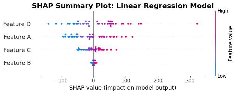
Interpreting the Linear Model SHAP Summary Plot
This summary plot for the linear regression model uses the same structure as previous summary plots, but interpreting it in the context of linear models reveals important insights:
Linear Model Characteristics: For linear models, SHAP values have a direct relationship to model coefficients, but they account for feature interactions in the context. The plot shows how these contextualized contributions vary across instances, even though the underlying model is linear.
Feature Ordering by Importance: The vertical ordering reflects average absolute SHAP values across test instances. In linear models, this ordering often correlates with coefficient magnitudes, but not always, because SHAP values incorporate contextual effects. Features with large coefficients typically appear near the top, but the exact order depends on how features interact with each other in practice.
Contribution Distribution Patterns: The horizontal spread of points reveals how each feature's contribution varies. In ideal linear models with independent features, you might see narrow, consistent distributions. Wider spreads indicate that features have variable impact depending on other feature values, even in a linear model.
Color-Feature Value Relationships: The color coding (blue for low values, red for high values) shows how feature values relate to contributions. For linear models with positive coefficients, you typically see red points (high values) on the right (positive contributions) and blue points (low values) on the left (negative or small contributions), creating a gradient that reflects the linear relationship.
Symmetry and Linearity: Linear models often produce more symmetric distributions than complex models. If the model is truly linear with independent features, points for each feature might cluster tightly around a central value. Asymmetry or wide spreads suggest that interactions or correlations between features are affecting contributions, even within the linear framework.
Coefficient Validation: You can use this plot to validate that SHAP values align with model coefficients. For a feature with a large positive coefficient, most points should appear on the right (positive SHAP values). However, SHAP values will vary based on instance-specific contexts, so some variability is expected and normal.
Comparing to Random Forest: If you compare this linear model plot to the earlier random forest plot, you might notice differences in:
- Distribution widths (linear models often have narrower spreads)
- Point clustering patterns (linear relationships produce different clustering than tree-based decisions)
- Feature ordering (which features rank as most important can differ between model types)
Exact vs. Approximate Computation: Linear models allow exact SHAP value computation (no approximation needed), so every point in this plot represents a precise calculation. This precision is visible in potentially cleaner, more consistent patterns compared to approximated SHAP values from complex models.
Practical Insights: Use this plot to understand how your linear model behaves across different instances. Even though the model structure is simple, SHAP reveals how feature contributions vary with context. This helps identify whether assumptions of linearity and independence hold in practice, and guides decisions about model complexity.
Practical Implications: From Theory to Real-World Impact
Understanding SHAP's mathematical foundation is important, but the value becomes clear when we apply it to real-world problems. The theoretical properties we've explored, including efficiency, symmetry, and completeness, aren't just mathematical curiosities. They translate directly into practical benefits that make SHAP indispensable for production machine learning systems.
Model Debugging and Validation: The completeness guaranteed by the efficiency property means that SHAP values provide a comprehensive view of model behavior. There are no hidden contributions or unexplained effects. When debugging anomalous predictions, you can trace exactly which features drove the decision, confident that nothing has been overlooked. This complete decomposition is particularly important in high-stakes applications like healthcare, finance, or autonomous systems, where understanding why a model made a specific decision can be a matter of safety or compliance. The mathematical guarantees ensure that the explanations are trustworthy, not just plausible-sounding stories.
Stakeholder Communication: The formula's structure, enumerating all contexts and weighting appropriately, ensures that SHAP explanations are consistent and fair, making them ideal for communicating with non-technical stakeholders. When you show a waterfall plot demonstrating how baseline plus feature contributions equals the prediction, you're not just showing numbers. You're making visible the mathematical guarantee that everything adds up correctly. This transparency builds trust because stakeholders can verify for themselves that the explanation is complete and principled, not arbitrary.
Feature Engineering and Selection: Because SHAP values reflect each feature's average contribution across all possible contexts, they provide a more nuanced view of feature importance than simple correlation or univariate statistics. Features that seem important in isolation might have smaller SHAP values when considered in context with other features (revealing redundancy), while features with modest univariate relationships might have larger SHAP values when their interactions with other features are properly accounted for. This contextual understanding guides feature engineering by revealing where to invest effort and which features are contributing unique information.
Model Comparison and Selection: The universality of SHAP, where the same formula works across model types, means you can compare explanations consistently even when comparing fundamentally different architectures. A random forest and a neural network might both perform similarly, but their SHAP explanations can reveal important differences in how they make decisions. Models with more intuitive SHAP patterns (where high-valued features naturally correspond to high SHAP values) may be preferable even if raw performance metrics are comparable, because interpretability has value beyond accuracy.
Regulatory Compliance: In regulated industries, SHAP's mathematical foundation provides an audit trail that simpler explanation methods cannot match. The properties we've discussed, including efficiency, symmetry, and additivity, are verifiable mathematical guarantees, not implementation details that might vary. This principled foundation makes SHAP explanations defensible to regulatory bodies because they're based on established mathematical theory, not ad-hoc heuristics that might be questioned under scrutiny.
Computational Considerations: While the exponential complexity of exact SHAP calculation is a real limitation, the SHAP library's approximation methods maintain the essential mathematical properties while being computationally tractable. Understanding the formula helps you evaluate these approximations: do they preserve efficiency? Do they maintain fair weighting across contexts? This knowledge lets you make informed trade-offs between explanation quality and computational cost, choosing appropriate methods for your specific needs and constraints.
Summary: The Complete Picture
We began with a fundamental question: How much does each feature contribute to this specific prediction? The challenge is that answering this question fairly requires navigating the fact that a feature's contribution depends on what other features are present, a complex attribution problem that simple methods cannot resolve.
SHAP (SHapley Additive exPlanations) solves this challenge by drawing on game theory's Shapley values to provide a mathematically principled framework for feature attribution. The core formula combines three essential components: enumeration of all possible contexts (summation over subsets), measurement of feature impact in each context (marginal contributions), and fair weighting by how naturally each context arises (combinatorial weighting factors). This structure ensures that attributions don't depend on arbitrary feature orderings or baseline assumptions, but rather reflect each feature's true average contribution across all possible scenarios.
The mathematical properties that emerge from this structure, including efficiency, symmetry, additivity, and dummy features, aren't just convenient byproducts. They're fundamental guarantees that make SHAP explanations trustworthy, complete, and interpretable. The efficiency property in particular makes explanations actionable: starting from baseline and adding each feature's SHAP contribution reconstructs the exact prediction, with no missing pieces or unexplained remainders.
This theoretical foundation translates directly into practical value. SHAP's universality means the same explanation framework works across any model type, from linear regression to deep neural networks, ensuring consistency in how we interpret different models. The method's dual capability (local and global explanations) makes it versatile for debugging individual predictions, understanding overall model behavior, and communicating insights to stakeholders. The mathematical rigor makes explanations defensible in regulatory contexts, while the intuitive visualizations make them accessible to non-technical audiences.
As machine learning models become increasingly complex and their applications more important, the ability to provide transparent, auditable explanations becomes increasingly valuable. SHAP's combination of mathematical rigor, practical versatility, and intuitive accessibility makes it a cornerstone of modern explainable AI systems. Understanding both the formula's structure and its implications ensures that we use SHAP effectively, recognizing both its power to illuminate model behavior and its boundaries in what it can explain.
The journey from attribution challenge to principled solution, from abstract formula to concrete implementation, from theoretical guarantees to practical applications: this is what makes SHAP more than just an explanation method. It's a comprehensive framework for understanding machine learning models with confidence, clarity, and mathematical rigor.
Quiz
Ready to test your understanding of SHAP (SHapley Additive exPlanations)? Take this quick quiz to reinforce what you've learned about feature attribution using game theory.

Comments