

A comprehensive guide covering t-SNE (t-Distributed Stochastic Neighbor Embedding), including mathematical foundations, probability distributions, KL divergence optimization, and practical implementation. Learn how to visualize complex high-dimensional datasets effectively.

This article is part of the free-to-read Machine Learning from Scratch
Choose your expertise level to adjust how many terms are explained. Beginners see more tooltips, experts see fewer to maintain reading flow. Hover over underlined terms for instant definitions.
t-SNE
t-Distributed Stochastic Neighbor Embedding (t-SNE) is a powerful dimensionality reduction technique that excels at visualizing high-dimensional data by preserving local neighborhood structures. Unlike linear methods such as PCA, t-SNE is specifically designed to reveal non-linear relationships and complex data structures that might be hidden in high-dimensional spaces. The method works by modeling the probability distribution of pairwise similarities in the original high-dimensional space and then finding a low-dimensional representation that preserves these similarities as closely as possible.
The key insight behind t-SNE is that it uses different probability distributions for the high-dimensional and low-dimensional spaces. In the high-dimensional space, it uses Gaussian distributions to model similarities, while in the low-dimensional space, it uses the heavier-tailed t-distribution. This asymmetry helps prevent the "crowding problem" where points would otherwise cluster too tightly in the center of the low-dimensional space, making it particularly effective for visualization tasks.
t-SNE is especially valuable for exploratory data analysis, where we want to understand the underlying structure of our data before applying more complex machine learning algorithms. It has become a standard tool in fields ranging from genomics and neuroscience to computer vision and natural language processing, where high-dimensional data visualization is crucial for gaining insights.
Advantages
t-SNE excels at revealing non-linear structures and complex data relationships that linear dimensionality reduction methods like PCA cannot capture. The method is particularly effective at separating distinct clusters and identifying outliers, making it valuable for exploratory data analysis. The heavy-tailed t-distribution used in the low-dimensional space helps prevent the crowding problem, allowing for better separation of data points and more interpretable visualizations.
The method is relatively robust to different types of noise and can handle various data types effectively. It preserves local neighborhood structures well, which means that points close in the original high-dimensional space typically remain close in the low-dimensional visualization. This local structure preservation makes t-SNE useful for understanding the fine-grained structure of complex datasets.
Disadvantages
One of the most significant limitations of t-SNE is that it is computationally expensive, with time complexity of O(n²), making it impractical for very large datasets (typically limited to datasets with fewer than 10,000 points). The method is also stochastic, meaning that different runs can produce different results, which can make interpretation challenging and requires multiple runs to ensure consistency.
t-SNE is primarily a visualization tool and should not be used for feature reduction in machine learning pipelines, as it doesn't preserve global structure and can be sensitive to hyperparameters. The method requires careful tuning of the perplexity parameter, which controls the effective number of neighbors and significantly impacts the results. Additionally, t-SNE can sometimes create misleading visualizations where apparent clusters in the low-dimensional space don't correspond to meaningful groups in the original data.
Building the Mathematical Foundation
To understand how t-SNE works, we need to follow its core logic: the algorithm tries to preserve relationships between nearby points when moving from high dimensions to low dimensions. Instead of trying to preserve exact distances, t-SNE preserves similarities. Think of it as keeping friends close together rather than measuring exact distances between people in a room.
The algorithm operates in three main steps. First, it measures how similar points are in the original high-dimensional space. Second, it creates a low-dimensional representation and measures similarities there. Third, it adjusts the low-dimensional positions until the two sets of similarities match as closely as possible.
Measuring similarities in high-dimensional space
We start with our original data points and in high-dimensional space. The first step is straightforward: compute how far apart these points are using squared Euclidean distance.
where:
- : the -th data point in the original high-dimensional space
- : the -th data point in the original high-dimensional space
- : squared Euclidean distance between points and
- : squared L2 norm (sum of squared differences across all dimensions)
This gives us raw distances, but t-SNE doesn't work directly with distances. Instead, it converts them into probabilities that express similarity. Why probabilities? Because they naturally normalize the scale and make similarities relative rather than absolute. A distance of 5 units means something different if most points are separated by 100 units versus if most are separated by 1 unit.
To convert distances into similarities, we use a Gaussian (normal) distribution centered at each point. The conditional probability represents the probability that point would pick as its neighbor if neighbors were selected in proportion to their probability density under this Gaussian.
where:
- : conditional probability that point picks point as its neighbor
- : bandwidth of the Gaussian kernel centered at point (controls the effective neighborhood size)
- : exponential function (converts distances to similarities)
- : sum over all points except point (normalization)
Let's break down what each part does:
- The numerator gives higher values to closer points and lower values to distant points. The exponential ensures all values are positive.
- The variance controls the width of the Gaussian. Larger means we consider more distant neighbors.
- The denominator normalizes these values so they sum to 1, making them proper probabilities.
The variance is different for each point, which is unusual but important. In dense regions of the data, we use smaller to focus on very close neighbors. In sparse regions, we use larger to capture the local structure. The perplexity parameter controls these variances indirectly. Higher perplexity means the Gaussian is wider, effectively considering more neighbors.
Now we have conditional probabilities , but there's a problem: might not equal . To fix this asymmetry, we symmetrize by averaging:
where:
- : symmetric joint probability of similarity between points and
- : total number of data points in the dataset
- The factor ensures that
This gives us a symmetric joint probability distribution where . The division by ensures all probabilities sum to 1 over all pairs. These symmetrized probabilities represent our target: they encode which points should be close together in the visualization.
Measuring similarities in low-dimensional space
Next, we need to measure similarities in the low-dimensional space where we want to visualize our data. Let and be the low-dimensional coordinates we're trying to find. We could use the same Gaussian distribution here, but that creates a problem called crowding.
The crowding problem happens because high-dimensional spaces have much more "room" than low-dimensional spaces. Imagine 100 points evenly distributed in 50 dimensions. When we try to place them in 2 dimensions while keeping all pairwise distances the same, they'll be forced too close together in the center. Moderate distances in high dimensions become impossible to represent in low dimensions.
To solve this, t-SNE uses a heavy-tailed distribution in low dimensions: the Student t-distribution with one degree of freedom (also called the Cauchy distribution). The similarity between points and is:
where:
- : similarity between points and in the low-dimensional space
- : low-dimensional representation of point (coordinates we're optimizing)
- : low-dimensional representation of point
- : squared Euclidean distance between points in low-dimensional space
- : Student t-distribution kernel with one degree of freedom
- : sum over all distinct pairs of points for normalization
The key difference from the Gaussian is instead of . The t-distribution has heavier tails, meaning it decreases more slowly as distance increases. This allows moderately distant points in low dimensions to still have reasonable similarity values, giving them room to spread out instead of crowding in the center.
The denominator again normalizes to make these proper probabilities that sum to 1.
Finding the right low-dimensional positions
Now we have two probability distributions: representing similarities we want to preserve from the high-dimensional space, and representing similarities in our current low-dimensional representation. We need to adjust the positions until these distributions match.
To measure how well they match, t-SNE uses the Kullback-Leibler (KL) divergence, a standard measure of how different two probability distributions are:
where:
- : Kullback-Leibler divergence (cost function to minimize)
- : target similarity between points and in high-dimensional space
- : current similarity between points and in low-dimensional space
- : natural logarithm
- The sum is over all pairs of points
The KL divergence has useful properties for this task. When is large (points should be close) but is small (they're actually far apart), the log ratio is large and positive, heavily penalizing the mismatch. When and are both small (points should be far apart and are), the contribution is minimal. The cost function is asymmetric: it cares more about keeping close points together than about separating distant points, which aligns with t-SNE's goal of preserving local structure.
To minimize this cost, we use gradient descent. We need the derivative of the cost with respect to each low-dimensional position :
where:
- : gradient of the cost function with respect to position
- The sum is over all other points
- : difference between target and current similarities
- : vector pointing from to in low-dimensional space
- : weighting factor from the t-distribution
- The factor of 4 comes from the derivative of the symmetrized KL divergence
This gradient has an elegant interpretation. For each pair of points:
- If (points should be closer than they are), the term is positive. The gradient pulls toward .
- If (points should be farther apart), the term is negative. The gradient pushes away from .
- The magnitude of the force depends on how different the probabilities are.
- The factor comes from the t-distribution and ensures the gradient doesn't explode for distant points.
The algorithm iteratively updates each by taking small steps in the direction opposite to this gradient, gradually moving points until the low-dimensional similarities match the high-dimensional similarities as closely as possible.
Key mathematical properties
Understanding a few mathematical properties helps explain t-SNE's behavior in practice.
Non-convexity and local minima: The cost function has multiple local minima because it's non-convex. Different random initializations can lead to different final configurations. This is why running t-SNE multiple times with different random seeds is important to ensure your visualization is stable.
Scale invariance: Multiplying all distances by a constant factor doesn't change the relative similarities. This means t-SNE results don't depend on the absolute scale of your data, only on the relative distances. However, the method is not rotation-invariant, so the orientation of your final visualization is arbitrary.
The role of perplexity: The perplexity parameter acts as a smoothness control. Lower values (5-15) create more localized neighborhoods, revealing fine-grained structure but potentially fragmenting the visualization. Higher values (30-50) create broader neighborhoods, emphasizing more global structure. The choice of perplexity significantly affects the result. A common default is 30, which typically balances local and global structure well for most datasets. The perplexity should generally be between 5 and 50, and you should try several values to see which gives the most interpretable visualization.
Visualizing t-SNE
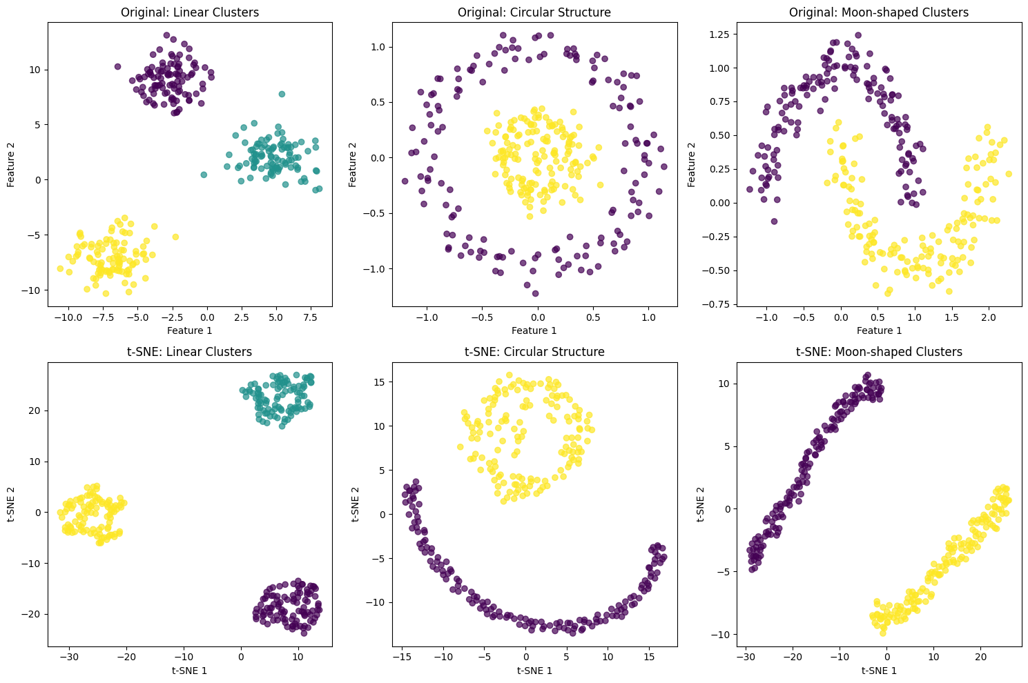
Let's create visualizations to understand how t-SNE works with different types of data structures. We'll start with a simple example using synthetic data to demonstrate the key concepts.
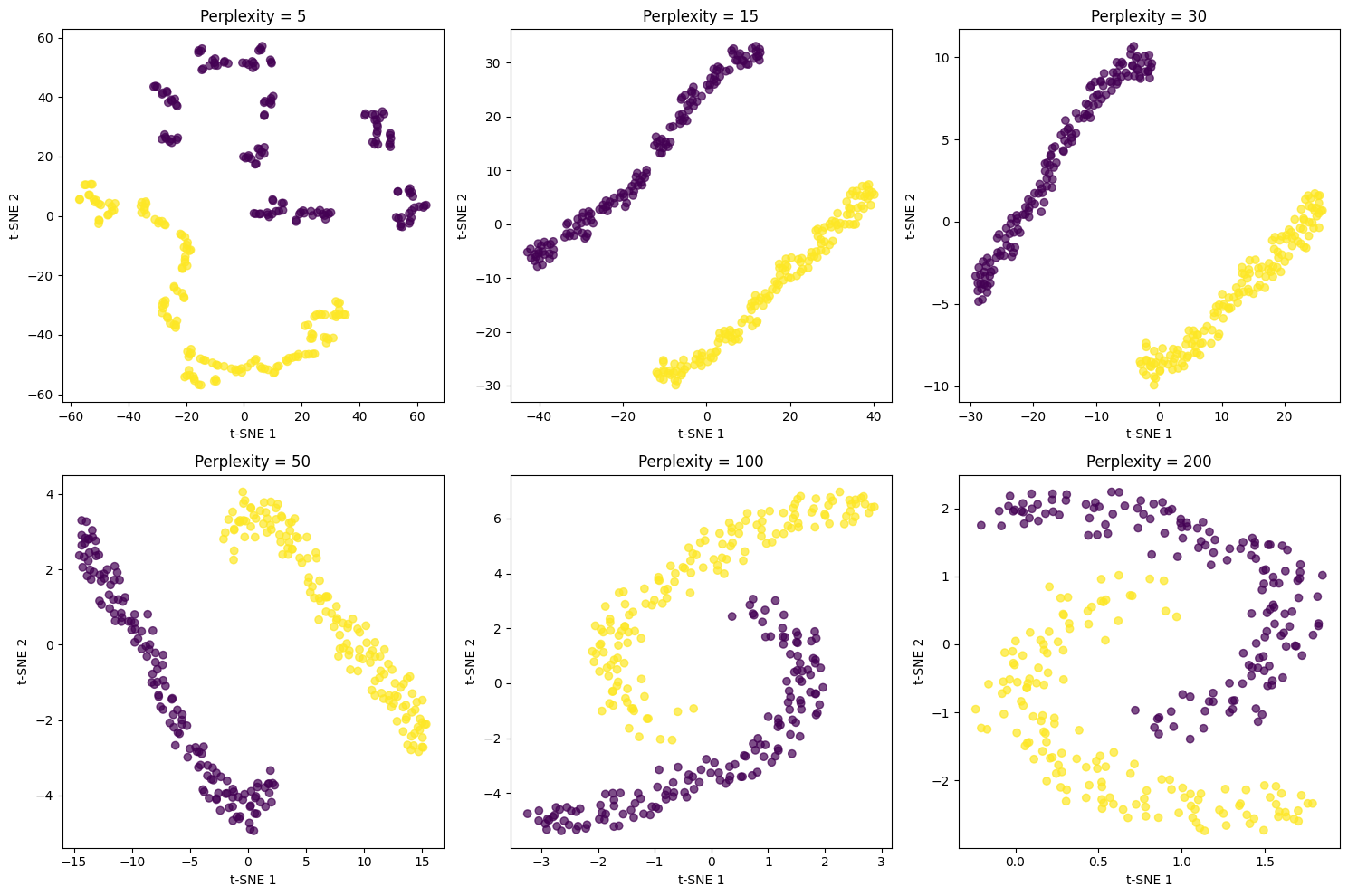
Now let's examine how different perplexity values affect the t-SNE visualization:
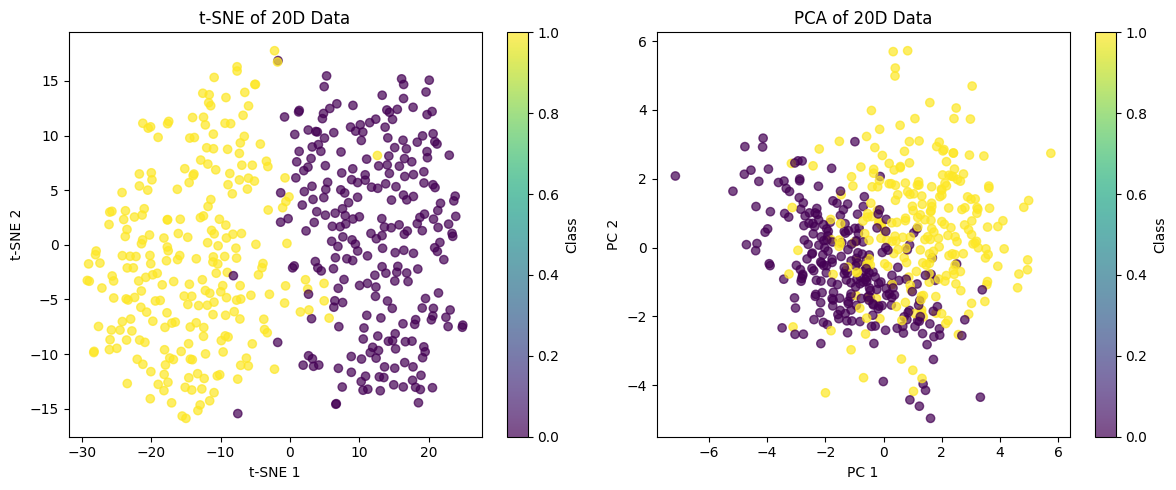
Let's also visualize the effect of t-SNE on high-dimensional data by projecting it back to 2D:
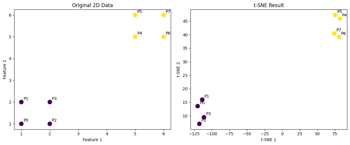
Example
Let's work through a concrete example using a small dataset to demonstrate how t-SNE calculations work step by step. We'll use a simple 2D dataset with 8 points divided into two clusters, showing exactly how the formulas are applied in practice.
Step 1: Calculate pairwise distances
First, we compute the squared Euclidean distance for all pairs of points.
Step 2: Convert distances to probabilities
Next, we apply the Gaussian kernel formula to convert distances into conditional probabilities. For demonstration, we'll calculate (the probability that point 0 picks each other point as a neighbor):
We use for simplicity (in practice, is determined by the perplexity parameter).
Notice how points 1, 2, and 3 (which are close to point 0 in the first cluster) have higher probabilities, while points 4-7 (in the distant second cluster) have probabilities close to zero.
Step 3: Apply complete t-SNE algorithm
Now we apply the full t-SNE algorithm, which computes all pairwise probabilities, symmetrizes them, creates a low-dimensional representation, and iteratively optimizes the positions to minimize the KL divergence.
Implementation in Scikit-learn
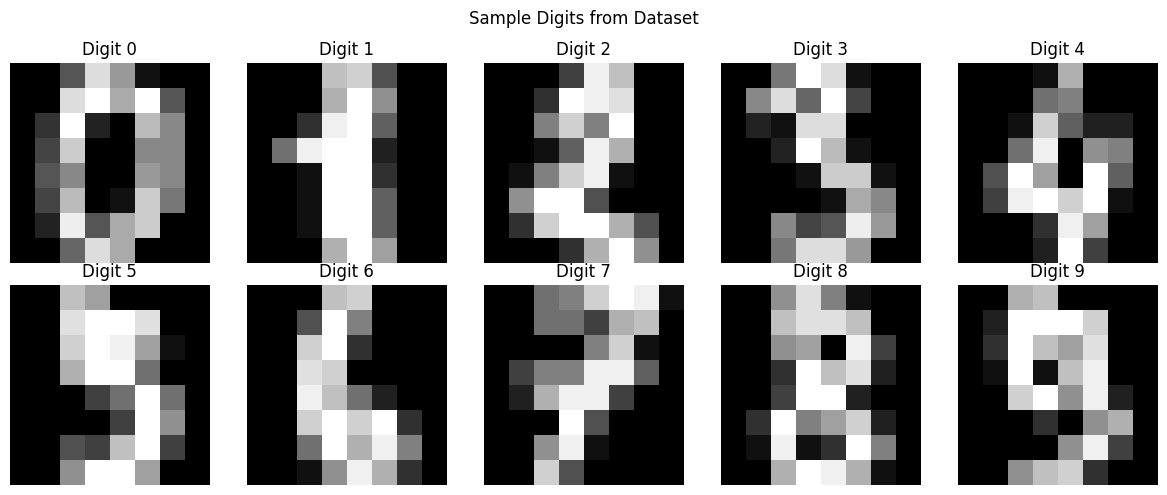
Scikit-learn provides a robust implementation of t-SNE through the TSNE class. This implementation is optimized for performance and includes several important features for practical use. Let's walk through a complete example using the digits dataset, which contains images of handwritten digits.
Loading and preparing the data
We'll start by loading the digits dataset and examining its basic properties.
The digits dataset contains 1,797 samples, each representing an 8×8 pixel image (64 features total). With 10 digit classes (0-9), this is a perfect test case for t-SNE visualization, as it has enough dimensions to make visualization challenging but not so many points that computation becomes impractical.
Applying t-SNE
Before applying t-SNE, we standardize the data to ensure all features contribute equally to the distance calculations.
The computation takes a few seconds on this moderately-sized dataset. The KL divergence value indicates how well the low-dimensional representation preserves the high-dimensional similarities. Lower values are better, though there's no universal threshold for what constitutes a "good" value. The key is that the optimization has converged (the value stopped decreasing significantly).
Visualizing the results
Let's visualize the t-SNE embedding to see how well it separates the different digit classes.
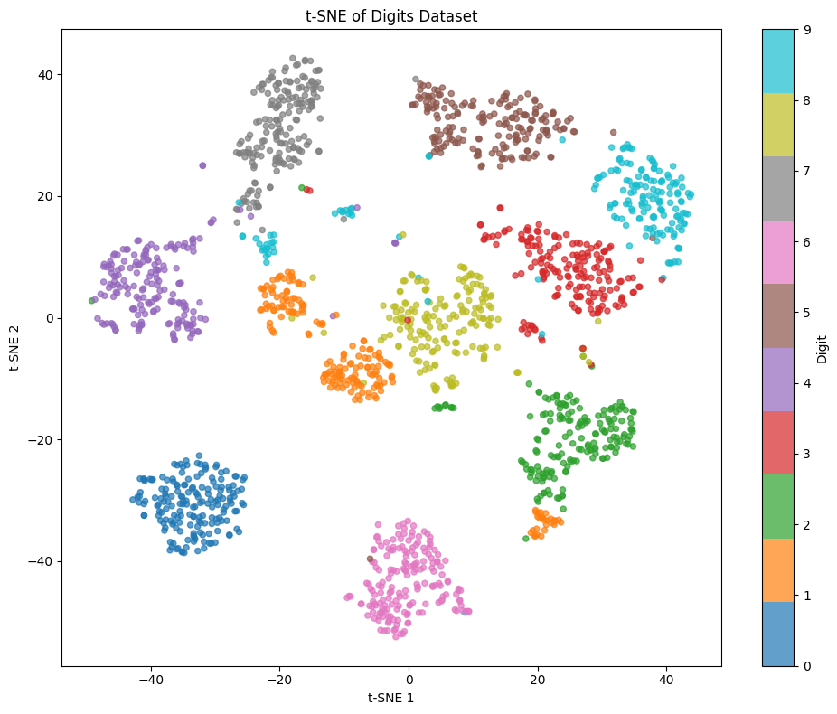
The visualization shows clear separation between most digit classes, with distinct clusters forming for each number. This demonstrates that t-SNE successfully captured the underlying structure in the 64-dimensional space. Notice that some digits like 0, 1, and 6 form tight, well-separated clusters, while others like 3, 5, and 8 show more overlap, reflecting their visual similarity.
Exploring different perplexity values
Perplexity is the most important parameter in t-SNE. Let's see how different values affect the visualization.
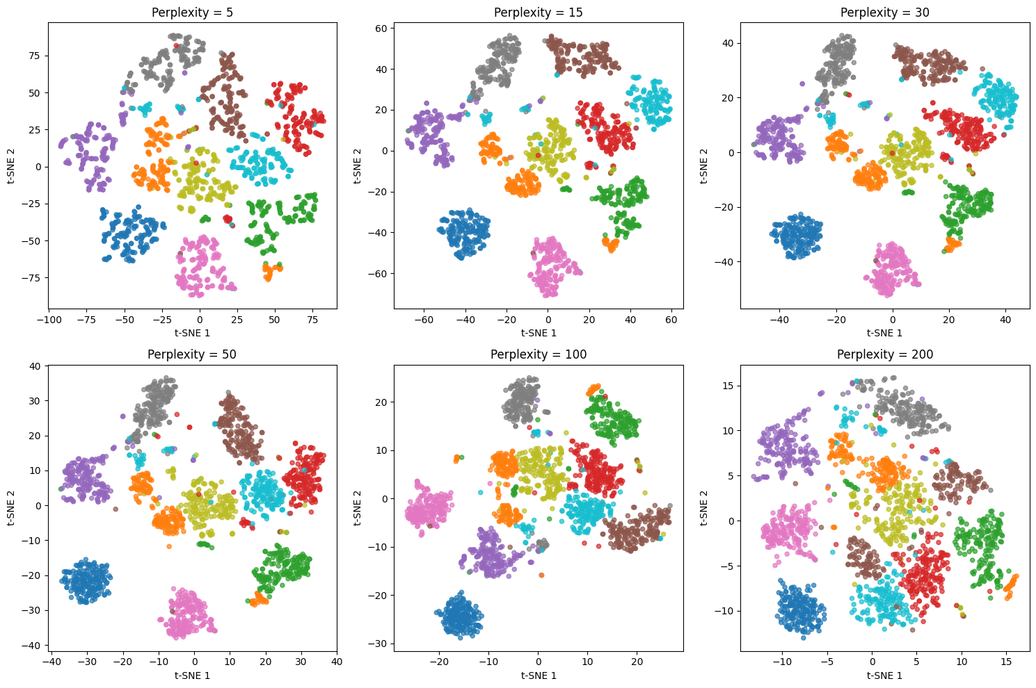
The perplexity value dramatically affects the visualization structure. Low values (5, 15) create many small, tight clusters that emphasize very local structure but can fragment natural groups. Medium values (30, 50) typically provide the best balance, revealing both local and global structure. High values (100, 200) create more spread-out visualizations that emphasize global structure but may lose fine-grained details. For this dataset with ~1,800 points, perplexity values between 30 and 50 work best.
Exploring different learning rates
The learning rate controls the step size during optimization. Let's examine its effect.
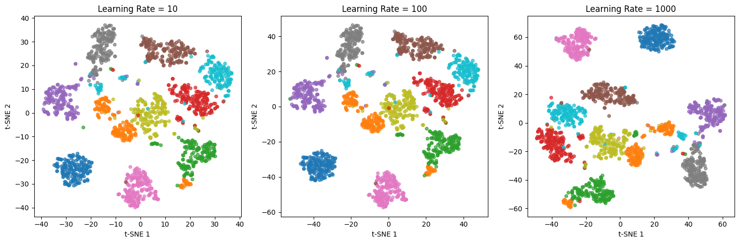
The learning rate affects how quickly the optimization converges. Very low values (10) may result in poor optimization, with points not fully separated. Moderate values (100) typically work well. Very high values (1000) can cause the optimization to overshoot, though scikit-learn's default of 200 handles this reasonably. If your visualization looks poor, try adjusting the learning rate before changing other parameters.
Key Parameters
Below are the main parameters that affect how t-SNE works and performs.
-
n_components: Number of dimensions in the embedding (default: 2). Use 2 for visualization, occasionally 3 for interactive 3D plots. Higher values defeat the purpose of visualization. -
perplexity: Controls the effective number of neighbors considered for each point (default: 30). Think of it as a smoothness parameter. Typical range is 5 to 50. Lower values (5-15) for small datasets or fine-grained structure, higher values (30-50) for larger datasets or global structure. Must be less than the number of samples. -
learning_rate: Step size for gradient descent (default: 200). Typical range is 10 to 1000. If clusters look compressed or poorly separated, try values between 100 and 1000. Too low can result in poor optimization, too high can cause instability. -
max_iter: Maximum number of optimization iterations (default: 1000). Increase to 2000 or 5000 if the KL divergence hasn't converged. For large datasets, you may need more iterations. -
random_state: Seed for reproducibility (default: None). Set to an integer to get consistent results across runs. Always use this when comparing different parameter settings. -
init: Initialization method (default: 'pca'). Using PCA initialization often leads to more stable results than random initialization. Can also pass a custom array of initial positions. -
method: Algorithm variant (default: 'barnes_hut'). Barnes-Hut t-SNE is faster (O(n log n)) for large datasets. Use 'exact' for smaller datasets (< 1000 points) when you need precise results. -
n_jobs: Number of CPU cores to use (default: None). Only affects the gradient computation. Set to -1 to use all available cores, though the speedup is limited.
Key Methods
The following are the most commonly used methods for interacting with t-SNE.
-
fit_transform(X): Fits t-SNE on data X and returns the embedded coordinates. This is the primary method you'll use. Returns an array of shape (n_samples, n_components). -
kl_divergence_: Attribute (not a method) that stores the final KL divergence after fitting. Lower values indicate better preservation of similarities. Use this to assess convergence and compare different parameter settings.
Practical Applications
t-SNE is primarily a visualization tool designed for exploratory data analysis of high-dimensional datasets. The method excels when you need to understand the structure of data with many features (typically more than 10 dimensions) by revealing clusters, identifying outliers, or exploring relationships that would be impossible to visualize in the original space. In genomics, researchers use t-SNE to visualize gene expression patterns across thousands of genes, revealing cell types and developmental stages. In natural language processing, t-SNE helps visualize word embeddings, showing semantic relationships between words in a two-dimensional space. Computer vision applications use t-SNE to explore how neural networks represent images, revealing which visual features the network considers similar.
The method is particularly valuable for validating clustering results. After applying a clustering algorithm to high-dimensional data, t-SNE can visualize whether the identified clusters form coherent, well-separated groups or whether they overlap significantly. This visual validation complements quantitative metrics and helps identify potential issues with cluster assignments. In customer segmentation, for example, t-SNE can reveal whether customer groups defined by purchasing patterns are truly distinct or whether the boundaries between segments are ambiguous.
t-SNE also serves as a powerful communication tool for presenting complex data to non-technical stakeholders. A well-crafted t-SNE visualization can convey the overall structure of high-dimensional data in an intuitive way, showing relationships and patterns that would be difficult to explain through statistics alone. However, this communication value depends on interpreting t-SNE visualizations correctly and avoiding common misunderstandings about what the plots do and do not show.
Best Practices
To achieve reliable and interpretable t-SNE visualizations, standardize your data before applying the algorithm. Since t-SNE relies on distance calculations, features with larger scales will dominate the similarity measures and distort the results. Standardization ensures all features contribute proportionally to the embedding. Always set a random seed using the random_state parameter to make your results reproducible, particularly when comparing different parameter settings or sharing visualizations with colleagues.
Run t-SNE multiple times with different random initializations to verify that your results are stable. If visualizations look substantially different across runs, the structure you observe may be an artifact of the optimization rather than genuine patterns in the data. Stable patterns that appear consistently are more trustworthy. Try several perplexity values (typically between 5 and 50) to understand how this parameter affects the visualization. Lower perplexity values emphasize very local structure, while higher values capture broader patterns. For most datasets with hundreds to thousands of points, perplexity values between 30 and 50 provide a good balance.
Complement t-SNE with other dimensionality reduction methods to gain multiple perspectives on your data. Compare t-SNE visualizations with PCA to distinguish linear from non-linear patterns. If you need to preserve more global structure or work with very large datasets, consider UMAP as an alternative. Using multiple methods helps you build confidence in observed patterns and reveals different aspects of your data's structure.
Data Requirements and Preprocessing
t-SNE works best with datasets containing between 50 and 10,000 points. Below 50 points, there may not be enough data to reveal meaningful structure, and the perplexity parameter becomes difficult to set appropriately. Above 10,000 points, the standard t-SNE implementation becomes computationally expensive due to its O(n²) complexity. For larger datasets, use the Barnes-Hut approximation by setting method='barnes_hut', which reduces complexity to O(n log n) with minimal impact on visualization quality for most applications.
The method requires numeric features and does not handle categorical variables directly. Encode categorical variables appropriately before applying t-SNE, using techniques like one-hot encoding for nominal variables or ordinal encoding for ordered categories. Handle missing values before applying t-SNE, as the algorithm requires complete data. Consider whether imputation is appropriate for your application or whether you should remove samples with missing values.
t-SNE assumes that meaningful similarities in the high-dimensional space can be captured through Euclidean distances. For some data types, this assumption may not hold. In text analysis, for example, cosine similarity might be more appropriate than Euclidean distance. While t-SNE itself uses Euclidean distances, you can preprocess your data with transformations that make Euclidean distance more meaningful for your specific domain.
Common Pitfalls
A frequent mistake is using t-SNE for feature reduction in machine learning pipelines. Unlike PCA or other linear methods, t-SNE does not preserve global structure and cannot reliably transform new points into the embedding space. The algorithm is designed for visualization, not as a preprocessing step for classification or regression models. Points that appear close in a t-SNE visualization may have been far apart in the original space, and the distances between clusters in the visualization are not meaningful. If you need dimensionality reduction for modeling, use PCA, factor analysis, or autoencoders instead.
Another common error is over-interpreting the precise positions and distances in t-SNE plots. The algorithm optimizes for preserving local neighborhoods, so the global arrangement of clusters and the distances between them should not be interpreted as representing true relationships in the original space. Two clusters that appear far apart in the t-SNE visualization are not necessarily more different than two clusters that appear closer together. Focus on which points cluster together and which points are isolated, rather than on absolute positions or inter-cluster distances.
Failing to experiment with multiple perplexity values leads to incomplete understanding of the data structure. A single perplexity value may emphasize certain patterns while obscuring others. Low perplexity values can fragment natural groups into many small clusters, while high perplexity values may merge distinct groups together. Always visualize your data with at least three different perplexity values to understand how robust your observations are to this parameter choice.
Computational Considerations
t-SNE's computational complexity depends on the algorithm variant and dataset size. The exact method has O(n²) time complexity and O(n²) space complexity, making it impractical for datasets with more than a few thousand points. For moderate datasets (1,000 to 10,000 points), expect computation times ranging from a few seconds to a few minutes on typical hardware. The Barnes-Hut approximation reduces time complexity to O(n log n) and is the default in scikit-learn for larger datasets.
Memory requirements can be substantial for large datasets. The exact method stores the full pairwise distance matrix, requiring significant RAM for datasets with thousands of points. If you encounter memory errors, switch to the Barnes-Hut method or sample your data to a manageable size. When sampling, use stratified sampling to preserve the relative proportions of different groups in your data if class labels are available.
For very large datasets (more than 10,000 points), consider working with a representative sample rather than the full dataset. Random sampling works for many applications, but for imbalanced datasets, stratified sampling ensures that minority groups are adequately represented in the visualization. Alternatively, you can create multiple t-SNE visualizations from different random samples to verify that observed patterns are consistent across samples. For production applications that need to visualize large datasets regularly, consider UMAP as a faster alternative that scales better while providing similar visualization quality.
Performance and Deployment Considerations
Evaluating t-SNE results is inherently subjective since the goal is visualization rather than prediction. However, you can assess quality through several approaches. Monitor the KL divergence value during optimization to ensure convergence. If the value remains high or fluctuates significantly, the optimization may not have converged, suggesting you should increase max_iter. Compare visualizations from multiple random initializations to assess stability. Consistent patterns across different runs indicate robust structure, while highly variable results suggest that the patterns may be artifacts.
Validate visual patterns using domain knowledge and quantitative methods. If t-SNE reveals clusters, quantify their separation using metrics like the silhouette score or by applying formal clustering algorithms and evaluating their performance. If you observe outliers in the visualization, investigate whether they correspond to known anomalies or data quality issues. Cross-reference t-SNE findings with other exploratory techniques like hierarchical clustering or PCA to build confidence in your interpretations.
For deployment and sharing, save t-SNE embeddings along with the original data labels to create reproducible visualizations. Document the parameter settings used (particularly perplexity, learning rate, and random state) so that colleagues can understand and reproduce your results. When presenting t-SNE visualizations to stakeholders, clearly explain what the plots show and what they do not show. Emphasize that distances between clusters are not meaningful and that the visualization emphasizes local structure over global relationships. Consider creating interactive visualizations that allow exploration of individual points to connect the abstract embedding space back to the original high-dimensional data.
Summary
t-SNE is a powerful dimensionality reduction technique for visualizing high-dimensional data by preserving local neighborhood structures. The method converts distances into probability distributions, using Gaussian distributions in the high-dimensional space and t-distributions in the low-dimensional space. This asymmetry solves the crowding problem, allowing points to spread out naturally in the visualization instead of clustering too tightly in the center.
The algorithm works by minimizing the Kullback-Leibler divergence between these two probability distributions through gradient descent. Each iteration adjusts point positions to better match the high-dimensional similarities in low-dimensional space. The perplexity parameter controls how many neighbors contribute to each point's similarity calculation, with values between 5 and 50 typically working well depending on dataset size.
Use t-SNE for exploratory data analysis, cluster validation, and outlier detection, not for feature reduction in machine learning pipelines. The method requires standardized data and works best with datasets containing 50 to 10,000 points. Always run multiple times with different random seeds to ensure stable results, and complement t-SNE with other dimensionality reduction methods like PCA or UMAP to get a complete picture of your data's structure. When used appropriately, t-SNE reveals complex non-linear relationships that linear methods cannot capture, making it valuable for understanding and communicating insights from high-dimensional datasets.
Quiz
Ready to test your understanding of t-SNE? Take this quick quiz to reinforce what you've learned about t-Distributed Stochastic Neighbor Embedding.

Comments