Data Handling & Visualization: Python for Quant Finance

Michael BrenndoerferNovember 7, 202540 min read

Master financial data handling with pandas, NumPy, and Numba. Learn time series operations, return calculations, and visualization for quant finance.

Reading Level

Choose your expertise level to adjust how many terms are explained. Beginners see more tooltips, experts see fewer to maintain reading flow. Hover over underlined terms for instant definitions.

Data Handling and Visualization

Quantitative finance is fundamentally a data-driven discipline. Building sophisticated models and executing trading strategies requires efficient loading, cleaning, manipulation, and exploration of financial data. This chapter introduces the Python ecosystem for quantitative finance. You will work with time series data using pandas and NumPy, learning how to load and manipulate data efficiently. You'll explore performance optimization when standard tools become bottlenecks and create visualizations that reveal patterns in price and return data.

The skills in this chapter form the foundation for everything that follows. You will repeatedly draw on these patterns when calculating portfolio returns, backtesting trading strategies, or training machine learning models.

Loading Financial Data

Financial data comes in many formats: CSV files from data vendors, Excel spreadsheets from analysts, SQL databases at institutions, and API responses from market data providers. Pandas provides a unified interface for all these formats. By abstracting away the underlying storage details, pandas lets you focus on analysis rather than file handling. Understanding how to efficiently load and structure this data is the first step in any quantitative workflow.

Reading CSV Files

The most common starting point is a CSV file containing historical price data. Comma-separated value files remain the universal exchange format. They are human-readable, easily edited, and supported by virtually every tool. Let's load a sample dataset to illustrate basic loading patterns:

In[2]:
Code
import pandas as pd
import numpy as np

## Create sample price data (simulating what you'd load from a CSV)
np.random.seed(42)
dates = pd.date_range("2020-01-01", periods=252, freq="B")  # Business days
prices = 100 * np.cumprod(1 + np.random.randn(252) * 0.02)

df = pd.DataFrame(
    {
        "date": dates,
        "open": prices * (1 + np.random.randn(252) * 0.005),
        "high": prices * (1 + np.abs(np.random.randn(252)) * 0.01),
        "low": prices * (1 - np.abs(np.random.randn(252)) * 0.01),
        "close": prices,
        "volume": np.random.randint(1_000_000, 10_000_000, 252),
    }
)

Use pd.read_csv() to load data. Three parameters matter for financial data:

  • parse_dates: Converts date columns to datetime objects automatically
  • index_col: Sets a column as the DataFrame index (typically the date)
  • dtype: Specifies column data types to prevent incorrect type inference, for example forcing numeric columns to float64.
In[3]:
Code
## Save our sample data to demonstrate loading
df.to_csv("sample_prices.csv", index=False)

## Load it back, parsing dates and setting the index
loaded_df = pd.read_csv(
    "sample_prices.csv", parse_dates=["date"], index_col="date"
)
Out[4]:
Console
                  open        high         low       close   volume
date                                                               
2020-01-01  102.065047  101.650535  100.495210  100.993428  1100734
2020-01-02  101.234072  101.204757  100.527996  100.714153  9546310
2020-01-03  101.243759  102.623134  101.143094  102.018781  3851274
2020-01-06  104.871805  106.034615  104.390124  105.126334  2225811
2020-01-07  105.296830  104.684790  104.031707  104.634020  4081091

Index type: DatetimeIndex
Data shape: (252, 5)

This displays the first five rows of price data with OHLC (open, high, low, close) values and volume. The index is now a DatetimeIndex, which is confirmed by the type output. The shape shows 252 rows (one year of business days) and 5 columns of data. This DatetimeIndex structure unlocks powerful time series operations we will explore shortly. The conversion from string dates to proper datetime objects is essential because it allows pandas to understand the temporal relationships between observations, enabling operations like date-range slicing and frequency-based resampling that would be impossible with plain text dates.

Handling Multiple Securities

Real-world analysis typically involves multiple securities. A portfolio manager might track dozens or hundreds of positions, while a factor model might require returns for thousands of stocks. Organize this data in two ways: wide format with one column per security, or long format with a single column for security identifier. Each format has advantages for different analyses.

In[5]:
Code
## Create multi-security data in wide format
np.random.seed(42)
dates = pd.date_range("2020-01-01", periods=252, freq="B")

## Each security starts at a different price and has different volatility
multi_prices = pd.DataFrame(
    {
        "AAPL": 100
        * np.cumprod(1 + np.random.randn(252) * 0.02),  # 2% daily vol
        "GOOGL": 150
        * np.cumprod(1 + np.random.randn(252) * 0.018),  # 1.8% daily vol
        "MSFT": 80
        * np.cumprod(1 + np.random.randn(252) * 0.022),  # 2.2% daily vol
    },
    index=dates,
)
Out[6]:
Console
Wide format (one column per security):
                  AAPL       GOOGL       MSFT
2020-01-01  100.993428  155.729822  78.854869
2020-01-02  100.714153  158.623963  78.009800
2020-01-03  102.018781  154.285810  76.993125
2020-01-06  105.126334  152.941022  75.529655
2020-01-07  104.634020  156.428751  75.610281

Three columns appear (AAPL, GOOGL, MSFT), each with price data for one security. Each row is a date, enabling easy cross-security price comparison. This format aligns values for cross-security calculations in the same row. Computing a correlation matrix or portfolio returns becomes straightforward.

Long format works better for filtering and grouping operations: especially when applying the same analysis across multiple securities or including additional attributes like sector or fundamentals.

In[7]:
Code
## Convert to long format
long_format = (
    multi_prices.reset_index()
    .melt(id_vars="index", var_name="ticker", value_name="price")
    .rename(columns={"index": "date"})
)
Out[8]:
Console
Long format (stacked):
        date ticker       price
0 2020-01-01   AAPL  100.993428
1 2020-01-02   AAPL  100.714153
2 2020-01-03   AAPL  102.018781
3 2020-01-06   AAPL  105.126334
4 2020-01-07   AAPL  104.634020
5 2020-01-08   AAPL  104.144046
6 2020-01-09   AAPL  107.433358
7 2020-01-10   AAPL  109.082320
8 2020-01-13   AAPL  108.058093
9 2020-01-14   AAPL  109.230653

Each price observation is a separate row with columns for date, ticker, and price. The first three rows show the same date with different tickers. Long format enables easy filtering and grouping, though cross-security calculations require pivoting to wide format. Understanding when to use each format saves effort as analyses grow more complex.

Time Series Fundamentals

Financial analysis revolves around time series: sequences of observations indexed by time. Unlike cross-sectional data where observations are independent, time series data has an inherent ordering that encodes crucial information. Prices depend on prior values, volatility clusters, and patterns repeat across periods. Pandas provides specialized tools for temporal data that simplify complex time-based logic into concise, readable code.

The DatetimeIndex

DatetimeIndex

A pandas index type for timestamps enabling time-based slicing, resampling, and alignment, essential for financial data analysis.

DatetimeIndex: The DatetimeIndex is one of pandas' most powerful features for financial applications. When your DataFrame has a DatetimeIndex, you gain access to intuitive time-based selection that understands calendar concepts like months, quarters, and years. This enables simple string-based slicing instead of complex boolean logic.

In[9]:
Code
## Select data for a specific month using .loc for partial string indexing
jan_2020 = multi_prices.loc["2020-01"]

## Select a date range
q1_2020 = multi_prices.loc["2020-01":"2020-03"]

## Select a specific date
specific_day = multi_prices.loc["2020-06-15"]
Out[10]:
Console
January 2020 data points: 23
Q1 2020 data points: 65

Prices on 2020-06-15:
AAPL      79.808238
GOOGL    158.105787
MSFT      68.231974
Name: 2020-06-15 00:00:00, dtype: float64

January contains approximately 21 business days of data, while Q1 contains about 63 days. The specific day selection returns a Series with one price value for each security. This demonstrates how DatetimeIndex enables intuitive slicing without complex boolean logic. Partial string indexing is far more readable than filtering with boolean masks, especially when working with dates. Without DatetimeIndex, you'd need complex boolean conditions to compare dates and handle month boundaries. The DatetimeIndex handles all of this automatically, expressing your intent directly.

Resampling Time Series

Financial data often needs to be converted between frequencies. Daily prices might need weekly or monthly conversion for longer-term analysis, risk reporting, or comparison with lower-frequency economic data. Alternatively, you might aggregate intraday tick data into daily bars for overnight processing. The resample() method handles this transformation elegantly, treating time series frequency conversion as a specialized form of grouping.

In[11]:
Code
## Resample daily prices to monthly using last observation
monthly_prices = multi_prices.resample("ME").last()

## For OHLC data, you'd use different aggregations
## open: first, high: max, low: min, close: last, volume: sum
Out[12]:
Console
Monthly prices (end of month):
                 AAPL       GOOGL       MSFT
2020-01-31  95.461369  139.417723  65.129614
2020-02-29  84.649298  141.740932  57.644081
2020-03-31  78.702497  162.164686  55.745337
2020-04-30  81.888774  165.972982  58.900833
2020-05-31  78.722978  152.012516  61.532614

Prices appear at the end of each month, reducing 252 daily observations to approximately 12 monthly observations. Each row represents the last trading day of the month. Downsampling is useful for longer-term analysis where daily fluctuations obscure trends. Upsampling requires choosing how to fill gaps: interpolation or forward-filling introduces artificial data points. Interpolation or forward-filling introduces artificial data points. For most financial applications, downsampling to lower frequencies is more practical. Frequency codes follow a consistent pattern: 'D' for daily, 'W' for weekly, 'ME' for month end, and 'QE' for quarter end. You can also resample to higher frequencies (upsampling), though this requires specifying how to fill the gaps. The aggregation function choice matters. Using 'last' preserves the end-of-period price, while 'mean' computes the period average. For OHLC data, use 'first' for open, 'max' for high, 'min' for low, 'last' for close, and 'sum' for volume to preserve each field's meaning.

Out[13]:
Visualization
Line chart comparing daily prices with monthly resampled prices for AAPL.
Daily and monthly resampled prices for AAPL throughout 2020 show how frequency conversion reveals underlying trends. Monthly resampling (orange markers) smooths daily fluctuations while preserving the upward trend. The reduction from 252 daily to 12 monthly observations makes the underlying price pattern clearer than daily noise alone.

Rolling Window Calculations

Many financial metrics rely on rolling windows, including moving averages, rolling volatility, and rolling correlations. These calculations capture how a statistic evolves over time and provide insight into changing market conditions that a single summary statistic would obscure. A rolling window calculation computes a statistic over a fixed-size moving window of data. For a window of size nn at time tt, we compute the statistic using observations from tn+1t-n+1 to tt.

Imagine sliding a frame across the data. At each position, you calculate a statistic using observations inside the frame, record it, then shift the frame forward by one observation. This generates a time series showing how the statistic evolves. Smaller windows respond quickly to recent data but are noisier. Larger windows are smoother but lag behind changes.

Out[14]:
Visualization
Diagram showing how a rolling window slides across time series data.
Rolling window concept: a 5-day window slides across price data. At t=9, the window includes indices 5 through 9, producing a mean of approximately 106.4. As the window slides forward, it generates a time series of statistics showing how values change over time by balancing responsiveness to recent data with stability from averaging multiple observations.

Formally, a rolling statistic StS_t with window size nn is computed as:

St=f(Xtn+1,Xtn+2,,Xt)S_t = f(X_{t-n+1}, X_{t-n+2}, \ldots, X_t)

where:

  • StS_t: statistic value at time tt
  • ff: the statistical function (examples include mean, standard deviation, maximum, minimum, or any aggregate function)
  • XiX_i: the observation at time ii
  • nn: the window size (number of observations to include)
  • tt: current time index

At each time point tt: you gather the most recent nn observations, apply your chosen function ff, and record the result. As tt advances, the window slides forward by dropping the oldest observation and incorporating the newest one. This creates a dynamic view of your statistic that reveals patterns invisible in static summaries.

Pandas makes these calculations straightforward:

In[15]:
Code
## Calculate 20-day and 50-day moving averages for AAPL
aapl = multi_prices["AAPL"].to_frame()
aapl["MA20"] = aapl["AAPL"].rolling(window=20).mean()
aapl["MA50"] = aapl["AAPL"].rolling(window=50).mean()

## Rolling 20-day volatility of returns
returns = multi_prices["AAPL"].pct_change()
rolling_vol = returns.rolling(window=20).std() * np.sqrt(252)  # Annualized

The annualization formula converts daily volatility to annual volatility. This conversion is essential: risk metrics are conventionally quoted on an annual basis, allowing comparison across assets and time periods. To understand why the square root appears, consider that volatility scales with the square root of time under the assumption of independent returns (the "square root of time" rule). This relationship, known as the "square root of time" rule, shows how risk scales across investment horizons.

σannual=σdaily×T\sigma_{\text{annual}} = \sigma_{\text{daily}} \times \sqrt{T}

where:

  • σannual\sigma_{\text{annual}}: annualized volatility (standard deviation of annual returns)
  • σdaily\sigma_{\text{daily}}: daily volatility, which is the standard deviation of daily returns
  • TT: number of trading days per year, which is 252 for US markets

This formula arises from the statistical properties of independent returns: assuming daily returns are independent and identically distributed with variance σ_d², the variance of returns over T days aggregates additively. The variance of a sum of independent random variables equals the sum of their variances, which is a fundamental property of probability theory. Therefore, if daily returns have variance σ_d², the variance of T-day cumulative returns is:

Var(R0,T)=t=1TVar(Rt)(variance of sum of independent variables)=Tσd2(sum of T identical variances)\begin{aligned} \text{Var}(R_{0,T}) &= \sum_{t=1}^{T} \text{Var}(R_t) && \text{(variance of sum of independent variables)} \\ &= T\sigma_d^2 && \text{(sum of } T \text{ identical variances)} \end{aligned}

where:

  • Var(R0,T)\text{Var}(R_{0,T}): variance of cumulative returns from time 0 to time TT
  • RtR_t: return at time tt
  • σd2\sigma_d^2: variance of daily returns
  • TT: number of days

Taking the square root to obtain standard deviation gives:

σT=Tσd\sigma_T = \sqrt{T}\sigma_d

where:

  • σT\sigma_T: volatility over TT days (standard deviation of TT-day returns)
  • σd\sigma_d: daily volatility
  • TT: number of days

A daily volatility of 1% does not imply annual volatility of 252% but rather approximately 16%, since 25215.9\sqrt{252} \approx 15.9. This distinction has profound implications for risk management and option pricing.

Out[16]:
Console
Prices with moving averages:
                 AAPL       MA20       MA50
2020-03-10  79.089214  85.043535  93.655550
2020-03-11  79.601845  84.632867  93.227718
2020-03-12  78.988780  84.028887  92.793211
2020-03-13  77.919395  83.372667  92.311223
2020-03-16  78.872624  82.860406  91.786149

Current 20-day annualized volatility: 32.81%

AAPL prices appear alongside their 20-day and 50-day moving averages. Notice how the moving averages smooth out daily price fluctuations, creating a cleaner representation of the underlying trend. The 20-day MA responds more quickly to price changes than the 50-day MA due to its shorter window. This responsiveness difference is why technical analysts often watch for crossovers between fast and slow moving averages as potential trading signals. The current volatility value represents the annualized standard deviation of returns over the most recent 20 trading days. Higher volatility indicates greater price uncertainty. The window parameter specifies the number of observations to include. The first n-1 values are NaN because insufficient history exists to compute the statistic, where n is the window size. Use min_periods to set the minimum number of observations required for a valid result, allowing calculations to begin earlier with less data.

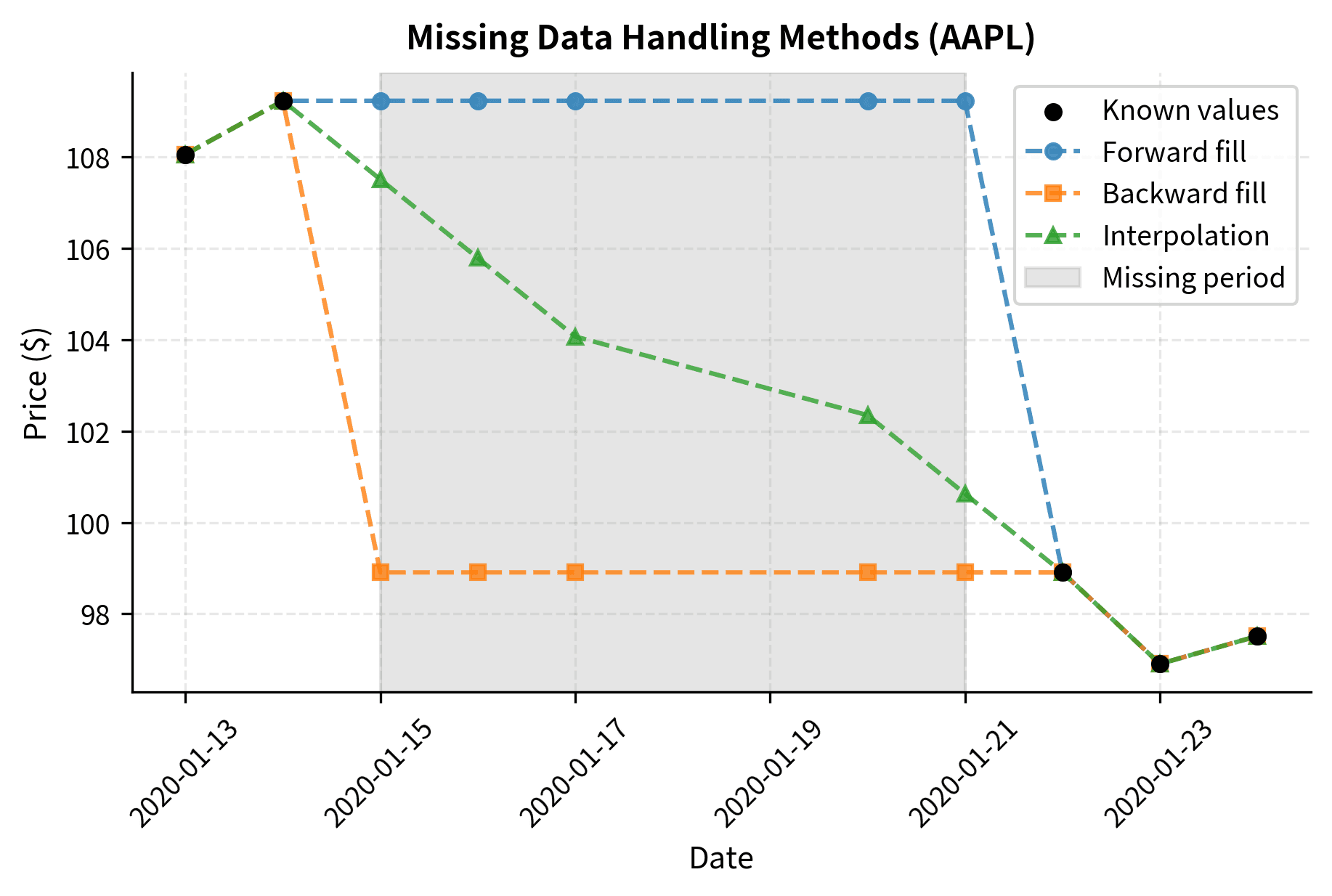
Handling Missing Data

Financial time series frequently contain missing values. Markets close for holidays, securities halt trading, and data feeds occasionally fail. Most analytical functions cannot operate on missing values: your choice of how to fill gaps significantly affects results.

In[17]:
Code
## Create data with some missing values
prices_with_gaps = multi_prices.copy()
prices_with_gaps.iloc[10:15, 0] = np.nan  # Remove some AAPL prices
prices_with_gaps.iloc[20:22, 1] = np.nan  # Remove some GOOGL prices
Out[18]:
Console
Missing values per column:
AAPL     5
GOOGL    2
MSFT     0
dtype: int64

AAPL has 5 missing values and GOOGL has 2, while MSFT has none. These gaps represent periods when we artificially removed data to demonstrate handling techniques. In real data, missing values might indicate trading halts, data feed failures, or corporate actions. Pandas provides several strategies for handling missing data: each strategy has different assumptions and use cases.

In[19]:
Code
## Forward fill: use last known value
ffill_prices = prices_with_gaps.ffill()

## Backward fill: use next known value
bfill_prices = prices_with_gaps.bfill()

## Interpolation: linear interpolation between known values
interp_prices = prices_with_gaps.interpolate(method="linear")

## Drop rows with any missing values
clean_prices = prices_with_gaps.dropna()
Out[20]:
Console
Original rows: 252
After dropna: 245

Missing after forward fill: 0

Dropping missing values reduces the dataset from 252 to approximately 245 rows, losing about 7 days of data. Forward filling eliminates all missing values (0 remaining) by carrying the last known price forward. This preserves all time periods but assumes prices remained constant during gaps. Choose based on your priorities: data completeness versus avoiding assumptions about missing periods. Forward filling is the most common approach for price data because it represents the last known price. However, use caution. It can introduce look-ahead bias if not applied carefully, and long gaps might mask important market events.

Out[21]:
Visualization
Line chart comparing forward fill, backward fill, and linear interpolation methods for handling missing data.
Three strategies for handling missing data in AAPL prices. Forward fill carries the last value forward, backward fill projects the next value backward, and linear interpolation draws a straight line between known values. The shaded region highlights the gap period. Each method reflects different assumptions about price behavior during gaps, with material implications for return calculations and volatility estimation.

Data Manipulation

Beyond loading and time series operations, you need to filter, transform, and aggregate data for analysis. These manipulation skills form the bridge between raw data and actionable insights.

Computing Returns

The most fundamental transformation in quantitative finance is converting prices to returns. Returns have better statistical properties than prices: they are stationary, comparable across securities, and easier to aggregate. Prices drift arbitrarily over time. Returns fluctuate around a stable mean with consistent variance that statistical methods require.

Simple returns measure the percentage price change from one period to the next, representing profit or loss per dollar invested. Use simple returns when calculating actual monetary gains or losses. For an investment that moves from price Pt1P_{t-1} to PtP_t, the simple return is:

Rt=PtPt1Pt1R_t = \frac{P_t - P_{t-1}}{P_{t-1}}

where:

  • RtR_t: simple return at time tt (fractional change, e.g., 0.05 for a 5% gain)
  • PtP_t: price at time tt
  • Pt1P_{t-1}: price at the previous time period

The numerator (PtPt1)(P_t - P_{t-1}) computes dollar profit or loss. For example, a stock moving from 100to100 to 105 gains 5pershare.Dividingby5 per share. Dividing by P_{t-1}normalizesthistoafractionalreturnasaproportionofinitialinvestment.Thisnormalizes this to a fractional return as a proportion of initial investment. This100 to 105moveyields105 move yields 5 / 100=0.05100 = 0.05 (a 5% return). This normalization enables performance comparison across securities with different price levels, since a 5gainmeanssomethingdifferentfora5 gain means something different for a 100 stock versus a $500 stock.

Log returns use the natural logarithm of the price ratio and have attractive mathematical properties. Importantly, log returns sum across time periods:

rt=ln(PtPt1)r_t = \ln\left(\frac{P_t}{P_{t-1}}\right)

where:

  • rtr_t: log return at time tt (continuous compounding rate)
  • PtP_t: price at time tt
  • Pt1P_{t-1}: price at the previous time period t1t-1
  • ln\ln: natural logarithm (base ee)

The logarithm transforms multiplicative price changes to additive returns, bridging discrete and continuous-time financial theory. Since ln(ab)=ln(a)+ln(b)\ln(ab) = \ln(a) + \ln(b), multi-period log returns sum simply. This additive property greatly simplifies calculations involving cumulative returns over many periods.

In[22]:
Code
## Calculate simple returns: (P_t - P_{t-1}) / P_{t-1}
simple_returns = multi_prices.pct_change()

## Calculate log returns: ln(P_t / P_{t-1})
log_returns = np.log(multi_prices / multi_prices.shift(1))
Out[23]:
Console
Simple returns (first 5 rows):
                AAPL     GOOGL      MSFT
2020-01-01       NaN       NaN       NaN
2020-01-02 -0.002765  0.018584 -0.010717
2020-01-03  0.012954 -0.027349 -0.013033
2020-01-06  0.030461 -0.008716 -0.019008
2020-01-07 -0.004683  0.022804  0.001067

Mean daily return:
AAPL    -0.000115
GOOGL    0.000304
MSFT    -0.001639
dtype: float64

The first five daily returns appear for each stock. The first row contains NaN values because we cannot calculate returns without a previous price: computing returns always costs one observation at the beginning of your series. The mean daily returns are small positive values, which is typical for equity returns. These represent the average daily percentage change across the sample period. Positive values indicate an upward drift in prices, though individual days show both gains and losses.

Out[24]:
Visualization
Scatter plot comparing simple returns versus log returns with reference line.
Simple and log returns for AAPL show near-perfect alignment along the diagonal line. Daily returns within a few percent produce virtually identical values for both methods. Deviations only become apparent at extreme price movements beyond typical volatility, confirming their mathematical equivalence for practical trading ranges.
Scatter plot showing difference between simple and log returns.
Difference between simple and log returns in basis points across AAPL daily returns. The discrepancy remains negligible for small returns but grows substantially for larger price movements, confirming the linear approximation r ≈ R holds well for typical daily trading ranges.
Simple vs. Log Returns

::: {.callout-note title="Simple vs. Log Returns"} Simple returns represent the actual percentage gain or loss an investor experiences and aggregate correctly across assets in a portfolio, making them essential for portfolio accounting.

Rp=iwiRiR_p = \sum_i w_i R_i

where:

  • RpR_p: total portfolio return, which is the weighted average of individual returns
  • wiw_i: weight of asset ii in the portfolio, which is the fraction of total portfolio value where iwi=1\sum_i w_i = 1
  • RiR_i: simple return of asset ii over the period
  • i\sum_i: sum over all assets in the portfolio, where index ii ranges over all holdings

This linear aggregation property is why simple returns are preferred for portfolio calculations. Each asset contributes to the portfolio return in proportion to its weight, making attribution straightforward. If you hold 60% stocks and 40% bonds, your portfolio return is simply 0.6 times the stock return plus 0.4 times the bond return.

Log returns aggregate additively across time. To find the total return over multiple periods, simply sum the individual period returns.

r0,T=t=1Trtr_{0,T} = \sum_{t=1}^{T} r_t

where:

  • r0,Tr_{0,T}: cumulative log return from time 0 to time TT
  • rtr_t: log return for period tt, from time t1t-1 to time tt
  • TT: final time period, which is the total number of periods
  • t=1T\sum_{t=1}^{T}: sum over all periods from 1 to TT

This additive property arises because \ln(P_T/P_0) = \ln(P_T/P_{T-1}) + \ln(P_{T-1}/P_{T-2}) + \cdots + \ln(P_1/P_0), making multi-period calculations simple. You can compute the return over any horizon by summing sub-period returns without any compounding adjustments.

For small returns where R<0.1|R| < 0.1, log and simple returns are approximately equal, with r ≈ R, because higher-order terms in the Taylor expansion of ln(1+R) are negligible. Most theoretical models use log returns for mathematical convenience. Portfolio calculations use simple returns for accuracy.

Filtering and Selecting

Boolean indexing extracts data subsets that meet specific criteria, enabling event studies, anomaly detection, and conditional sample construction.

In[25]:
Code
## Find days where AAPL return exceeded 3% in absolute value
large_moves = simple_returns[simple_returns["AAPL"].abs() > 0.03]

## Find days where all three stocks moved in the same direction
same_direction = simple_returns[
    ((simple_returns > 0).all(axis=1)) | ((simple_returns < 0).all(axis=1))
]
Out[26]:
Console
Days with AAPL moves > 3%: 29
Days all stocks moved together: 76

AAPL had large moves exceeding 3% on several days. Synchronized trading days indicate market-wide correlation. More synchronization suggests common factors, while less suggests idiosyncratic behavior. These filtering operations identify periods worth exploring further.

Merging Datasets

Financial analysis often requires combining data from different sources such as prices with fundamentals, returns with factor exposures, or multiple time series with different starting dates.

In[27]:
Code
## Create a market data series (S&P 500 proxy)
market_returns = pd.DataFrame(
    {"market": np.random.randn(252) * 0.01}, index=dates
)

## Join stock and market returns
combined = simple_returns.join(market_returns, how="inner")
Out[28]:
Console
Combined dataset:
                AAPL     GOOGL      MSFT    market
2020-01-01       NaN       NaN       NaN  0.004933
2020-01-02 -0.002765  0.018584 -0.010717  0.001848
2020-01-03  0.012954 -0.027349 -0.013033 -0.008584
2020-01-06  0.030461 -0.008716 -0.019008  0.007003
2020-01-07 -0.004683  0.022804  0.001067 -0.005756

Shape: (252, 4)

Four columns appear (three stock returns plus market return). The shape confirms 252 rows and one new column. The inner join ensures we only keep dates present in both datasets. This prevents alignment errors. This combined view enables calculations like beta estimation or performance attribution that require comparing security returns to market returns. The join method aligns on the index, which works well for time series with the same frequency. For more complex merges, use pd.merge() with explicit key columns.

Summary Statistics

Compute comprehensive statistical summaries to understand your data's characteristics:

In[29]:
Code
## Descriptive statistics
stats = simple_returns.describe()

## Add skewness and kurtosis
stats.loc["skew"] = simple_returns.skew()
stats.loc["kurtosis"] = simple_returns.kurtosis()
Out[30]:
Console
Return statistics:
              AAPL     GOOGL      MSFT
count     251.0000  251.0000  251.0000
mean       -0.0001    0.0003   -0.0016
std         0.0194    0.0179    0.0219
min        -0.0524   -0.0583   -0.0593
25%        -0.0138   -0.0127   -0.0167
50%         0.0012    0.0001   -0.0012
75%         0.0120    0.0122    0.0126
max         0.0771    0.0554    0.0579
skew        0.3076    0.0495    0.0629
kurtosis    0.6112   -0.0350   -0.0393

This view reveals key return distribution characteristics. Mean values show average daily returns, standard deviation quantifies typical volatility, and min/max values show extreme single-day moves. Skewness near zero suggests symmetric distributions, though equity returns typically show slight negative skew. Positive kurtosis indicates fat tails: extreme returns occur more frequently than normal theory predicts. This universal feature matters critically for risk management.

Performance Optimization

Pandas and NumPy are highly optimized, but certain operations become bottlenecks with large datasets or real-time systems. Knowing when and how to optimize matters.

NumPy: The Foundation

NumPy arrays underpin pandas and provide the fastest vectorized operations. Vectorization applies operations to entire arrays at once instead of looping through individual elements. For performance-critical code: working directly with NumPy arrays provides the best performance.

In[31]:
Code
## Extract NumPy arrays from DataFrame
prices_array = multi_prices.values
dates_array = multi_prices.index.values

## Vectorized calculation is much faster than loops
returns_numpy = np.diff(prices_array, axis=0) / prices_array[:-1]
Out[32]:
Console
Array shape: (251, 3)
First few returns:
[[-0.00276529  0.01858437 -0.01071676]
 [ 0.01295377 -0.02734866 -0.01303267]
 [ 0.0304606  -0.00871621 -0.0190078 ]]

One fewer return observation exists per security since returns require two prices. The first few returns display as a matrix showing the initial return calculations for each security. Working with NumPy arrays directly eliminates pandas overhead for pure numerical operations, providing substantial speed improvements. Avoid Python loops over array elements. Apply operations to entire arrays at once to leverage NumPy's compiled C code.

Numba: JIT Compilation for Custom Functions

Just-In-Time (JIT) Compilation

Numba compiles Python functions to machine code at runtime, achieving C-like performance while maintaining Python syntax.

When standard NumPy operations cannot express your custom logic, Numba provides high performance. Write ordinary Python code, and Numba automatically translates it to fast machine code when the function is first called.

In[33]:
Code
from numba import jit


@jit(nopython=True)
def calculate_drawdowns(prices):
    """Calculate drawdown series from price array.

    Drawdown measures the percentage decline from a historical peak. At time $t$, the drawdown is computed as:

    $$
    DD_t = \frac{P_t - \text{Peak}_t}{\text{Peak}_t}
    $$

    where:

    - $DD_t$: drawdown at time $t$ (a non-positive value where more negative numbers indicate larger percentage declines from the peak)
    - $P_t$: current price at time $t$
    - $\text{Peak}_t$: maximum price observed from the start of the series up to and including time $t$ (where $\text{Peak}_t = \max_{s \leq t} P_s$)

    The drawdown is zero when the price equals its historical peak, indicating a new high, and becomes negative when the price falls below the peak. More negative values indicate larger declines. For example, a drawdown of $-0.20$ means the current price is 20% below its historical high. If the peak was $100 and the current price is $80: the drawdown is $(80-100)/100 = -0.20$.
    """
    n = len(prices)
    drawdowns = np.empty(n)
    peak = prices[0]

    for i in range(n):
        if prices[i] > peak:
            peak = prices[i]
        drawdowns[i] = (prices[i] - peak) / peak

    return drawdowns


## Apply to our price data
aapl_prices = multi_prices["AAPL"].values
drawdowns = calculate_drawdowns(aapl_prices)
Out[34]:
Console
Maximum drawdown: -31.50%
Current drawdown: -14.28%

The worst peak-to-trough decline during the period appears in the maximum drawdown. The current drawdown indicates how far the current price sits below the most recent peak. A current drawdown of 0% means we are at a new all-time high: a negative value shows we are below the peak. These metrics are critical for assessing risk and understanding the worst-case historical losses an investment experienced. The @jit(nopython=True) decorator tells Numba to compile the function without falling back to Python objects. This provides the best performance while requiring only NumPy arrays and basic Python types.

Out[35]:
Visualization
Two-panel chart showing AAPL price and drawdown series over time.
AAPL price series with corresponding drawdown over one year of trading. The upper panel shows daily closing prices and the running peak. The lower panel displays drawdown as percentage decline from the peak. Zero drawdown indicates new highs, while negative values show market corrections and how far current prices sit below historical highs. Maximum drawdown marks the worst peak-to-trough decline and is a key risk metric for evaluating investment losses.

Let's compare performance between a pure Python implementation and the Numba version:

In[36]:
Code
import time


def calculate_drawdowns_python(prices):
    """Pure Python implementation for comparison."""
    n = len(prices)
    drawdowns = np.empty(n)
    peak = prices[0]

    for i in range(n):
        if prices[i] > peak:
            peak = prices[i]
        drawdowns[i] = (prices[i] - peak) / peak

    return drawdowns


## Create larger dataset for timing
large_prices = np.cumprod(1 + np.random.randn(100_000) * 0.02) * 100

## Warm up Numba (first call includes compilation time)
_ = calculate_drawdowns(large_prices)

## Time both implementations
start = time.time()
for _ in range(100):
    _ = calculate_drawdowns_python(large_prices)
python_time = time.time() - start

start = time.time()
for _ in range(100):
    _ = calculate_drawdowns(large_prices)
numba_time = time.time() - start
Out[37]:
Console
Pure Python: 1.349 seconds
Numba JIT:   0.006 seconds
Speedup:     208.4x

Numba demonstrates a dramatic performance advantage over pure Python. Pure Python is slower due to interpreter overhead on each iteration. Numba compiles the function to machine code and achieves near-C speeds. The speedup multiplier quantifies the performance gain. This speedup matters for tick data processing, Monte Carlo simulations, and strategy backtesting.

Cython: When You Need More Control

Cython offers another approach to performance optimization by compiling Python-like code to C. While Numba is sufficient for most needs, Cython provides more control over memory management and C library integration when required.

In[61]:
Code
## Cython code (would be in a .pyx file)
## cimport numpy as np
## import numpy as np
#
## def calculate_drawdowns_cython(np.ndarray[np.float64_t, ndim=1] prices):
##     cdef int n = prices.shape[0]
##     cdef np.ndarray[np.float64_t, ndim=1] drawdowns = np.empty(n)
##     cdef double peak = prices[0]
##     cdef int i
#
##     for i in range(n):
##         if prices[i] > peak:
##             peak = prices[i]
##         drawdowns[i] = (prices[i] - peak) / peak
#
##     return drawdowns

Start with pandas and NumPy. Use Numba when profiling reveals bottlenecks due to its simpler workflow. Reserve Cython for C library integration or extreme optimization.

When to Optimize

Follow this approach to optimization:

  1. Write clear code first using pandas and NumPy
  2. Profile to identify actual bottlenecks with tools like %timeit or cProfile
  3. Optimize the critical 10% consuming 90% of runtime
  4. Verify correctness after optimization

Avoid premature optimization: a 50ms versus 5ms backtest difference rarely matters during development. However, a live trading system unable to process market data fast enough will miss opportunities and incur losses.

Data Visualization

Visualizations reveal patterns and relationships in data that remain invisible in raw numbers.

Price Charts

The price chart is the most fundamental financial visualization, showing how prices evolve over time.

In[38]:
Code
import matplotlib.pyplot as plt

plt.rcParams.update(
    {
        "figure.figsize": (6.0, 4.0),
        "figure.dpi": 300,
        "figure.constrained_layout.use": True,
        "font.family": "sans-serif",
        "font.sans-serif": [
            "Noto Sans CJK SC",
            "Apple SD Gothic Neo",
            "DejaVu Sans",
            "Arial",
        ],
        "font.size": 10,
        "axes.titlesize": 11,
        "axes.titleweight": "bold",
        "axes.titlepad": 8,
        "axes.labelsize": 10,
        "axes.labelpad": 4,
        "xtick.labelsize": 9,
        "ytick.labelsize": 9,
        "legend.fontsize": 9,
        "legend.title_fontsize": 10,
        "legend.frameon": True,
        "legend.loc": "best",
        "lines.linewidth": 1.5,
        "lines.markersize": 5,
        "axes.grid": True,
        "grid.alpha": 0.3,
        "grid.linestyle": "--",
        "axes.spines.top": False,
        "axes.spines.right": False,
        "axes.prop_cycle": plt.cycler(
            color=["#1f77b4", "#ff7f0e", "#2ca02c", "#d62728", "#7f7f7f"]
        ),
    }
)

plt.figure()
multi_prices.plot()
plt.xlabel("Date")
plt.ylabel("Price ($)")
plt.title("Stock Prices (2020)")
plt.legend(loc="upper left")
plt.show()

Prices trended upward overall in 2020 with notable volatility. The different y-axis scales make direct comparison difficult. GOOGL trades at higher absolute prices than AAPL or MSFT, so normalization to a common starting point is needed to reveal relative performance.

In[39]:
Code
plt.rcParams.update(
    {
        "figure.figsize": (6.0, 4.0),
        "figure.dpi": 300,
        "figure.constrained_layout.use": True,
        "font.family": "sans-serif",
        "font.sans-serif": [
            "Noto Sans CJK SC",
            "Apple SD Gothic Neo",
            "DejaVu Sans",
            "Arial",
        ],
        "font.size": 10,
        "axes.titlesize": 11,
        "axes.titleweight": "bold",
        "axes.titlepad": 8,
        "axes.labelsize": 10,
        "axes.labelpad": 4,
        "xtick.labelsize": 9,
        "ytick.labelsize": 9,
        "legend.fontsize": 9,
        "legend.title_fontsize": 10,
        "legend.frameon": True,
        "legend.loc": "best",
        "lines.linewidth": 1.5,
        "lines.markersize": 5,
        "axes.grid": True,
        "grid.alpha": 0.3,
        "grid.linestyle": "--",
        "axes.spines.top": False,
        "axes.spines.right": False,
        "axes.prop_cycle": plt.cycler(
            color=["#1f77b4", "#ff7f0e", "#2ca02c", "#d62728", "#7f7f7f"]
        ),
    }
)

plt.figure()
normalized = multi_prices / multi_prices.iloc[0] * 100
normalized.plot()
plt.xlabel("Date")
plt.ylabel("Value (starting = 100)")
plt.title("Normalized Price Performance")
plt.axhline(y=100, color="gray", linestyle="--", alpha=0.5)
plt.legend(loc="upper left")
plt.show()

AAPL and MSFT outperformed GOOGL. The common baseline of 100 reveals relative performance clearly. All three stocks dipped sharply in March 2020, followed by recovery. Normalization is essential when comparing investments with different price levels.

Return Distributions

Return distribution visualizations reveal characteristics critical for quantitative models.

In[40]:
Code
from scipy import stats

plt.rcParams.update(
    {
        "figure.figsize": (6.0, 4.0),
        "figure.dpi": 300,
        "figure.constrained_layout.use": True,
        "font.family": "sans-serif",
        "font.sans-serif": [
            "Noto Sans CJK SC",
            "Apple SD Gothic Neo",
            "DejaVu Sans",
            "Arial",
        ],
        "font.size": 10,
        "axes.titlesize": 11,
        "axes.titleweight": "bold",
        "axes.titlepad": 8,
        "axes.labelsize": 10,
        "axes.labelpad": 4,
        "xtick.labelsize": 9,
        "ytick.labelsize": 9,
        "legend.fontsize": 9,
        "legend.title_fontsize": 10,
        "legend.frameon": True,
        "legend.loc": "best",
        "lines.linewidth": 1.5,
        "lines.markersize": 5,
        "axes.grid": True,
        "grid.alpha": 0.3,
        "grid.linestyle": "--",
        "axes.spines.top": False,
        "axes.spines.right": False,
        "axes.prop_cycle": plt.cycler(
            color=["#1f77b4", "#ff7f0e", "#2ca02c", "#d62728", "#7f7f7f"]
        ),
    }
)

plt.figure()

aapl_returns = simple_returns["AAPL"].dropna()

## Histogram
plt.hist(
    aapl_returns,
    bins=50,
    density=True,
    alpha=0.7,
    edgecolor="black",
    label="Actual returns",
)

## Overlay normal distribution
x = np.linspace(aapl_returns.min(), aapl_returns.max(), 100)
normal_pdf = stats.norm.pdf(x, aapl_returns.mean(), aapl_returns.std())
plt.plot(x, normal_pdf, "r-", linewidth=2, label="Normal distribution")

plt.xlabel("Daily Return")
plt.ylabel("Density")
plt.title("AAPL Daily Return Distribution")
plt.legend()
plt.show()

AAPL returns concentrate near zero compared to the normal distribution (red). The actual distribution has a higher peak near zero and fatter tails than the normal distribution. Extreme returns occur more frequently than normal theory predicts. Fat tails represent a fundamental stylized fact of financial returns.

Out[41]:
Visualization
Q-Q plot showing departure from normality in the tails of the return distribution.
Quantile-quantile plot comparing AAPL daily returns to a normal distribution (red line). The characteristic S-shaped pattern shows extreme returns occur far more frequently than normal theory predicts. This fat-tail phenomenon confirms that constant-parameter risk models systematically underestimate tail risk.

Scatter Plots and Correlations

Correlations between securities matter for portfolio construction and risk management. Scatter plots visualize pairwise relationships by plotting one variable against another.

In[42]:
Code
plt.rcParams.update(
    {
        "figure.figsize": (6.0, 4.0),
        "figure.dpi": 300,
        "figure.constrained_layout.use": True,
        "font.family": "sans-serif",
        "font.sans-serif": [
            "Noto Sans CJK SC",
            "Apple SD Gothic Neo",
            "DejaVu Sans",
            "Arial",
        ],
        "font.size": 10,
        "axes.titlesize": 11,
        "axes.titleweight": "bold",
        "axes.titlepad": 8,
        "axes.labelsize": 10,
        "axes.labelpad": 4,
        "xtick.labelsize": 9,
        "ytick.labelsize": 9,
        "legend.fontsize": 9,
        "legend.title_fontsize": 10,
        "legend.frameon": True,
        "legend.loc": "best",
        "lines.linewidth": 1.5,
        "lines.markersize": 5,
        "axes.grid": True,
        "grid.alpha": 0.3,
        "grid.linestyle": "--",
        "axes.spines.top": False,
        "axes.spines.right": False,
        "axes.prop_cycle": plt.cycler(
            color=["#1f77b4", "#ff7f0e", "#2ca02c", "#d62728", "#7f7f7f"]
        ),
    }
)

plt.figure()

plt.scatter(simple_returns["AAPL"], simple_returns["GOOGL"], alpha=0.5)

## Add regression line
mask = ~(simple_returns["AAPL"].isna() | simple_returns["GOOGL"].isna())
z = np.polyfit(
    simple_returns.loc[mask, "AAPL"], simple_returns.loc[mask, "GOOGL"], 1
)
p = np.poly1d(z)
x_line = np.linspace(
    simple_returns["AAPL"].min(), simple_returns["AAPL"].max(), 100
)
plt.plot(x_line, p(x_line), "r-", label="Regression line")

correlation = simple_returns["AAPL"].corr(simple_returns["GOOGL"])

plt.xlabel("AAPL Daily Return")
plt.ylabel("GOOGL Daily Return")
plt.title(f"Return Correlation: {correlation:.3f}")
plt.legend()
plt.axhline(y=0, color="gray", linestyle="-", alpha=0.3)
plt.axvline(x=0, color="gray", linestyle="-", alpha=0.3)
plt.show()

AAPL and GOOGL returns show a clear positive relationship, moving together on both positive and negative days. The red regression line captures this relationship. Moderate correlation indicates synchronized movement with some independent variation. Perfect correlation (1.0) shows points on the line, while zero correlation shows a random cloud. Lower correlation provides better diversification than highly correlated assets. For multiple securities, A correlation matrix summarizes all pairwise relationships.

In[43]:
Code
plt.rcParams.update(
    {
        "figure.figsize": (6.5, 4.0),
        "figure.dpi": 300,
        "figure.constrained_layout.use": True,
        "font.family": "sans-serif",
        "font.sans-serif": [
            "Noto Sans CJK SC",
            "Apple SD Gothic Neo",
            "DejaVu Sans",
            "Arial",
        ],
        "font.size": 10,
        "axes.titlesize": 11,
        "axes.titleweight": "bold",
        "axes.titlepad": 8,
        "axes.labelsize": 10,
        "axes.labelpad": 4,
        "xtick.labelsize": 9,
        "ytick.labelsize": 9,
        "legend.fontsize": 9,
        "legend.title_fontsize": 10,
        "legend.frameon": True,
        "legend.loc": "best",
        "lines.linewidth": 1.5,
        "lines.markersize": 5,
        "axes.grid": True,
        "grid.alpha": 0.3,
        "grid.linestyle": "--",
        "axes.spines.top": False,
        "axes.spines.right": False,
        "axes.prop_cycle": plt.cycler(
            color=["#1f77b4", "#ff7f0e", "#2ca02c", "#d62728", "#7f7f7f"]
        ),
    }
)

plt.figure()

corr_matrix = simple_returns.corr()
im = plt.imshow(corr_matrix, cmap="RdYlBu_r", vmin=-1, vmax=1)

## Add correlation values as text
for i in range(len(corr_matrix)):
    for j in range(len(corr_matrix)):
        text = plt.text(
            j, i, f"{corr_matrix.iloc[i, j]:.2f}", ha="center", va="center"
        )

plt.xticks(range(len(corr_matrix.columns)), corr_matrix.columns)
plt.yticks(range(len(corr_matrix.index)), corr_matrix.index)
plt.title("Return Correlation Matrix")
plt.colorbar(im, label="Correlation")
plt.show()

The diagonal shows perfect correlation, 1.0, while off-diagonal values reveal relationships between securities. All pairs show positive correlations, indicated by warm colors, with varying strength across pairs. Market-wide correlation reduces diversification benefits when constructing portfolios from similar sectors.

Rolling Statistics

Financial relationships are not static: rolling correlations reveal how relationships evolve over time.

In[44]:
Code
plt.rcParams.update(
    {
        "figure.figsize": (6.0, 4.0),
        "figure.dpi": 300,
        "figure.constrained_layout.use": True,
        "font.family": "sans-serif",
        "font.sans-serif": [
            "Noto Sans CJK SC",
            "Apple SD Gothic Neo",
            "DejaVu Sans",
            "Arial",
        ],
        "font.size": 10,
        "axes.titlesize": 11,
        "axes.titleweight": "bold",
        "axes.titlepad": 8,
        "axes.labelsize": 10,
        "axes.labelpad": 4,
        "xtick.labelsize": 9,
        "ytick.labelsize": 9,
        "legend.fontsize": 9,
        "legend.title_fontsize": 10,
        "legend.frameon": True,
        "legend.loc": "best",
        "lines.linewidth": 1.5,
        "lines.markersize": 5,
        "axes.grid": True,
        "grid.alpha": 0.3,
        "grid.linestyle": "--",
        "axes.spines.top": False,
        "axes.spines.right": False,
        "axes.prop_cycle": plt.cycler(
            color=["#1f77b4", "#ff7f0e", "#2ca02c", "#d62728", "#7f7f7f"]
        ),
    }
)

## | layout-ncol: 1
plt.figure()

## Rolling correlation
rolling_corr = simple_returns["AAPL"].rolling(60).corr(simple_returns["GOOGL"])
plt.plot(rolling_corr.index, rolling_corr.values)
plt.ylabel("Correlation")
plt.title("60-Day Rolling Correlation: AAPL vs GOOGL")
plt.axhline(y=0, color="gray", linestyle="--", alpha=0.5)
plt.show()

plt.figure()
rolling_vol = simple_returns["AAPL"].rolling(20).std() * np.sqrt(252)
plt.plot(rolling_vol.index, rolling_vol.values)
plt.xlabel("Date")
plt.ylabel("Annualized Volatility")
plt.title("20-Day Rolling Volatility: AAPL")
plt.show()

The relationship between AAPL and GOOGL fluctuates from weak to strong positive correlation, indicating varying degrees of synchronized movement. The rolling volatility plot shows AAPL's risk profile varies significantly throughout the year and spikes in March 2020 during COVID-19 volatility. Time-varying metrics demonstrate that constant-parameter models fail to capture reality. Static models can break down dramatically when market conditions shift.

Limitations and Practical Considerations

Pandas prioritizes convenience, but row-wise iteration and complex conditional logic can be orders of magnitude slower than necessary. Performance optimization techniques using Numba address many of these bottlenecks. Optimization requires careful attention to data types: unexpected inputs can introduce subtle bugs.

Data quality issues pervade financial datasets: missing values from trading halts, stock splits that distort price series, survivorship bias in historical databases, and timestamp inconsistencies across data sources. The fillna() and interpolate() methods address these issues: the right approach depends on the data's context. Forward-filling works for portfolio calculations but risks look-ahead bias in backtests.

Effective financial visualization balances art and science and requires customization for specific audiences and purposes. A chart for internal research can prioritize information density, while a client presentation might emphasize clarity and visual appeal. Matplotlib offers extensive customization, though mastering it takes practice.

These patterns assume datasets that fit in memory. Production systems handling tick data or large security universes require different architectures with databases, chunked processing, and distributed computing. Subsequent chapters will build on these foundations while introducing more sophisticated analytical techniques.

Summary

This chapter covered essential data handling and visualization skills for quantitative finance.

Data loading and management: Pandas provides a unified interface for financial data from multiple sources. A DatetimeIndex enables time-based slicing, resampling, and rolling calculations.

Time series operations: Resampling converts between frequencies, rolling windows compute statistics, and proper missing data handling prevents errors.

Data manipulation: Convert prices to returns, then filter, merge, and summarize data for analysis.

Performance optimization: Use Numba's JIT compilation when pandas becomes a bottleneck, achieving dramatic speedups while maintaining Python syntax. Start with clear code, profile to find bottlenecks, and optimize only where needed.

Visualization: Charts reveal patterns invisible in summary statistics. Use price charts, distributions, correlations, and rolling metrics to explore data.

You will repeatedly use these data handling patterns when calculating risk, building factor models, or training machine learning models.

Quiz

Ready to test your understanding? Take this quick quiz to reinforce what you've learned about data handling and visualization in quantitative finance.

Loading component...

Reference

BIBTEXAcademic
@misc{datahandlingvisualizationpythonforquantfinance, author = {Michael Brenndoerfer}, title = {Data Handling & Visualization: Python for Quant Finance}, year = {2025}, url = {https://mbrenndoerfer.com/writing/data-handling-visualization-quantitative-finance-python}, organization = {mbrenndoerfer.com}, note = {Accessed: 2025-12-30} }
APAAcademic
Michael Brenndoerfer (2025). Data Handling & Visualization: Python for Quant Finance. Retrieved from https://mbrenndoerfer.com/writing/data-handling-visualization-quantitative-finance-python
MLAAcademic
Michael Brenndoerfer. "Data Handling & Visualization: Python for Quant Finance." 2025. Web. 12/30/2025. <https://mbrenndoerfer.com/writing/data-handling-visualization-quantitative-finance-python>.
CHICAGOAcademic
Michael Brenndoerfer. "Data Handling & Visualization: Python for Quant Finance." Accessed 12/30/2025. https://mbrenndoerfer.com/writing/data-handling-visualization-quantitative-finance-python.
HARVARDAcademic
Michael Brenndoerfer (2025) 'Data Handling & Visualization: Python for Quant Finance'. Available at: https://mbrenndoerfer.com/writing/data-handling-visualization-quantitative-finance-python (Accessed: 12/30/2025).
SimpleBasic
Michael Brenndoerfer (2025). Data Handling & Visualization: Python for Quant Finance. https://mbrenndoerfer.com/writing/data-handling-visualization-quantitative-finance-python