

Explore the empirical properties of financial returns: heavy tails, volatility clustering, and the leverage effect. Essential patterns for risk modeling.
Choose your expertise level to adjust how many terms are explained. Beginners see more tooltips, experts see fewer to maintain reading flow. Hover over underlined terms for instant definitions.
Stylized Facts of Financial Returns
When you examine financial return data from different assets, markets, and time periods, certain empirical regularities appear again and again. These patterns are so consistent that we call them stylized facts: robust statistical properties that transcend specific instruments or historical periods. Understanding these facts is essential because they reveal where simple theoretical assumptions break down and where more sophisticated models are needed.
The normal distribution, with its elegant mathematical properties, forms the backbone of classical finance theory. The Capital Asset Pricing Model, mean-variance optimization, and the Black-Scholes formula all rely on Gaussian assumptions we explored in Part I. Yet when you analyze actual return data, you discover systematic departures from normality that have profound implications for risk management, derivative pricing, and portfolio construction.
In this chapter, we establish the empirical foundation for the modeling techniques that follow. Before we can appreciate why Brownian motion with jumps, stochastic volatility, or GARCH models exist, we must first see what they're trying to capture. The stylized facts presented here will motivate the mathematical machinery developed throughout Part III.
Linear Returns vs. Log Returns
Before examining distributional properties, we need to clarify how returns are measured. Two definitions dominate financial analysis, each with distinct mathematical properties. The choice between them affects not only how we interpret results but also which statistical tools we can legitimately apply. Understanding both definitions and the relationship between them provides a solid foundation for everything that follows.
Simple (arithmetic) returns measure the percentage change in price. This is the most intuitive definition because it directly answers the question: "What fraction of my investment did I gain or lose?" When you say a stock "went up 5%," you typically mean the simple return was 0.05.
where:
- : simple return at time
- : price of the asset at time
- : price of the asset at time
The numerator captures the dollar change in price, while dividing by the initial price normalizes this change to a percentage. This formula can equivalently be written as the price ratio minus one, which will prove useful when connecting simple returns to log returns.
Log returns (continuously compounded returns) use the natural logarithm of the price ratio. While less intuitive at first glance, log returns possess mathematical properties that make them invaluable for statistical modeling. The key insight is that taking the logarithm transforms multiplication into addition, which dramatically simplifies multi-period analysis.
where:
- : log return at time
- : natural logarithm function
- : price of the asset at time
- : price of the asset at time
The second form of this equation reveals an elegant interpretation: the log return equals the change in the logarithm of price. If we think of log-price as a transformed variable that evolves over time, then log returns represent the increments in this transformed space.
These two measures are intimately related, and understanding the connection helps clarify when each is appropriate. Since the simple return satisfies , we can derive the relationship by taking the natural logarithm of both sides. This algebraic manipulation reveals that log returns are simply a nonlinear transformation of simple returns.
where:
- : log return at time
- : price of the asset at time
- : price of the asset at time
- : simple return at time
- : natural logarithm function
For small returns (typical of daily data), they are approximately equal since when is close to zero. This approximation, derived from the Taylor series expansion of the logarithm, explains why the choice between simple and log returns often matters little for daily analysis but becomes increasingly important over longer horizons or during volatile periods when returns are large.
Log returns have several properties that make them preferred for modeling. Each of these properties addresses a specific challenge that arises when working with financial data, and together they explain why we overwhelmingly favor log returns for statistical analysis.
-
Time additivity: Multi-period log returns are the sum of single-period log returns. If are daily log returns, the total return over days is simply . Simple returns require compounding: . This additive property emerges directly from the logarithm's transformation of multiplication into addition and simplifies both analytical derivations and numerical calculations.
-
Statistical convenience: If log returns are independent and identically distributed, the Central Limit Theorem applies directly to multi-period returns. Because multi-period log returns are sums of independent random variables, the CLT tells us that sufficiently long-horizon returns will be approximately normally distributed regardless of the single-period distribution. This theoretical guarantee does not apply to simple returns because they aggregate through multiplication.
-
Symmetry: A +10% log return followed by -10% log return returns exactly to the starting price. With simple returns, +10% followed by -10% leaves you with a net loss. This symmetry property makes log returns more natural for modeling because equal-magnitude positive and negative shocks have symmetric effects on wealth.
-
No lower bound violation: Log returns can range from to , avoiding the awkward lower bound of -100% that simple returns face. Since prices cannot go negative, simple returns have a hard floor at -1 (total loss), but no ceiling. Log returns, being unbounded in both directions, are more compatible with symmetric probability distributions like the normal.
Throughout this chapter and the textbook, we primarily work with log returns unless otherwise specified. Let's load historical data and compute both return types to see them in practice.
The correlation between simple and log returns is essentially 1.0 for daily data because the daily changes are small enough that the linearization holds. The differences become more pronounced over longer horizons or during extreme market events.
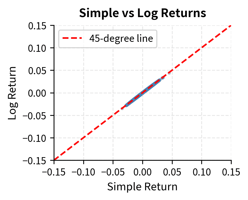
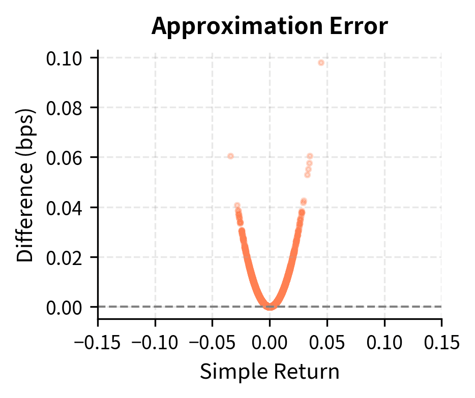
The scatter plot confirms that for typical daily returns (within a few percent), the two measures are nearly identical. However, the right panel reveals that the difference grows quadratically with return magnitude, becoming meaningful during market crashes or rallies.
Heavy Tails and Excess Kurtosis
The most striking departure from normality in financial returns is the presence of heavy tails (also called "fat tails"). Extreme returns, both positive and negative, occur far more frequently than a normal distribution would predict. This observation has profound implications for risk management because it means that relying on normal distribution assumptions will systematically underestimate the probability of large losses. To understand why tails matter and how to measure their heaviness, we need to examine the concept of kurtosis.
Measuring Tail Heaviness with Kurtosis
Kurtosis quantifies the weight in the tails of a distribution relative to a normal distribution. Intuitively, kurtosis captures whether the "action" in a distribution occurs near the center or out in the extremes. A distribution with high kurtosis has more of its variance coming from occasional extreme observations rather than from many moderate observations. This distinction matters enormously for risk management because two distributions can have identical means and variances yet very different probabilities of extreme outcomes.
For a random variable with mean and standard deviation , kurtosis is defined as:
where:
- : kurtosis of random variable
- : expected value operator
- : random variable representing returns
- : mean of
- : standard deviation of
The formula computes the fourth moment of the standardized distribution. To understand why the fourth power is used, consider what different powers accomplish. The first power gives us the mean, measuring central tendency. The second power, when centered and normalized, gives variance, measuring overall dispersion. The third power gives skewness, measuring asymmetry. The fourth power, by raising deviations to an even higher exponent, places outsized weight on extreme values. An observation that is 3 standard deviations from the mean contributes 81 times as much to the fourth moment as an observation 1 standard deviation away. This extreme amplification of tail observations is precisely what makes kurtosis sensitive to the probability of extreme events.
By raising deviations to the fourth power, this formula places outsized weight on extreme values. Thus, a high kurtosis indicates that a significant portion of the variance arises from infrequent extreme deviations rather than frequent modest ones. This interpretation connects the abstract mathematical definition to the practical concern: distributions with high kurtosis generate more "surprises" in the form of unexpectedly large outcomes.
The normal distribution has kurtosis of exactly 3. This value serves as a natural benchmark because the normal distribution arises so frequently as a limiting distribution. Excess kurtosis subtracts this baseline to create a measure centered at zero for the normal case:
where:
- : kurtosis as defined above
- : kurtosis of a standard normal distribution
Subtracting 3 makes interpretation straightforward: positive excess kurtosis means heavier tails than normal, zero means normal-like tails, and negative excess kurtosis (rarely observed in financial data) means lighter tails than normal.
A distribution with positive excess kurtosis is called leptokurtic. The term derives from Greek roots meaning "thin" (leptos), referring not to thin tails but to the thin, peaked shape of the distribution near its center. Such distributions have:
- More probability mass concentrated near the mean
- Less probability in the "shoulders" of the distribution
- Much more probability in the extreme tails
This combination creates a characteristic shape: tall and narrow in the center with extended tails. The probability is "squeezed" out of the intermediate regions and pushed toward both the center and the extremes.
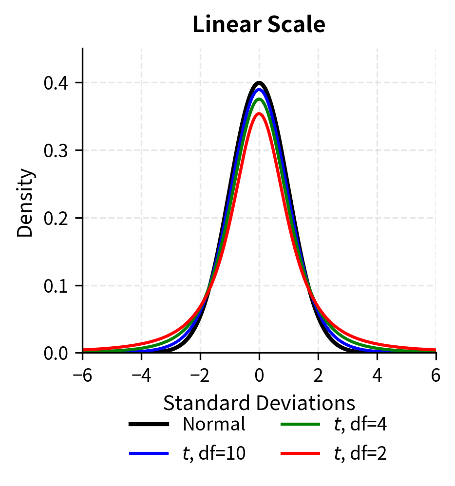
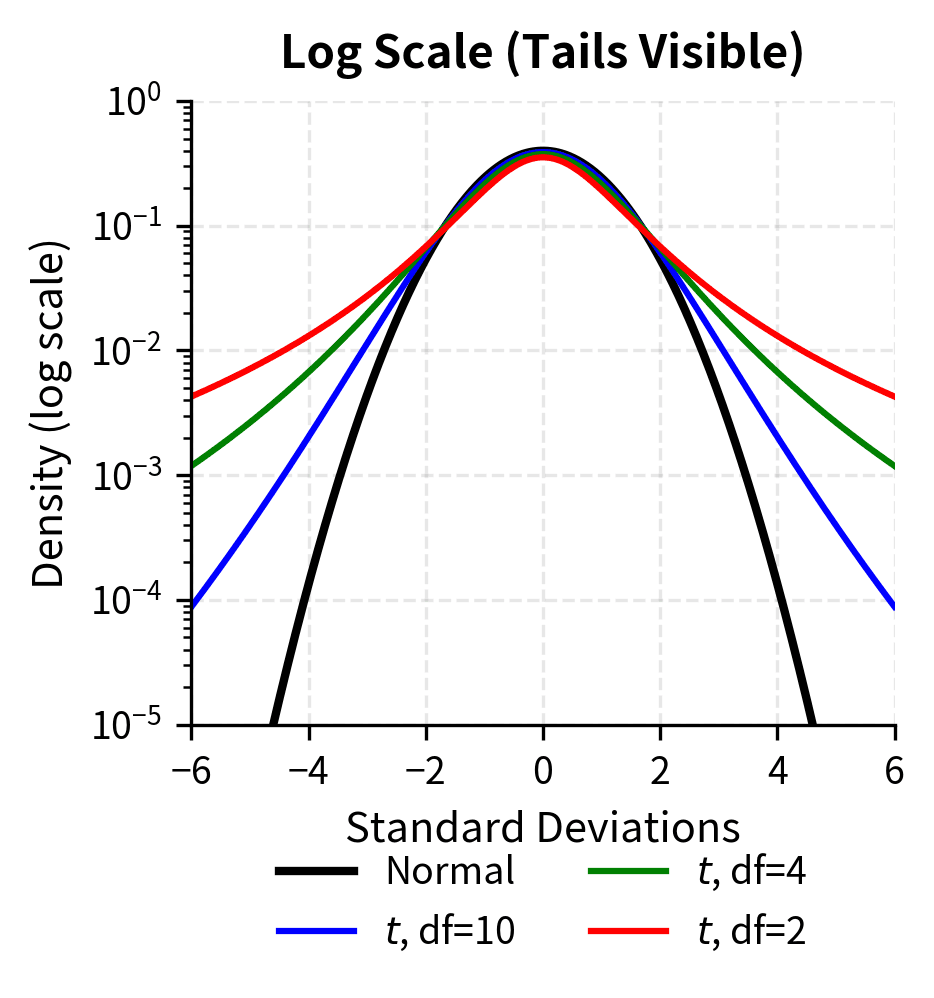
The log-scale plot makes the tail differences dramatic. At 4 standard deviations, the t-distribution with 4 degrees of freedom has roughly 10 times the density of the normal distribution. This translates directly to more frequent extreme events.
Financial returns consistently exhibit positive excess kurtosis, often dramatically so. Let's quantify this for our S&P 500 data.
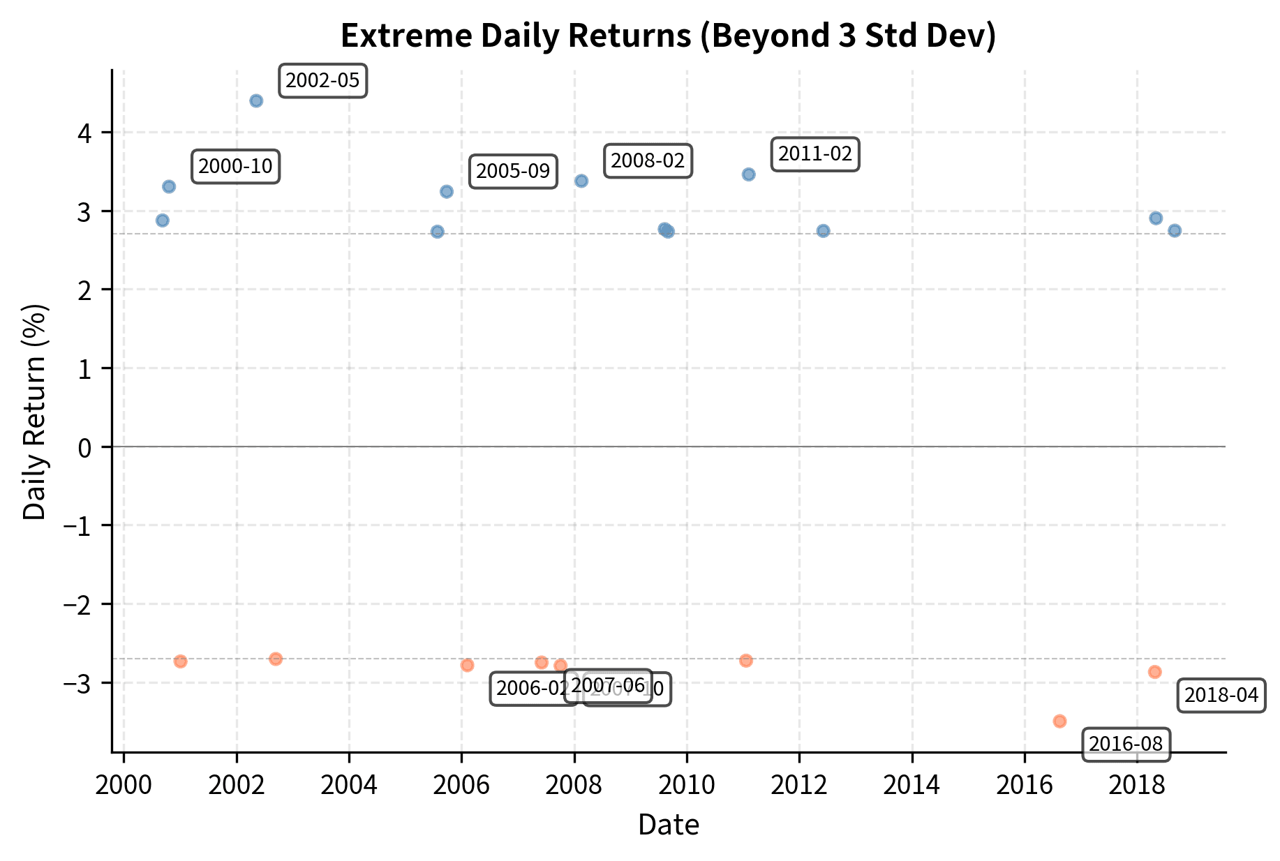
The excess kurtosis of approximately 10 or higher indicates that extreme events are far more common than the normal distribution predicts. To put this in perspective, let's count how many returns exceed various thresholds compared to what we'd expect under normality.
The ratio column reveals the essence of heavy tails. Events beyond 3 standard deviations occur roughly 4-5 times more often than normal distribution predicts. Beyond 4 standard deviations, the ratio becomes even more extreme. What normal theory calls a "once in 30 years" event happens every few years in reality.
Visualizing Heavy Tails
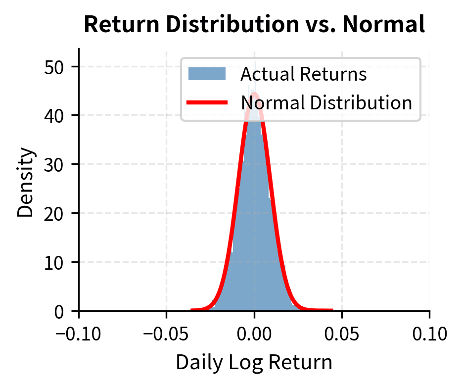
A histogram comparison against the normal distribution makes the heavy tails visually apparent.
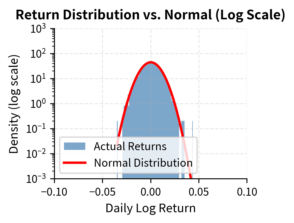
The log-scale plot on the right is particularly revealing. Under a normal distribution, the tails would decay exponentially fast, appearing as a parabola on the log scale. Instead, actual returns show much slower decay, remaining elevated far into the tails.
Q-Q Plots for Tail Analysis
A quantile-quantile (Q-Q) plot provides another powerful diagnostic. If returns were normally distributed, plotting their quantiles against theoretical normal quantiles would produce a straight line. Deviations reveal where the actual distribution differs.
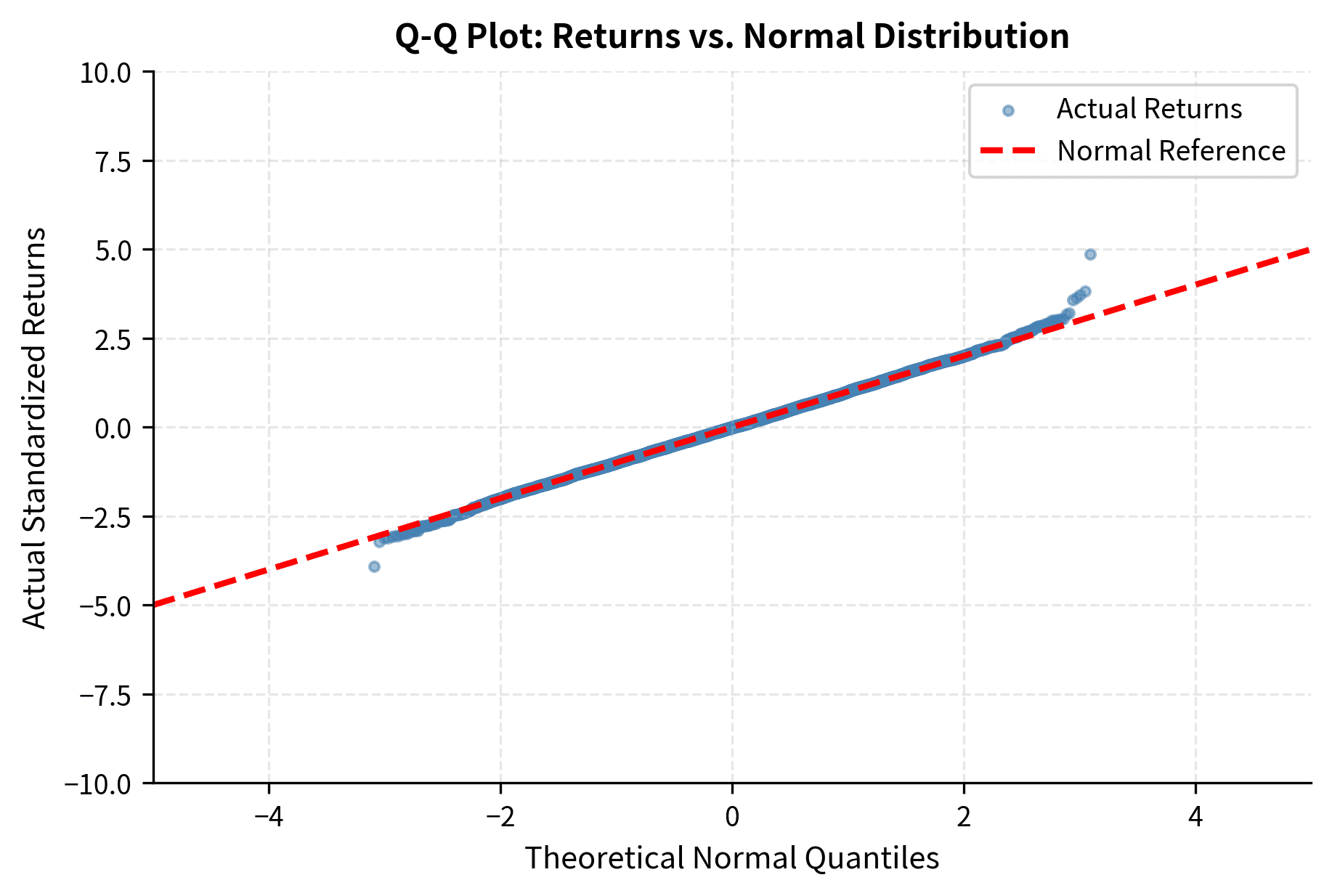
The S-shape in the Q-Q plot is the signature of heavy tails. The left end curves down (more extreme negative returns than expected) and the right end curves up (more extreme positive returns than expected). If returns were normal, points would follow the dashed line throughout.
Skewness: Asymmetry in Returns
While heavy tails occur in both directions, financial returns often show asymmetry: the left tail (losses) tends to be heavier than the right tail (gains). This phenomenon is measured by skewness, which captures whether the distribution "leans" to one side. Understanding skewness is crucial for risk management because asymmetric distributions require different treatment of upside and downside risk.
For a random variable with mean and standard deviation , skewness is defined as the third standardized moment:
where:
- : skewness of random variable
- : expected value operator
- : random variable representing returns
- : mean of
- : standard deviation of
The third power serves a specific purpose in this formula. Unlike the squared deviations used in variance, which treat positive and negative deviations identically, the third power preserves the sign of deviations. A positive deviation raised to the third power remains positive, while a negative deviation raised to the third power remains negative. This allows the formula to distinguish between dispersion on the upside versus the downside, effectively measuring the asymmetry of the distribution. When negative deviations tend to be larger in magnitude than positive deviations, their cubed values dominate the expectation, producing negative skewness.
The normal distribution has skewness of zero (perfect symmetry). Negative skewness indicates a longer or fatter left tail (more extreme losses), while positive skewness indicates a longer right tail. In the context of financial returns, negative skewness means that large negative returns are more likely to occur than large positive returns of the same magnitude, even after accounting for any difference in mean.
A measure of asymmetry in a probability distribution. Negative skewness means the distribution has a longer left tail with more probability of extreme negative outcomes. Positive skewness means the distribution has a longer right tail.
Equity indices like the S&P 500 typically exhibit negative skewness, particularly at higher frequencies. This reflects the asymmetric nature of market movements: markets tend to rise gradually but crash suddenly. The 1987 Black Monday crash (-20.5% in one day) is more extreme than any single-day gain in S&P 500 history.
The asymmetry has important implications for risk management. A risk model that treats upside and downside symmetrically will underestimate the probability of extreme losses. This is why measures like Value at Risk (VaR) and Expected Shortfall that focus specifically on the loss tail are critical.
Volatility Clustering
Perhaps the most practically important stylized fact is volatility clustering: large returns (positive or negative) tend to be followed by large returns, and small returns tend to be followed by small returns. Markets exhibit periods of calm punctuated by periods of turbulence. This phenomenon violates the assumption that each day's return is drawn independently from the same distribution, and it has profound implications for forecasting risk.
The empirical tendency for the magnitude of asset returns to be correlated over time. Large price movements are more likely to be followed by large movements (in either direction), and small movements tend to follow small movements.
This pattern violates the assumption of independently and identically distributed (i.i.d.) returns. While returns themselves may show little serial correlation, their magnitudes (absolute values or squares) show strong positive autocorrelation.
Visualizing Volatility Clustering
A time series plot of returns immediately reveals volatility clustering.
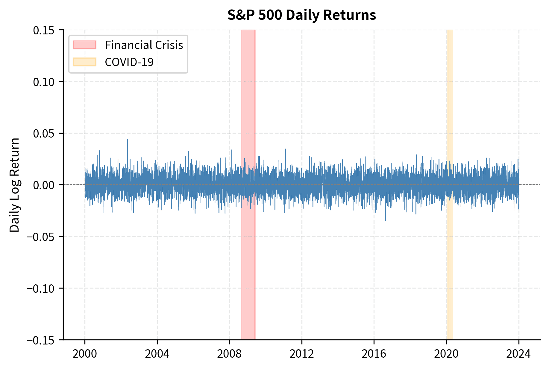
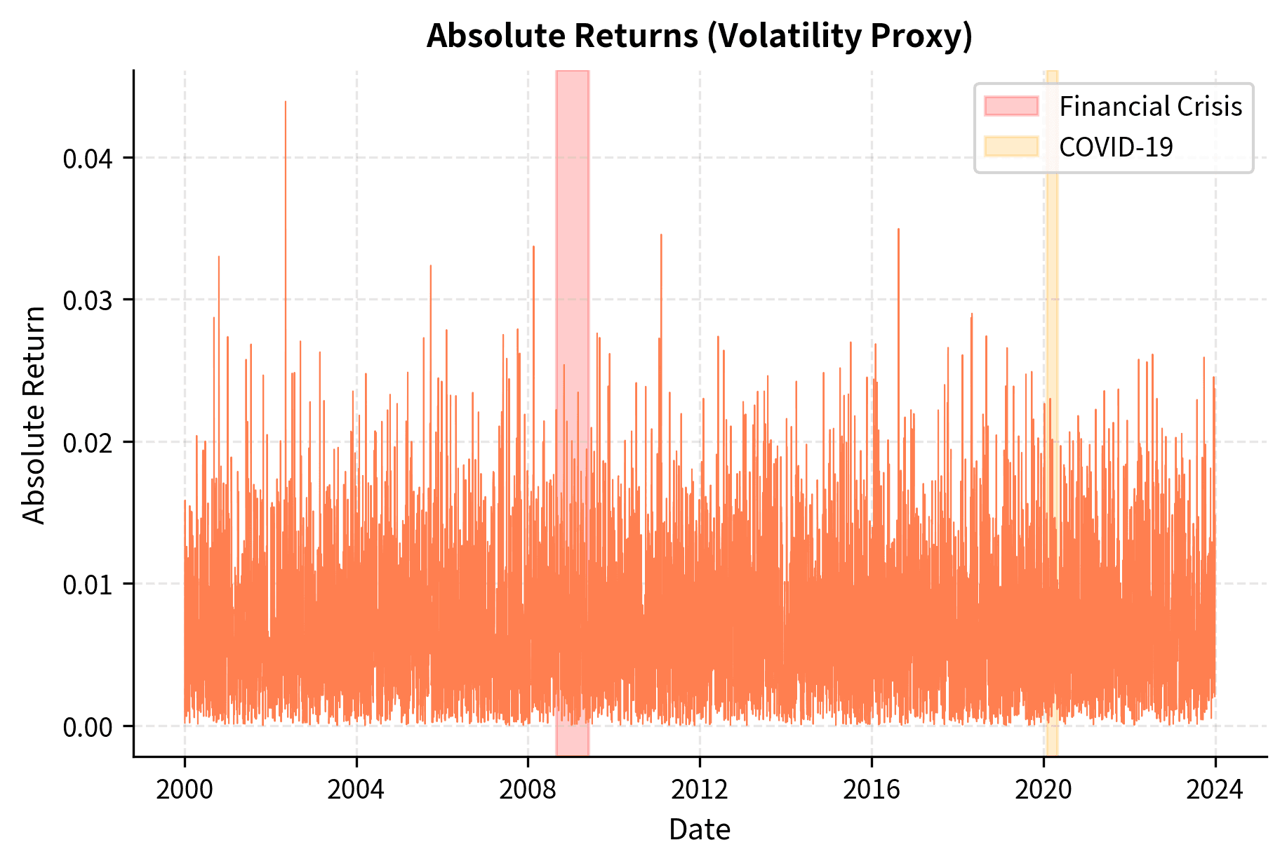
The clustering is unmistakable. The 2008 financial crisis and March 2020 COVID crash show prolonged periods of elevated volatility, followed by gradual calming. This is not random. There's genuine memory in the volatility process.
Quantifying Clustering with Autocorrelation
We can quantify volatility clustering by computing autocorrelation functions for returns and squared returns. Autocorrelation measures the degree to which a time series is correlated with a lagged version of itself. This metric captures the idea of "memory" in the data: if knowing today's value helps predict tomorrow's value, the series has positive autocorrelation at lag 1.
The autocorrelation at lag measures the correlation between a time series and its -period lagged version:
where:
- : autocorrelation coefficient at lag
- : covariance operator
- : variance operator
- : return at time
- : return at time
The numerator measures how returns at time co-move with returns from periods earlier. Dividing by the variance normalizes this metric to a range of , making it comparable to a standard correlation coefficient. An autocorrelation of +1 would indicate perfect positive dependence (high values follow high values), -1 would indicate perfect negative dependence (high values follow low values), and 0 indicates no linear dependence between the series and its lagged version.
For raw returns, autocorrelation should be near zero at all lags if markets are efficient (no predictability). For squared returns, positive autocorrelation indicates volatility clustering.
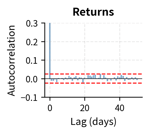
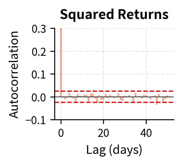
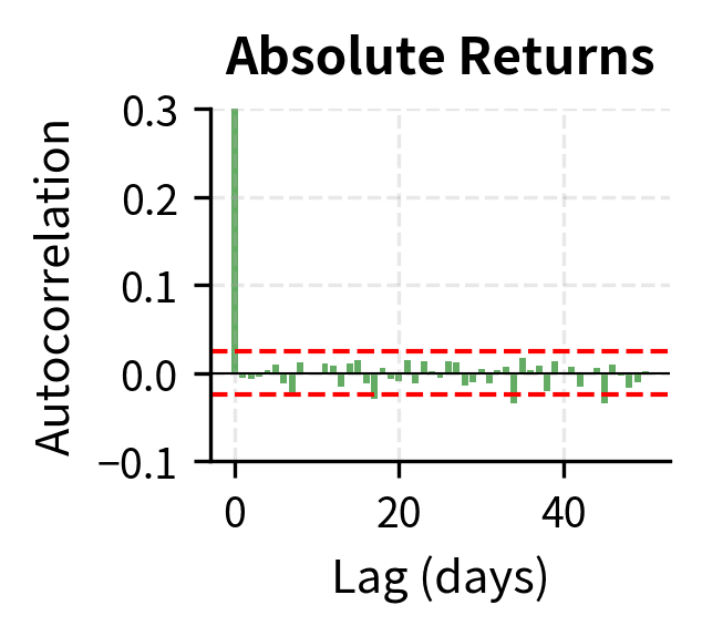
The contrast is stark. Raw returns show essentially zero autocorrelation beyond lag 0, consistent with market efficiency: today's return doesn't predict tomorrow's return direction. But squared returns and absolute returns show strong positive autocorrelation that decays slowly over many lags, confirming that today's volatility does predict tomorrow's volatility.
The slow decay of volatility autocorrelation has important implications. Volatility "shocks" persist for extended periods. A single turbulent day doesn't mean tomorrow will be turbulent, but an entire turbulent week suggests elevated volatility will continue. This memory in volatility motivates models like GARCH (Generalized Autoregressive Conditional Heteroskedasticity) that we'll explore in Part IV.
The Leverage Effect
A subtler but important stylized fact is the leverage effect: negative returns tend to increase future volatility more than positive returns of the same magnitude. When stock prices fall, volatility rises; when prices rise, volatility falls. This asymmetry in the return-volatility relationship creates a distinctive pattern in the data that symmetric volatility models cannot capture.
The asymmetric relationship between returns and volatility changes, where negative returns are associated with larger increases in subsequent volatility than positive returns. Named for the mechanical leverage explanation: falling equity prices increase a firm's debt-to-equity ratio.
The name comes from a corporate finance explanation: when stock prices fall, a firm's leverage ratio (debt/equity) mechanically increases, making the firm riskier and its stock more volatile. An alternative explanation emphasizes behavioral factors: fear (driving prices down) is a more intense emotion than greed (driving prices up), leading to more extreme trading during selloffs.
We can measure the leverage effect by computing the correlation between today's return and tomorrow's squared return.
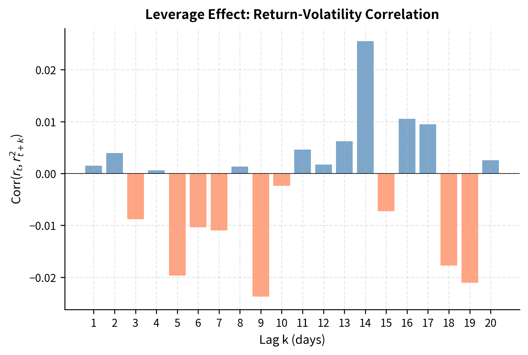
The negative correlations confirm the leverage effect: a negative return today (falling prices) is associated with higher squared returns (higher volatility) in subsequent days. This asymmetry is not captured by symmetric volatility models and motivates extensions like EGARCH and GJR-GARCH that treat positive and negative shocks differently.
Aggregational Gaussianity
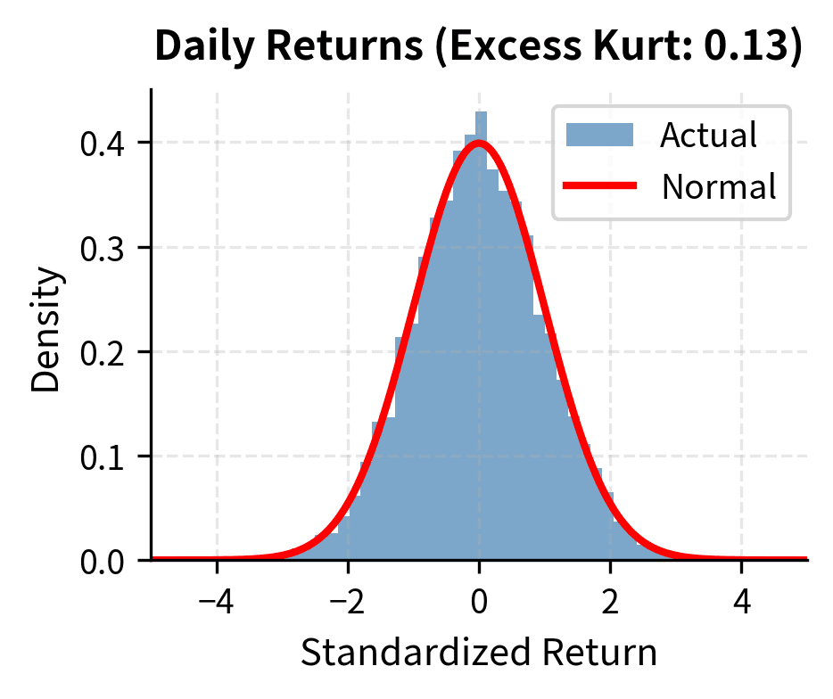
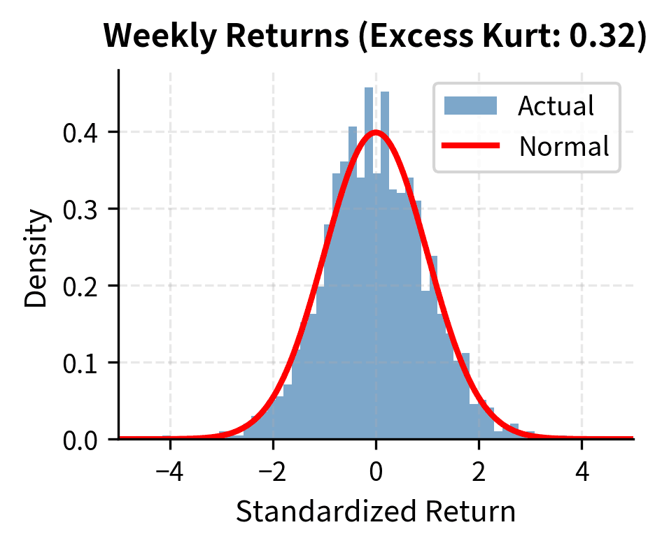
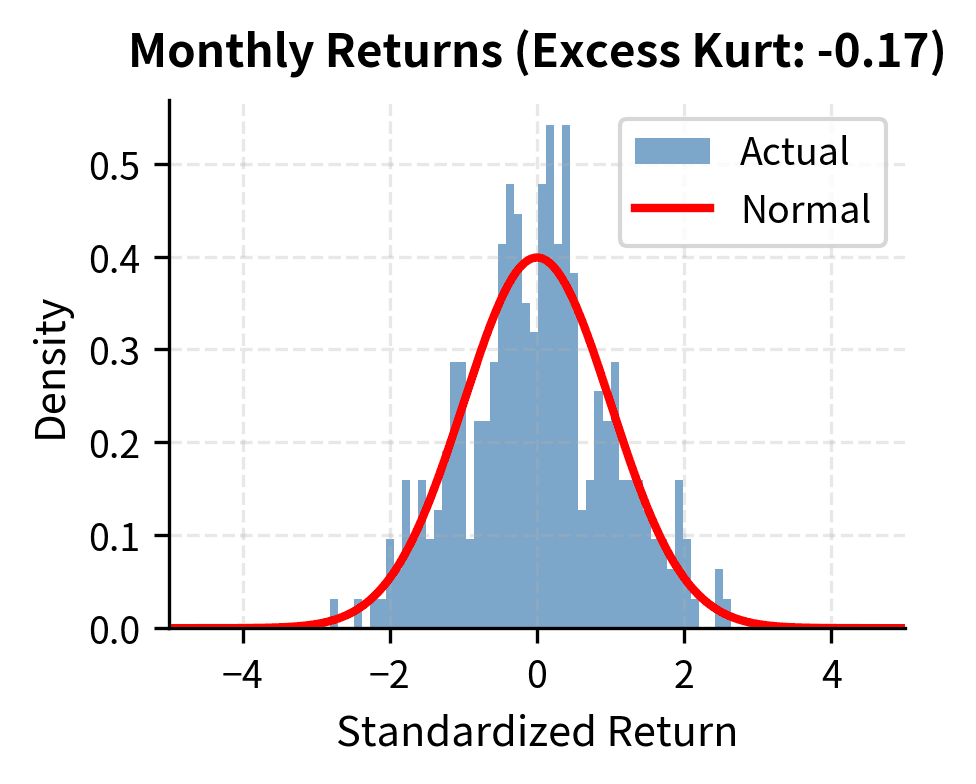
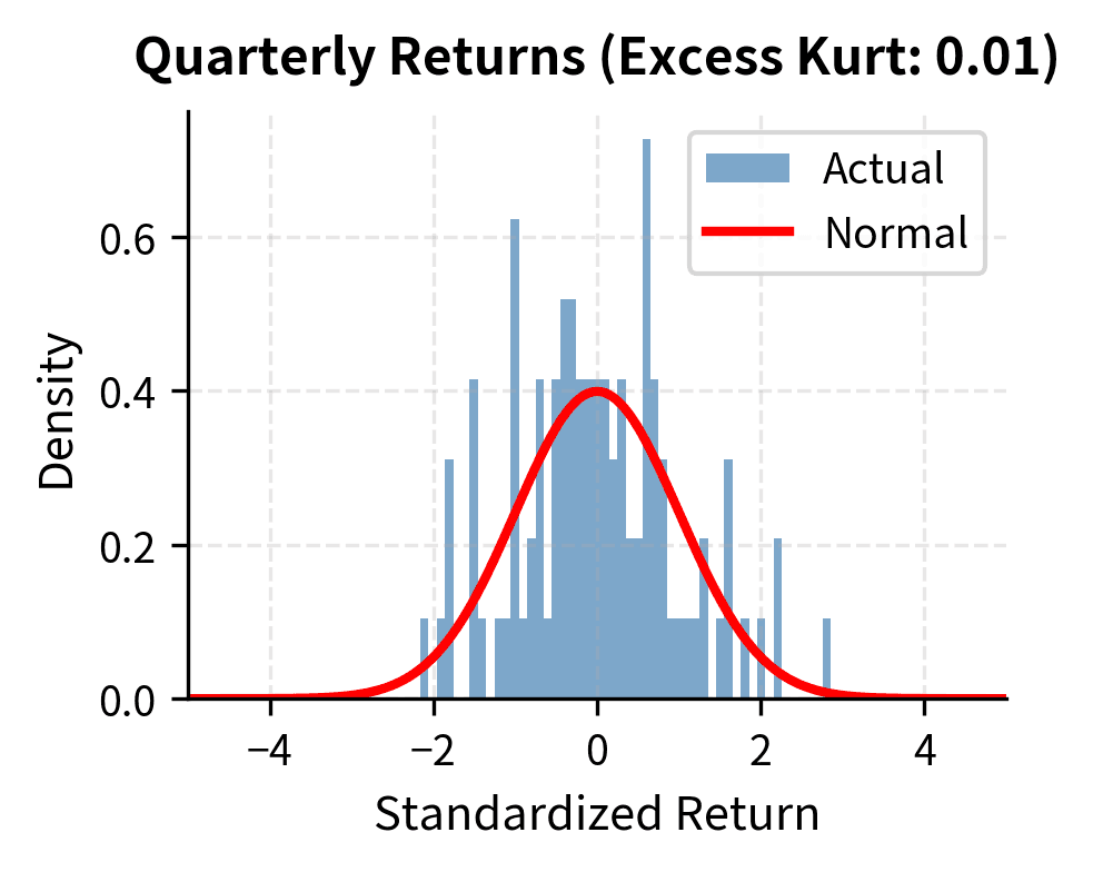
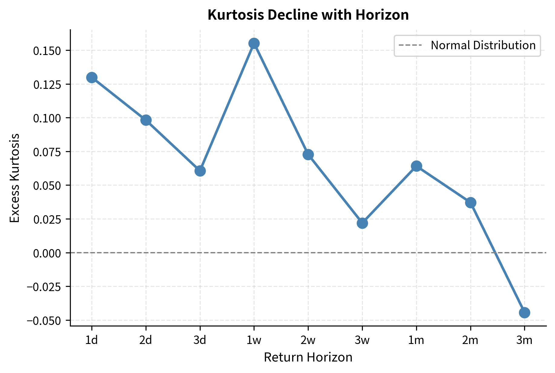
An intriguing stylized fact is that while daily returns are highly non-normal, returns over longer horizons become progressively more Gaussian. This phenomenon, called aggregational Gaussianity, results from a form of the Central Limit Theorem operating on the time-aggregated returns.
As you increase the measurement interval from daily to weekly to monthly to annual, the distribution of returns converges toward normality. Heavy tails diminish, and excess kurtosis declines toward zero.
The excess kurtosis drops substantially as we move from daily to quarterly returns. This has practical implications: while daily VaR requires non-normal distributions, annual risk assessments can often rely more heavily on Gaussian approximations.
Absence of Linear Autocorrelation
We noted earlier that raw returns show little autocorrelation. This is a stylized fact in its own right, reflecting the weak-form efficient market hypothesis: past prices should not predict future returns. If they did, you would exploit the pattern until it disappeared.
However, "little" autocorrelation is not zero autocorrelation. Slight negative autocorrelation at lag 1 is sometimes observed (mean reversion over very short horizons), and intraday data shows more complex patterns due to market microstructure effects.
The Ljung-Box test typically fails to reject the null hypothesis of no autocorrelation for raw returns but strongly rejects it for squared returns. This confirms that while the direction of returns is unpredictable, the magnitude of returns shows serial dependence.
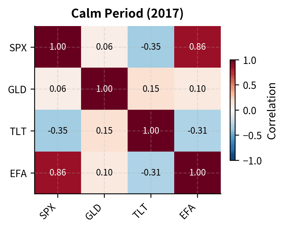
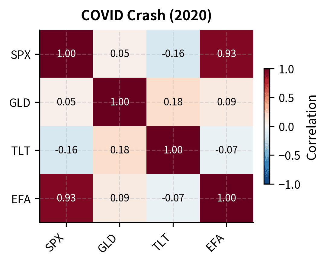
Correlation Breakdown in Crises
A final stylized fact with profound implications for portfolio management: correlations between assets increase during market stress. The diversification benefits you count on in normal times partially evaporate precisely when you need them most.
This isn't merely an artifact of increased volatility. Even controlling for volatility, the underlying correlation structure shifts during crises. Assets that seemed uncorrelated become highly correlated when panic sets in.
During the financial crisis and COVID crash, correlations between S&P 500 and other assets shift compared to calm periods. The correlation between US and international equities (EFA) typically spikes during crises, reducing the diversification benefit of global equity allocation exactly when losses are largest.
Implications for Financial Modeling
The stylized facts we've documented have profound implications for quantitative finance practice.
Limitations of the Normal Distribution
The normal distribution, despite its mathematical elegance, fails to capture the essential features of financial returns. Using normal assumptions leads to systematic underestimation of tail risk. The Black-Scholes model, which we'll derive in upcoming chapters, assumes log returns follow a normal distribution and volatility is constant. In light of what we've learned, these assumptions are clearly violated.
This doesn't mean Black-Scholes is useless. It remains the foundation of options pricing. But you must understand its limitations and adjust accordingly. The implied volatility smile we'll study in Part III arises precisely because the market prices in fat tails that Black-Scholes ignores.
Alternative Distributions
Several distributions better capture the heavy-tailed nature of financial returns:
- Student's t-distribution: Adds a degrees-of-freedom parameter that controls tail heaviness. As degrees of freedom decrease, tails become fatter.
- Generalized hyperbolic distributions: A flexible family that nests many special cases, allowing calibration to both skewness and kurtosis.
- Stable distributions: Capture the possibility of infinite variance, relevant for highly fat-tailed data.
The fitted t-distribution with its low degrees of freedom captures the tail behavior much better than the normal distribution. A degrees of freedom parameter around 3-5 is typical for daily equity returns.
Volatility Modeling
Volatility clustering motivates conditional heteroskedasticity models where volatility is modeled as a time-varying process. The ARCH (Autoregressive Conditional Heteroskedasticity) model introduced by Robert Engle and the GARCH generalization by Tim Bollerslev explicitly model how volatility evolves over time. These models are essential for:
- Accurate Value at Risk calculations
- Option pricing with time-varying volatility
- Portfolio optimization with realistic risk forecasts
- Understanding implied volatility dynamics
We'll explore these models in detail in Part IV on Time Series Models.
Risk Management Implications
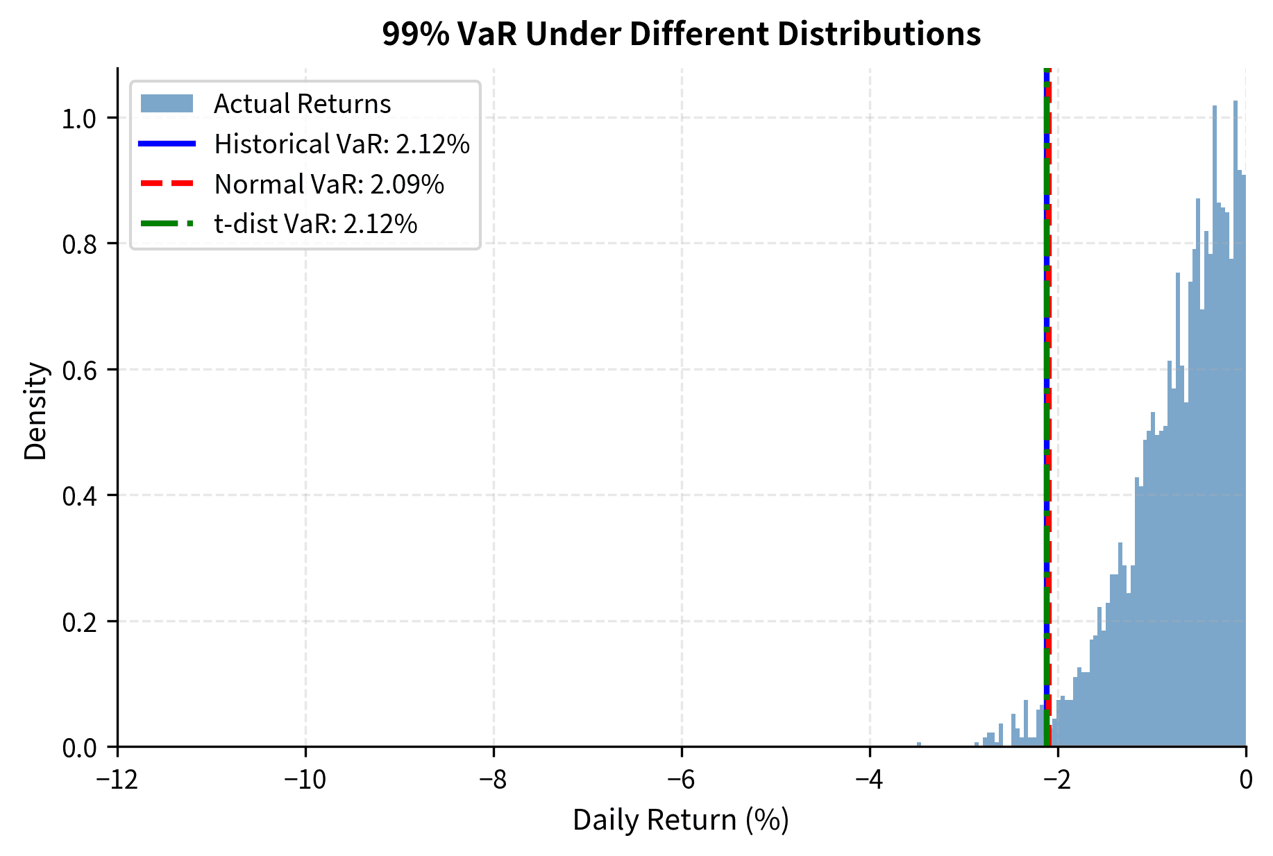
Traditional risk measures based on normal distributions dramatically underestimate tail risk. Consider Value at Risk (VaR) at the 99% confidence level:
The normal distribution VaR typically shows more exceedances than expected (more days with losses exceeding the VaR threshold), indicating underestimation of risk. The t-distribution and historical approaches provide more conservative and accurate estimates.
Key Parameters
The key parameters for the statistical models and risk measures used in this chapter are:
- Confidence Level (): The probability that losses will not exceed the VaR threshold (e.g., 99%). Higher confidence levels result in more conservative (larger) VaR estimates.
- Degrees of Freedom (): A parameter of the Student's t-distribution controlling tail heaviness. Lower values (e.g., 3-5) indicate fatter tails; as , the distribution converges to Normal.
- Lag (): The time shift used in autocorrelation calculations. Significant autocorrelation at lag implies predictability based on observations periods ago.
Universality Across Markets
A remarkable aspect of these stylized facts is their universality. They appear in:
- Different asset classes (equities, bonds, currencies, commodities)
- Different geographic markets (US, Europe, Asia, emerging markets)
- Different time periods (pre-WWII, post-WWII, modern era)
- Different frequencies (minute, hourly, daily, weekly)
While the specific parameter values vary (emerging market equities have higher kurtosis than developed markets, currencies show less skewness than equities), the qualitative features persist. This universality suggests these patterns reflect fundamental aspects of how markets aggregate information and how participants behave, rather than artifacts of specific market structures.
The persistence of these facts across diverse settings reinforces their importance for financial modeling. Any model that ignores heavy tails, volatility clustering, or the leverage effect will systematically misjudge risk and misprice derivatives across virtually all financial markets.
Summary
This chapter established the empirical foundation for quantitative modeling by documenting the robust statistical properties of financial returns:
Heavy tails and excess kurtosis represent the most dramatic departure from normality. Extreme returns occur far more frequently than the normal distribution predicts, with daily equity returns typically showing excess kurtosis of 5-15. This has direct implications for tail risk measurement and derivative pricing.
Negative skewness characterizes many equity return distributions, reflecting the asymmetric nature of market movements: gradual rises and sudden crashes. Risk models must account for this asymmetry in the loss tail.
Volatility clustering means that market turbulence is persistent. Today's volatility strongly predicts tomorrow's volatility, with autocorrelation in squared returns remaining significant for many weeks. This violates the i.i.d. assumption underlying many classical models.
The leverage effect introduces asymmetry in volatility dynamics: negative returns increase future volatility more than positive returns. This correlation between returns and volatility changes has implications for option pricing and hedging.
Aggregational Gaussianity provides a silver lining: returns become more normal at longer horizons. Daily returns require careful non-normal treatment, but annual risk assessments can rely more heavily on Gaussian approximations.
These stylized facts motivate the sophisticated modeling techniques developed throughout the remainder of this textbook. The Brownian motion framework of the next chapter provides a mathematical foundation for continuous-time price processes, but you'll now understand why extensions like jump-diffusions and stochastic volatility are necessary to capture market reality. The gap between elegant theory and messy reality is precisely where quantitative finance earns its value.
Quiz
Ready to test your understanding? Take this quick quiz to reinforce what you've learned about the stylized facts of financial returns.

Comments